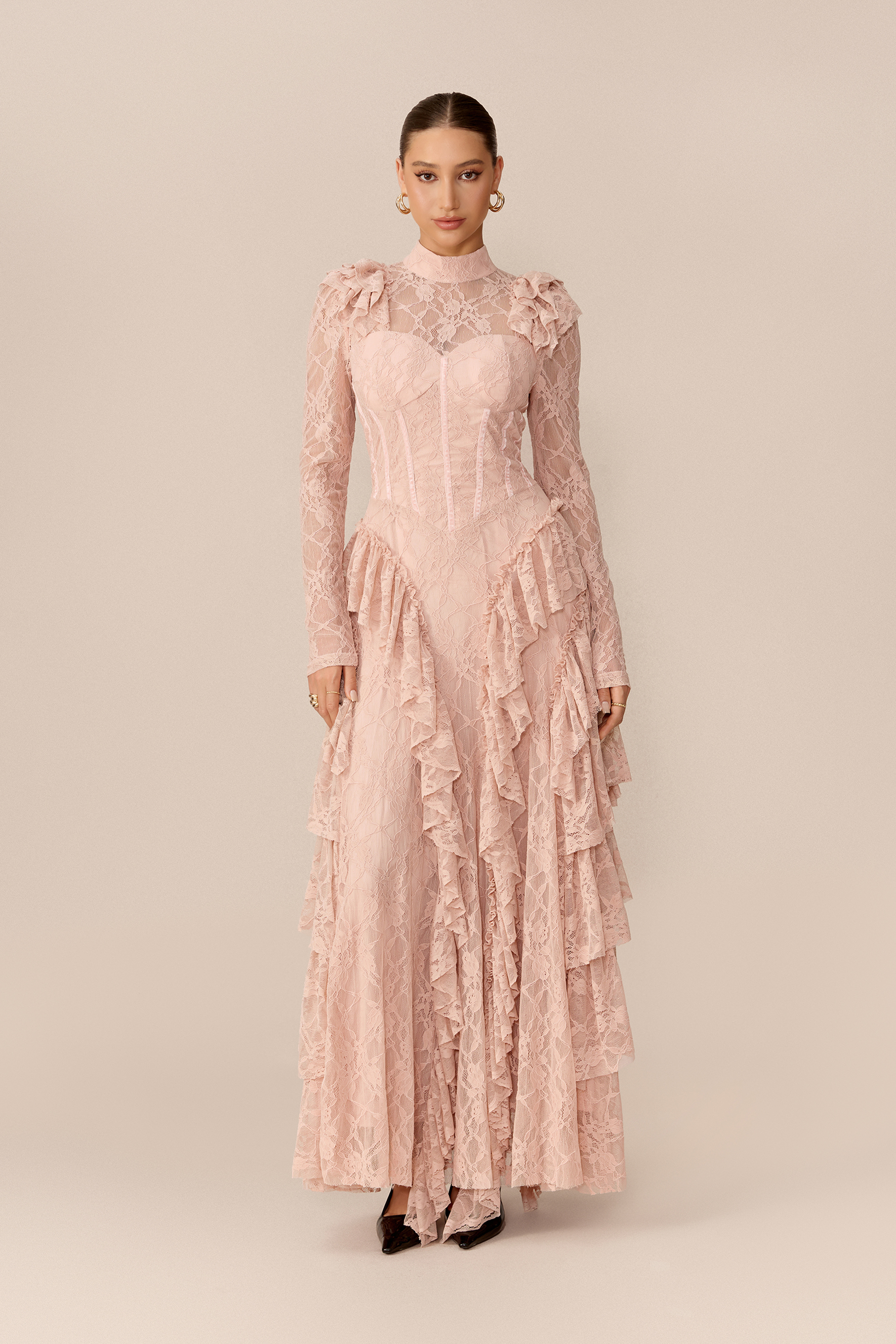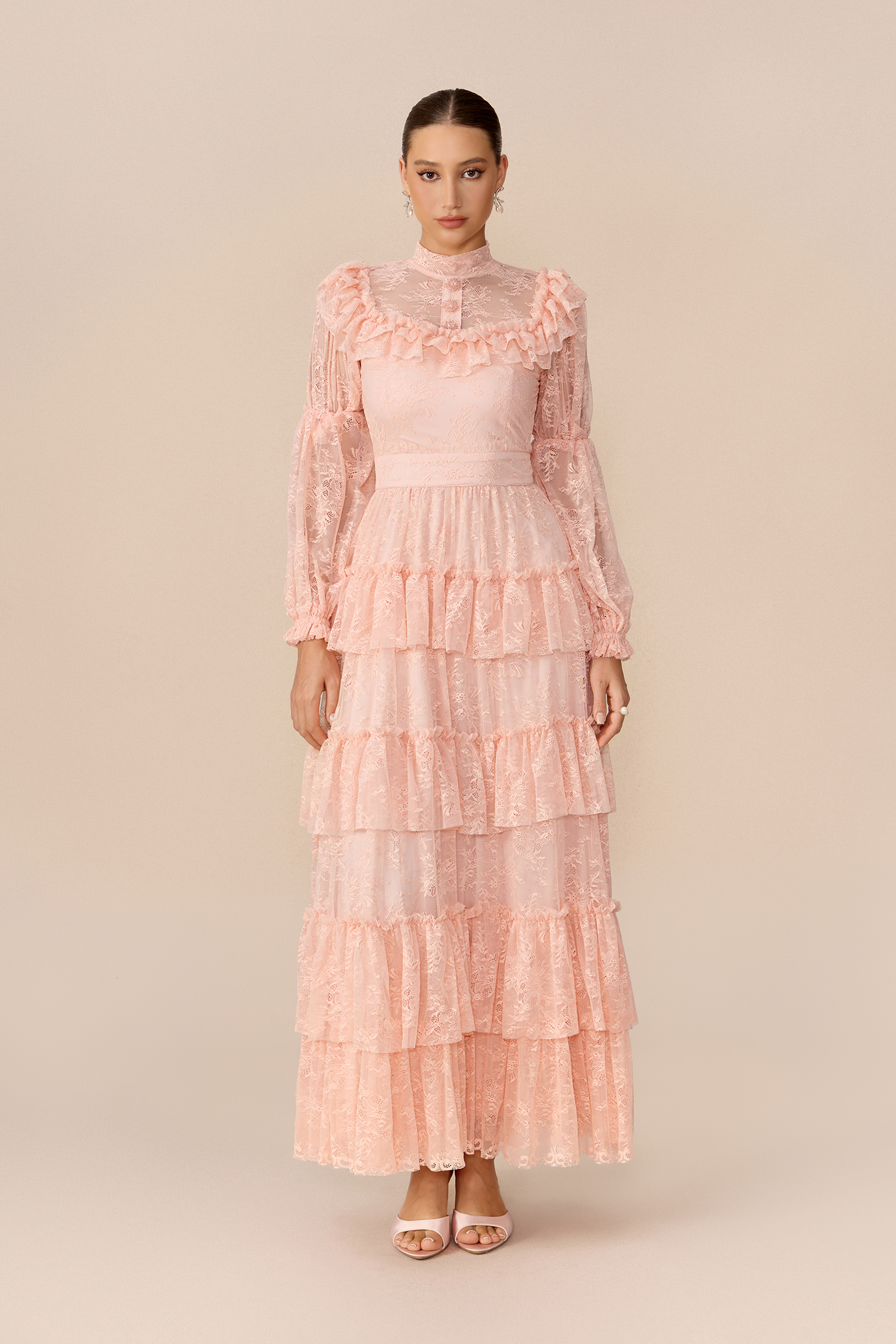

Pinkes Kleid


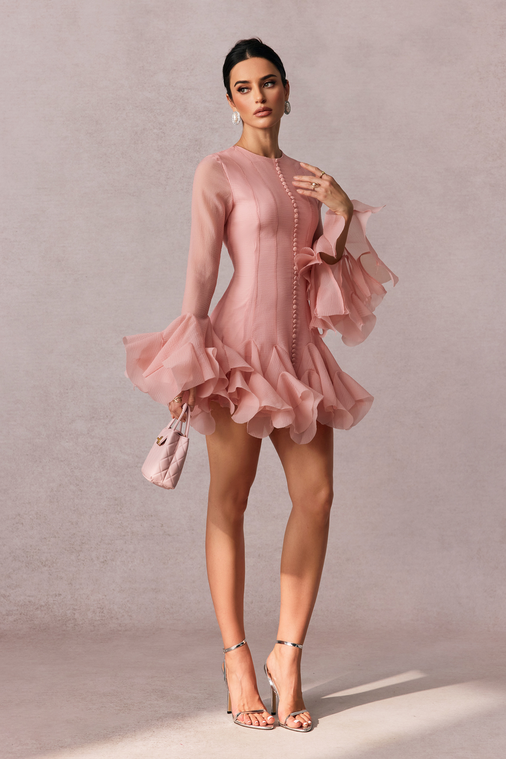
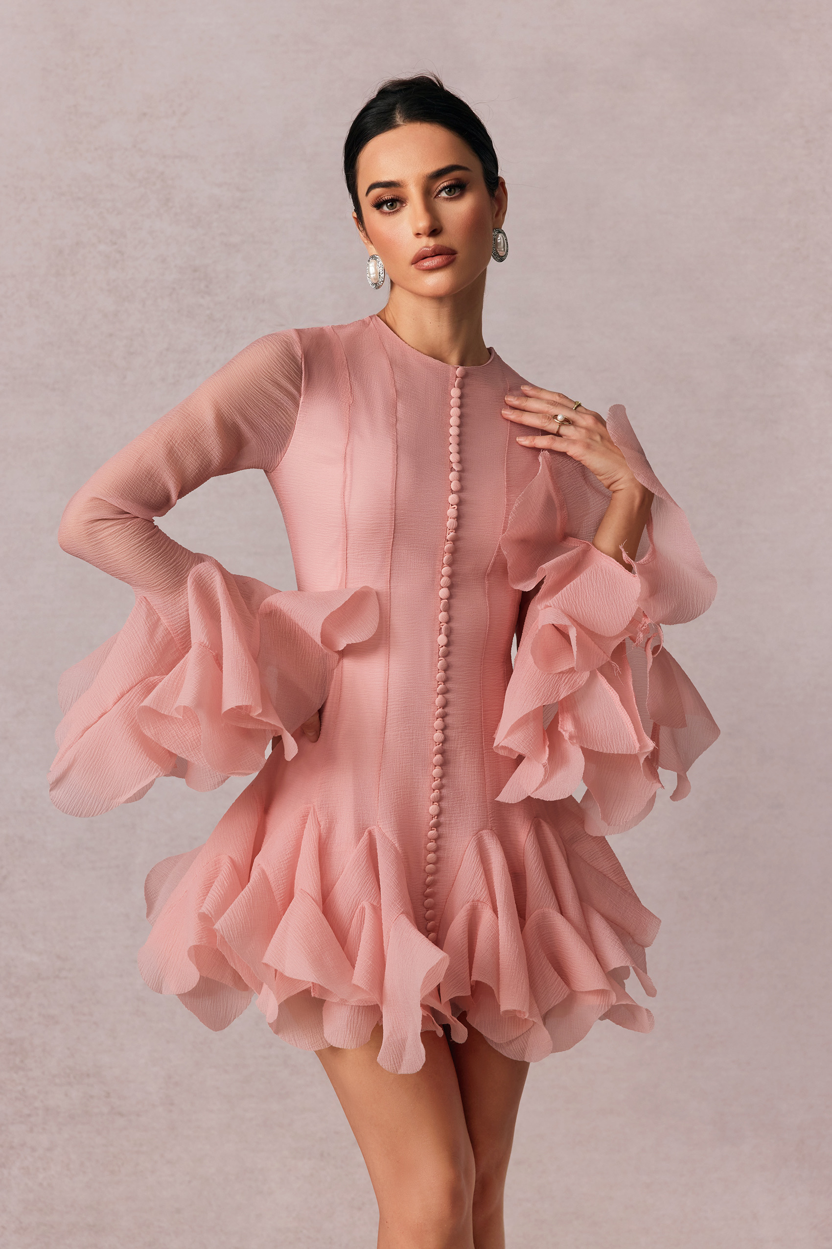
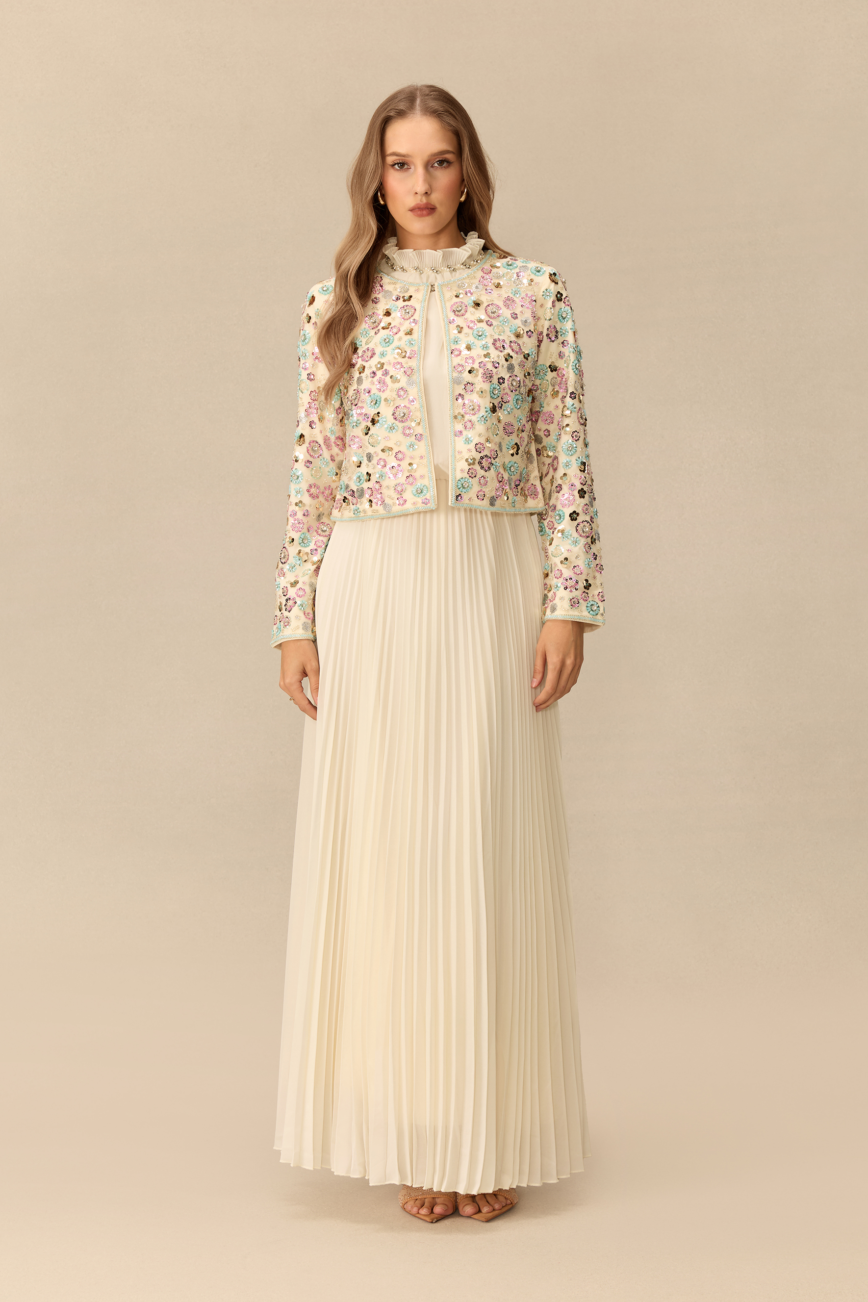
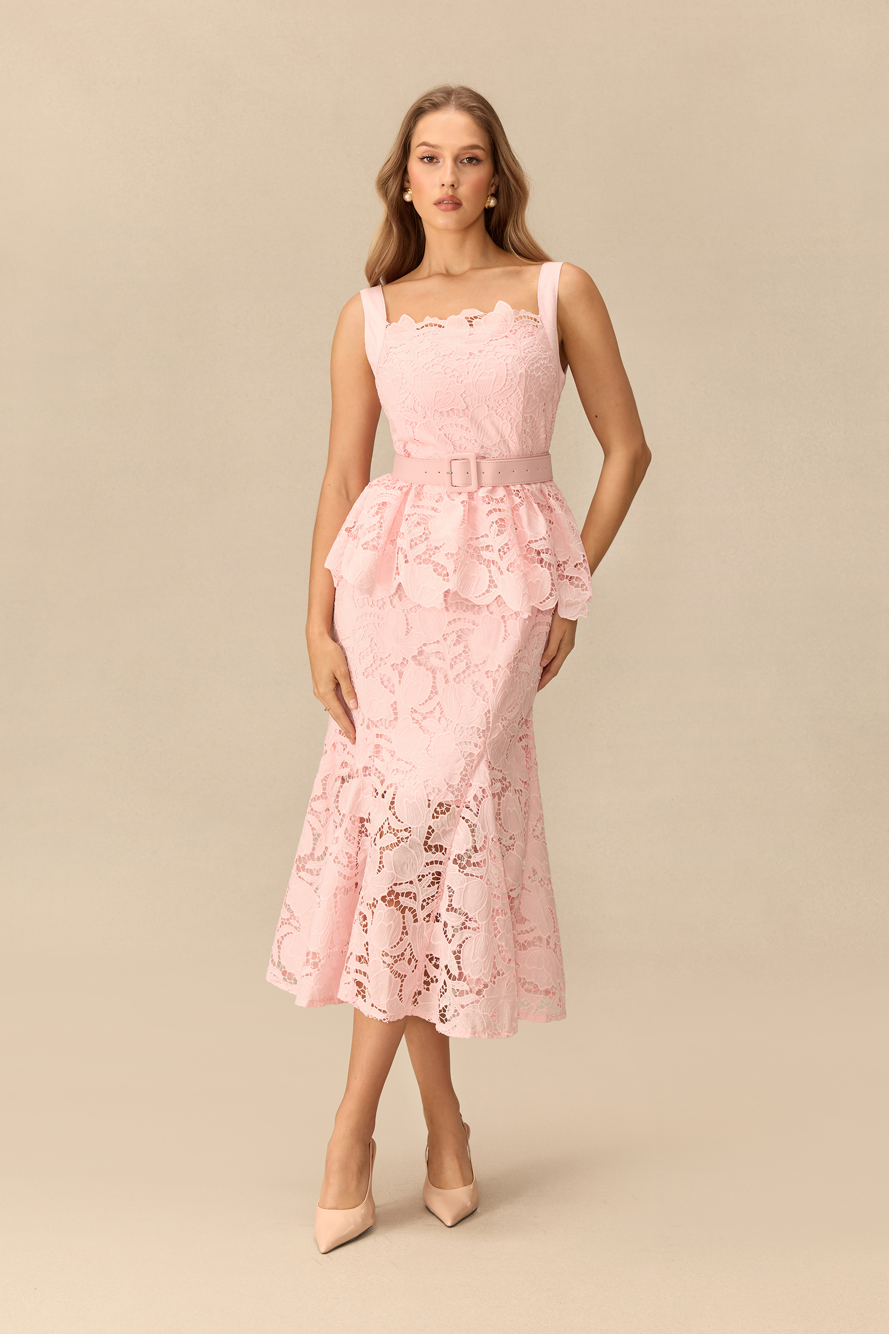
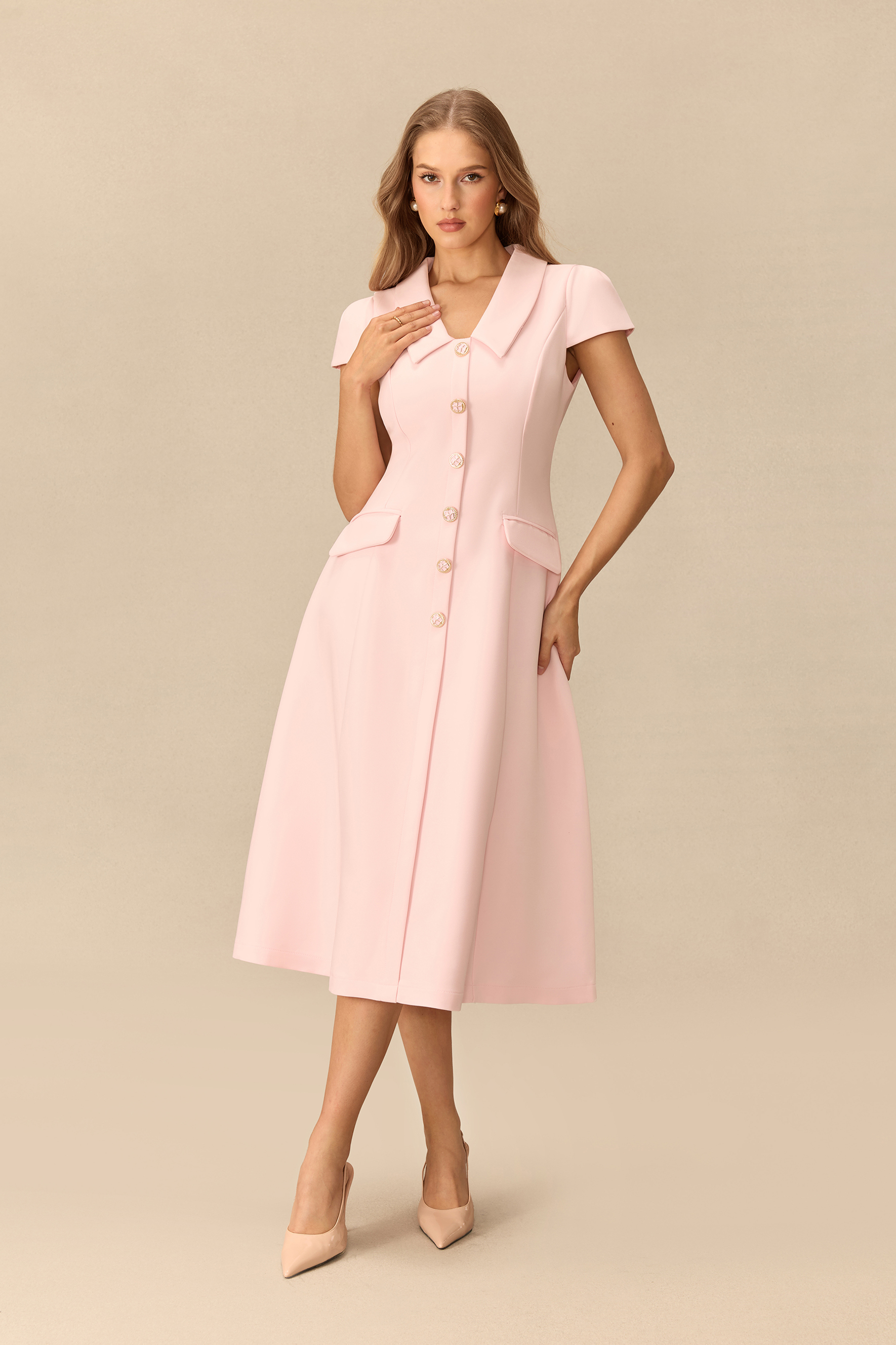
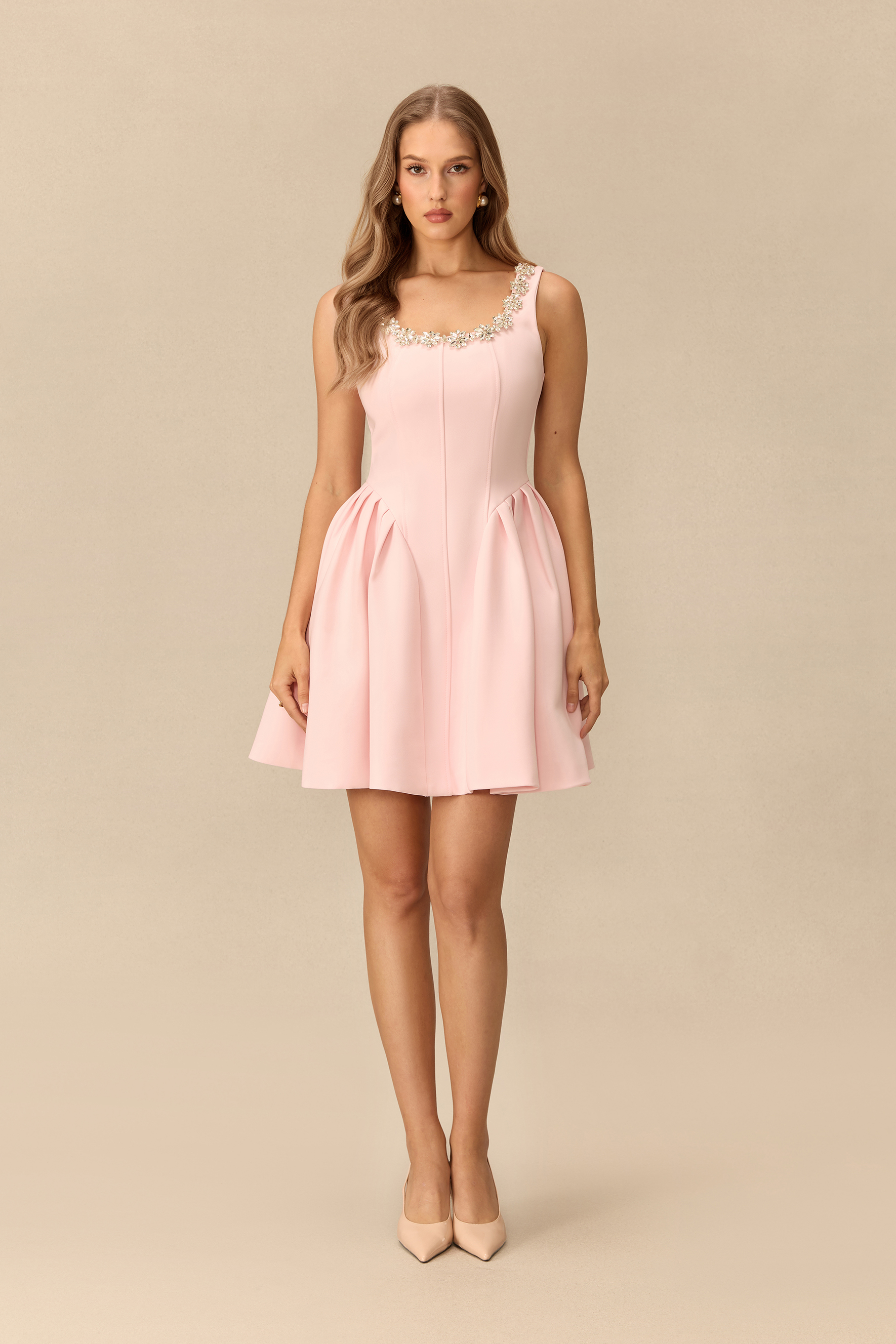
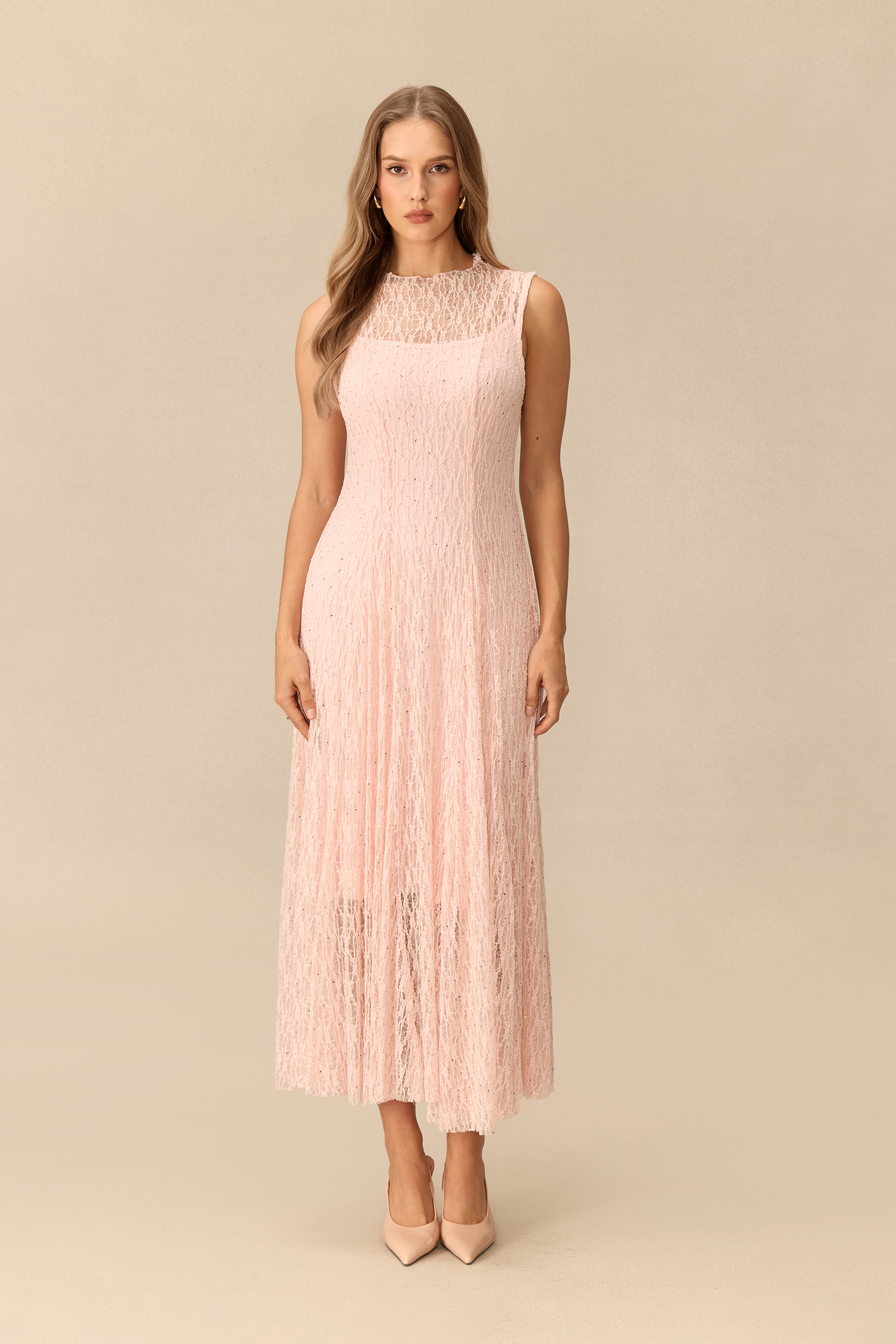
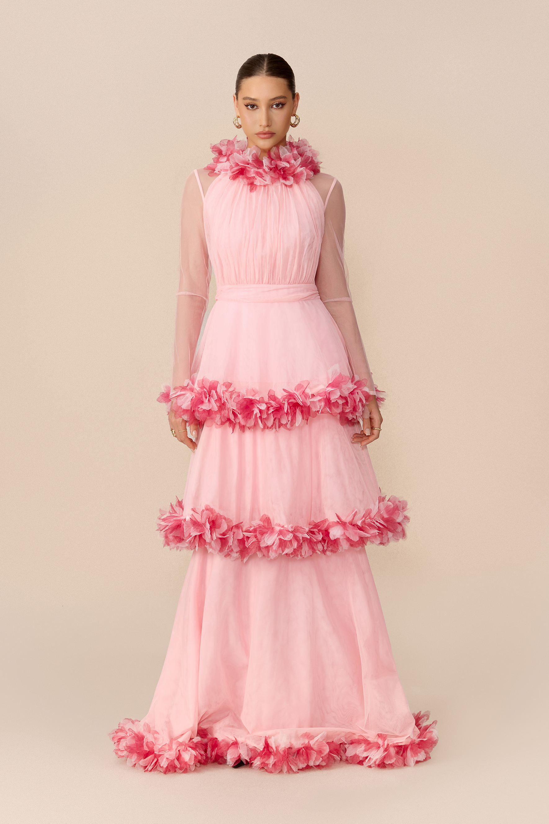
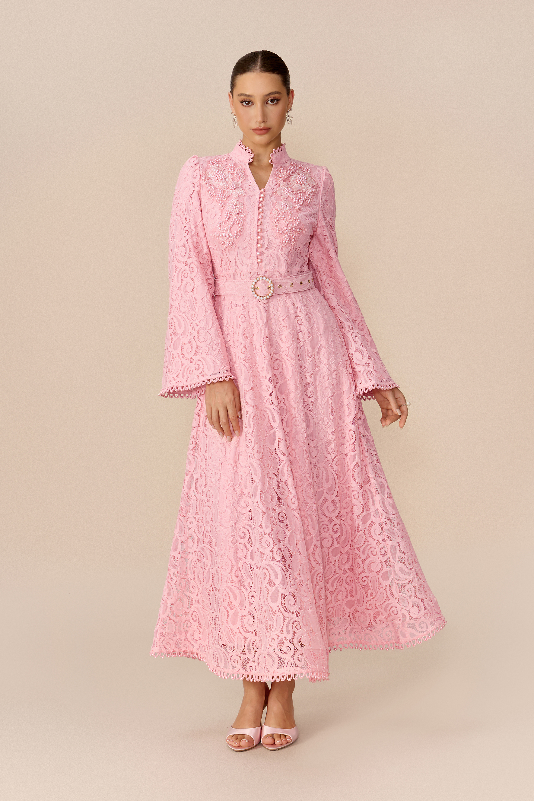
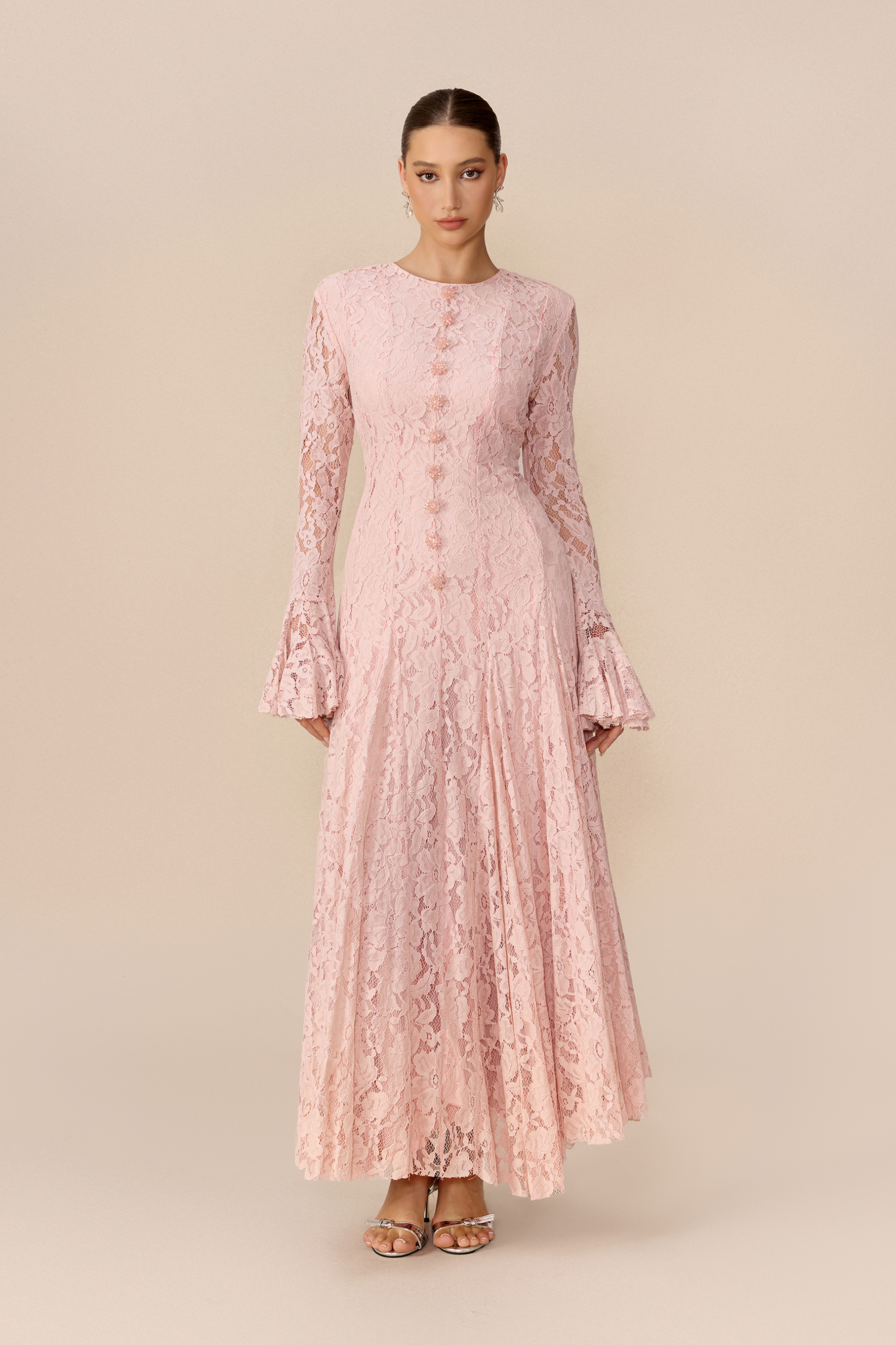
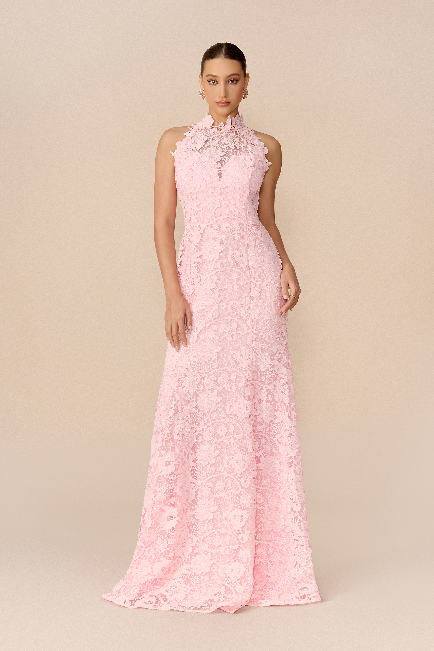
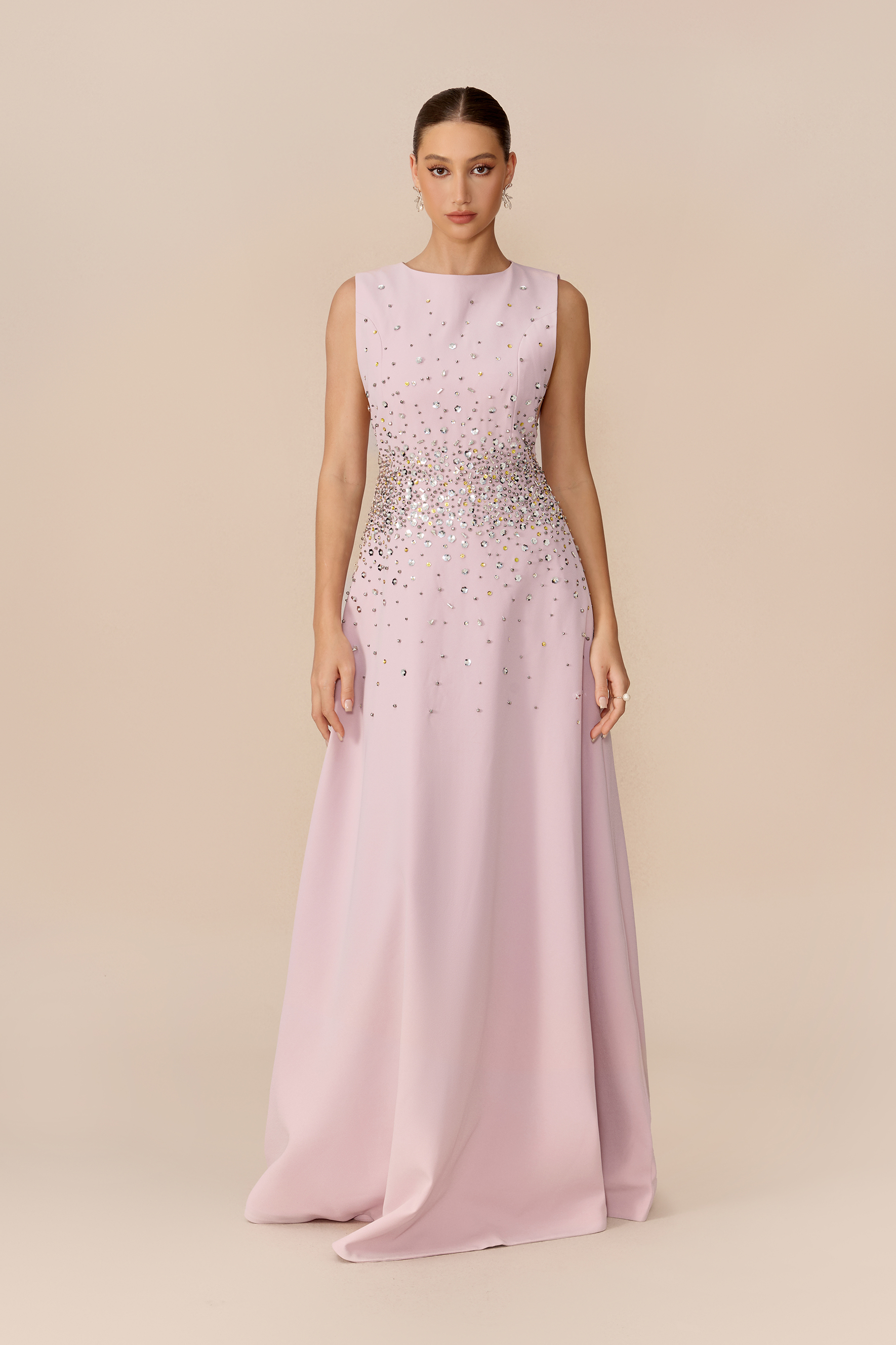
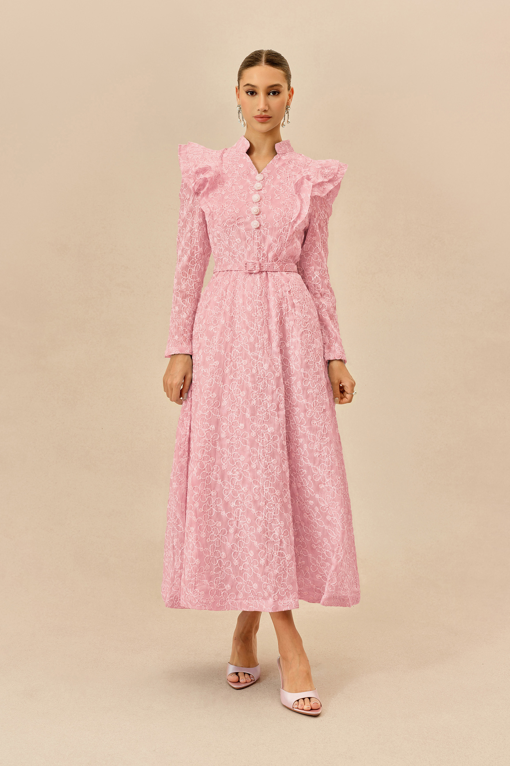
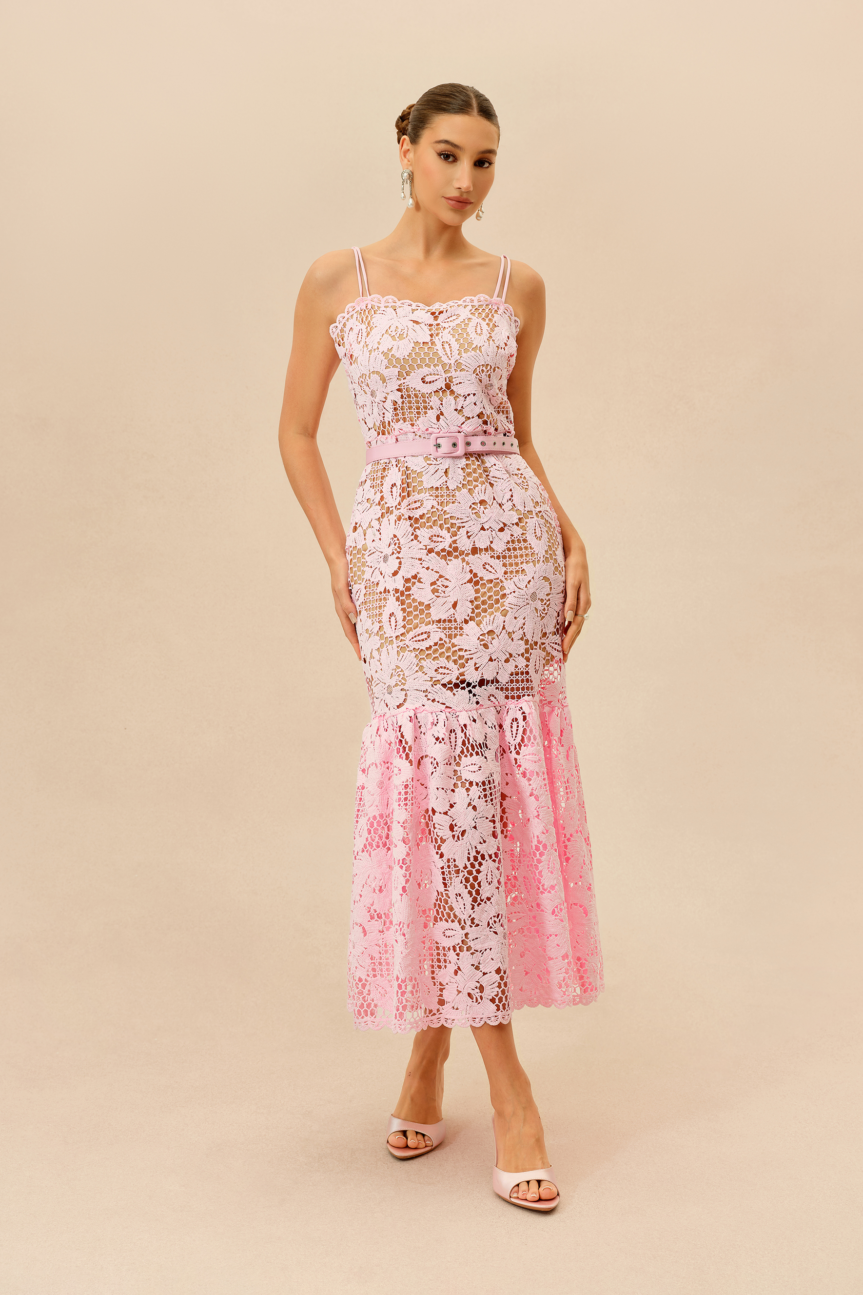
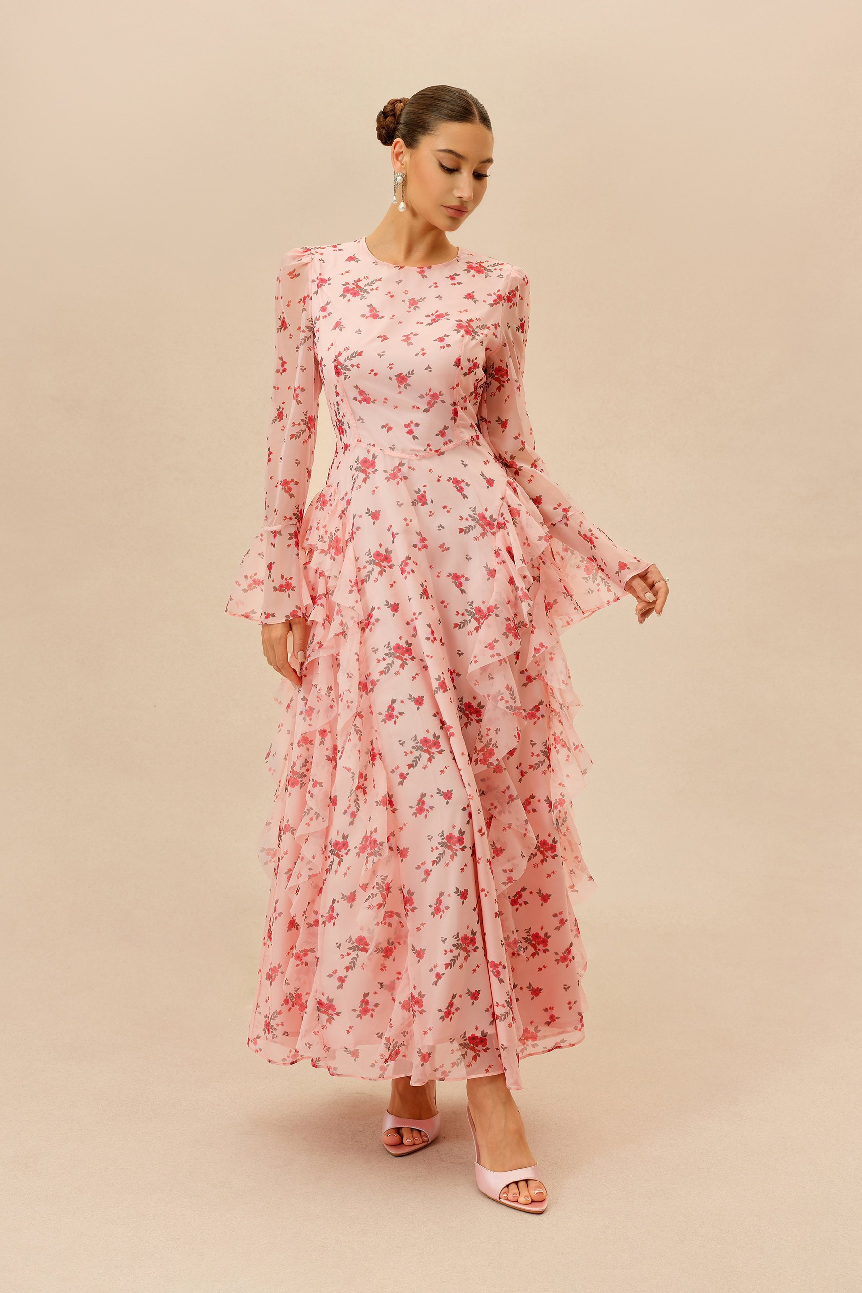
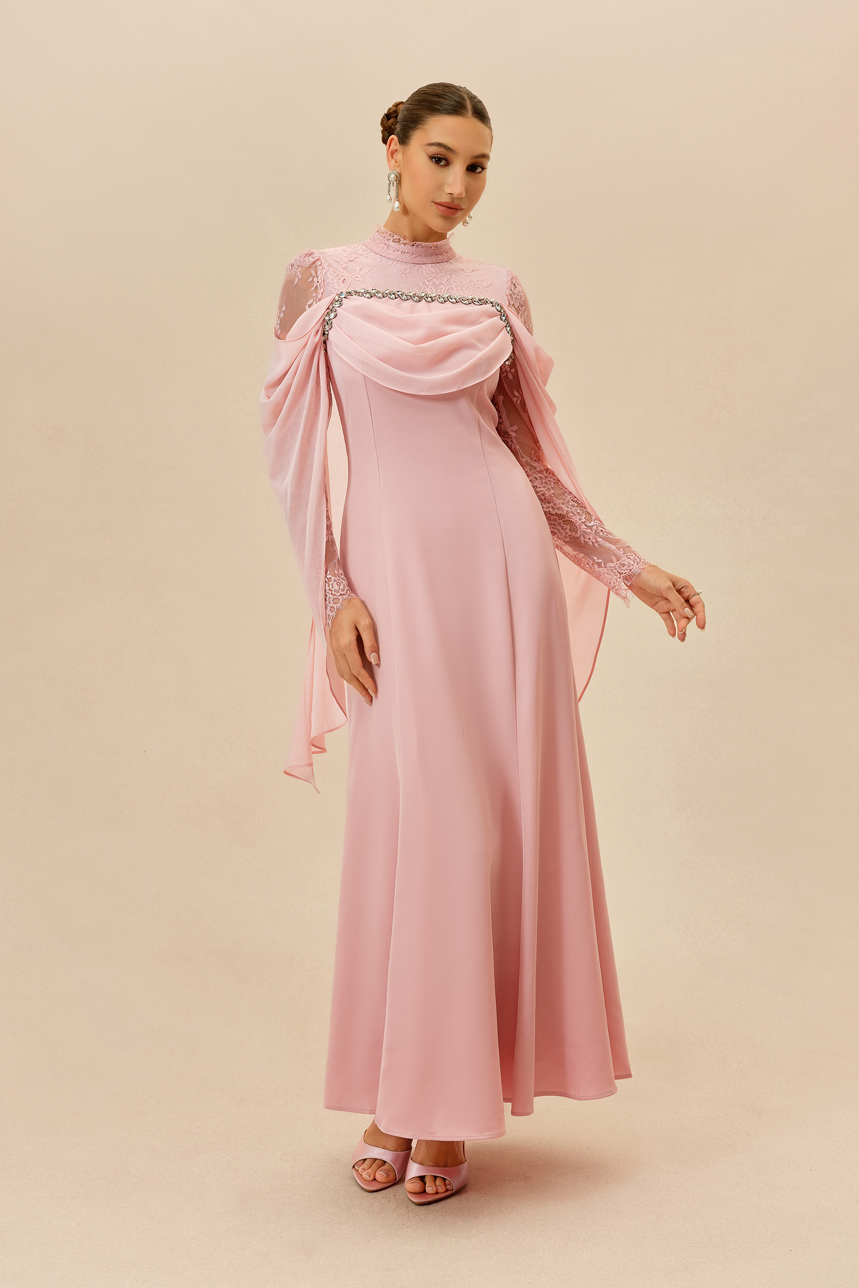
Pink has a wider range than it first appears. A pale blush can feel soft and understated, rose tones bring more warmth, while hot pink and fuchsia push the color into a brighter, more expressive direction. That range is what makes pink distinctive: the same color family can shift from quiet to striking simply through changes in tone and saturation.
The easiest way to narrow down a pink dress is to look at how much presence you want the color to have.
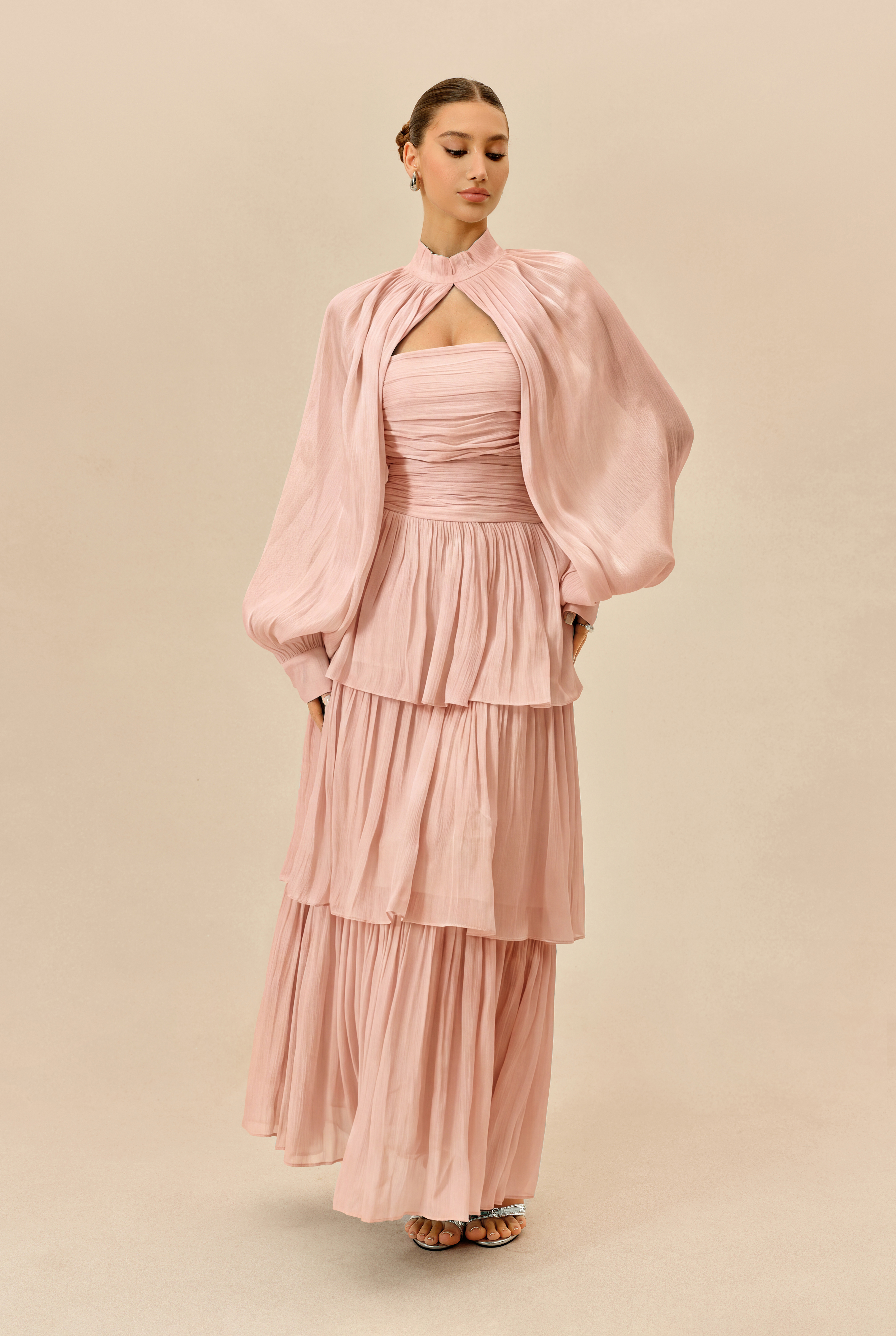
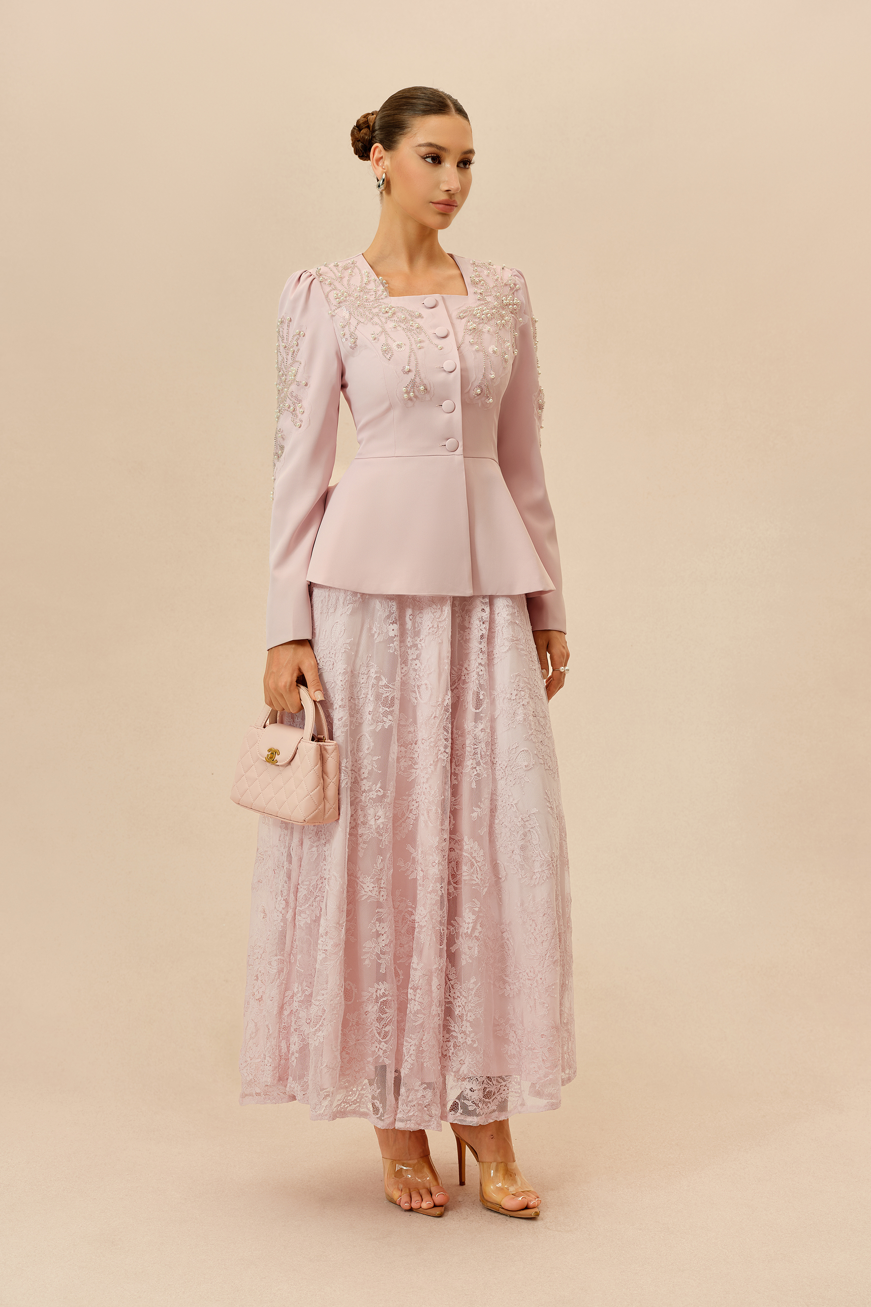
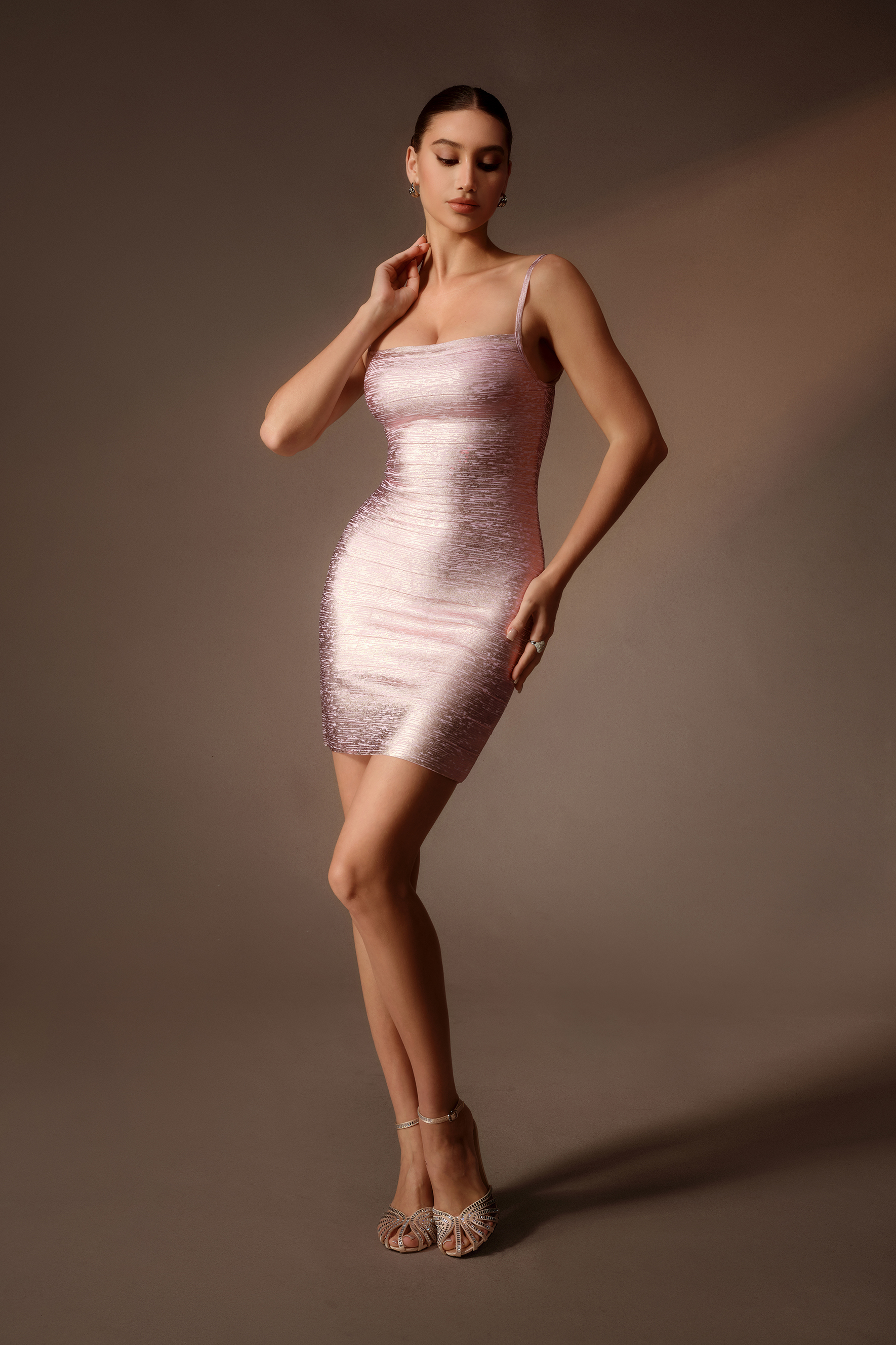
Lighter pinks tend to blend more gently into a look, while deeper or more saturated shades draw the eye more quickly. Mauve and dusty rose sit somewhere in between, with a more muted quality than brighter pinks.
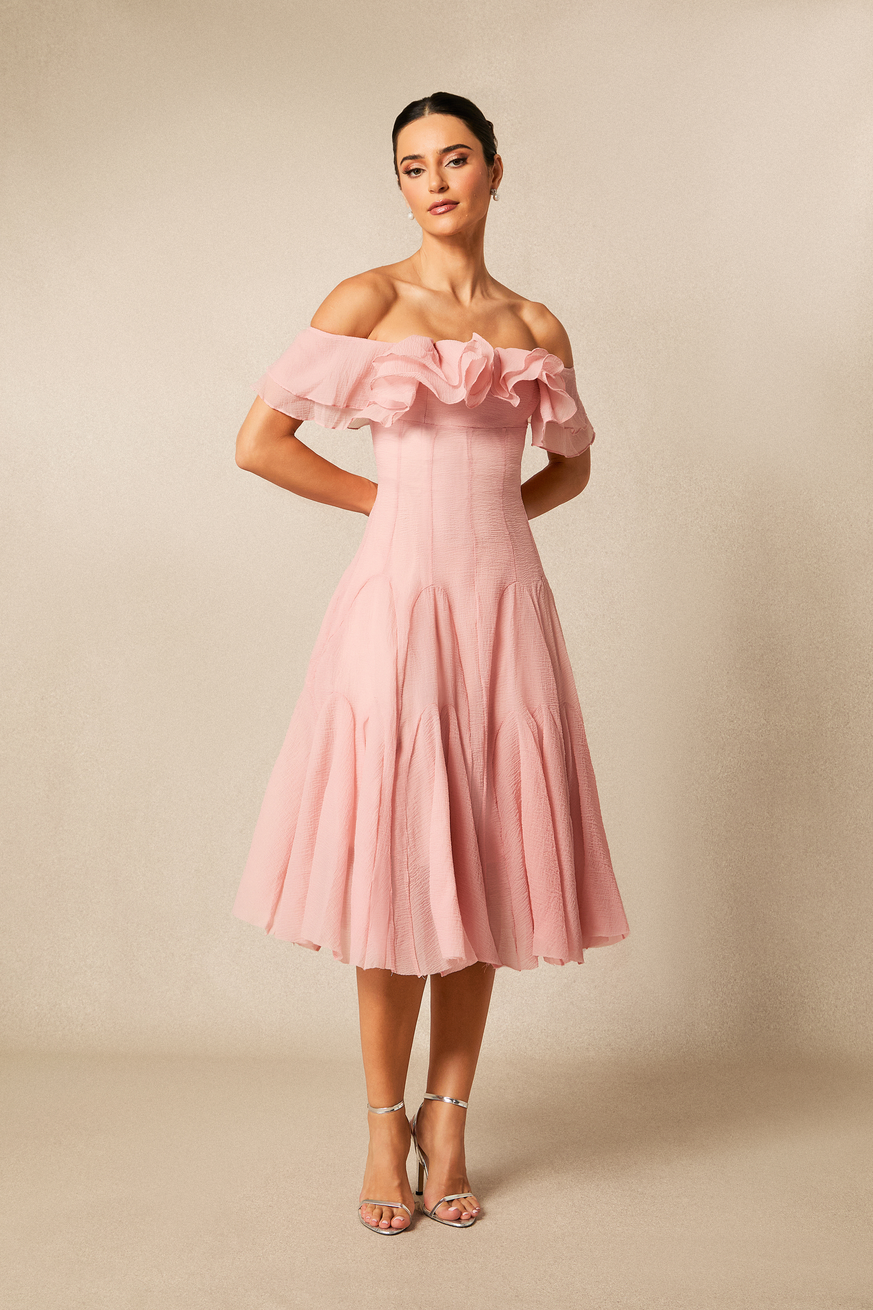
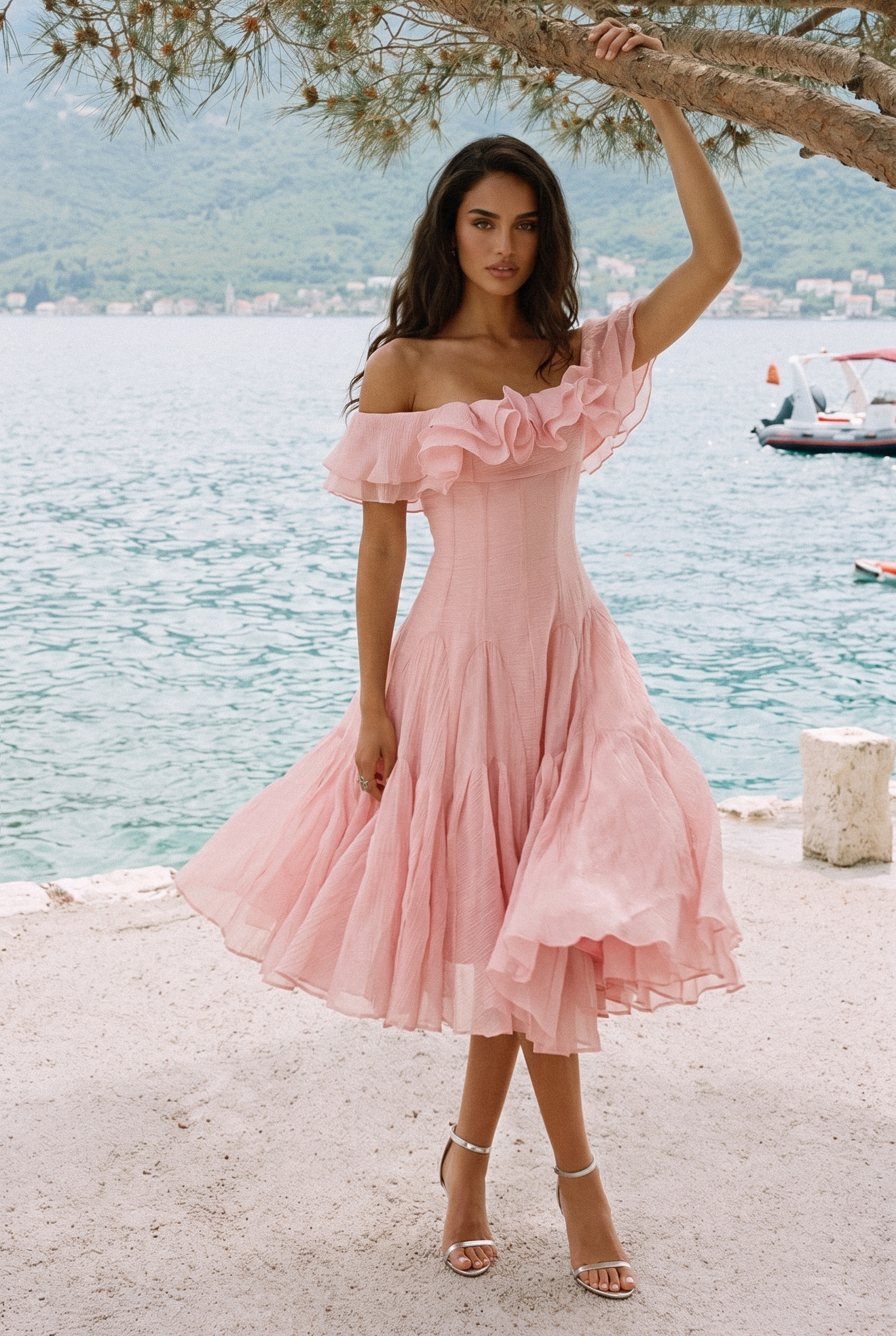
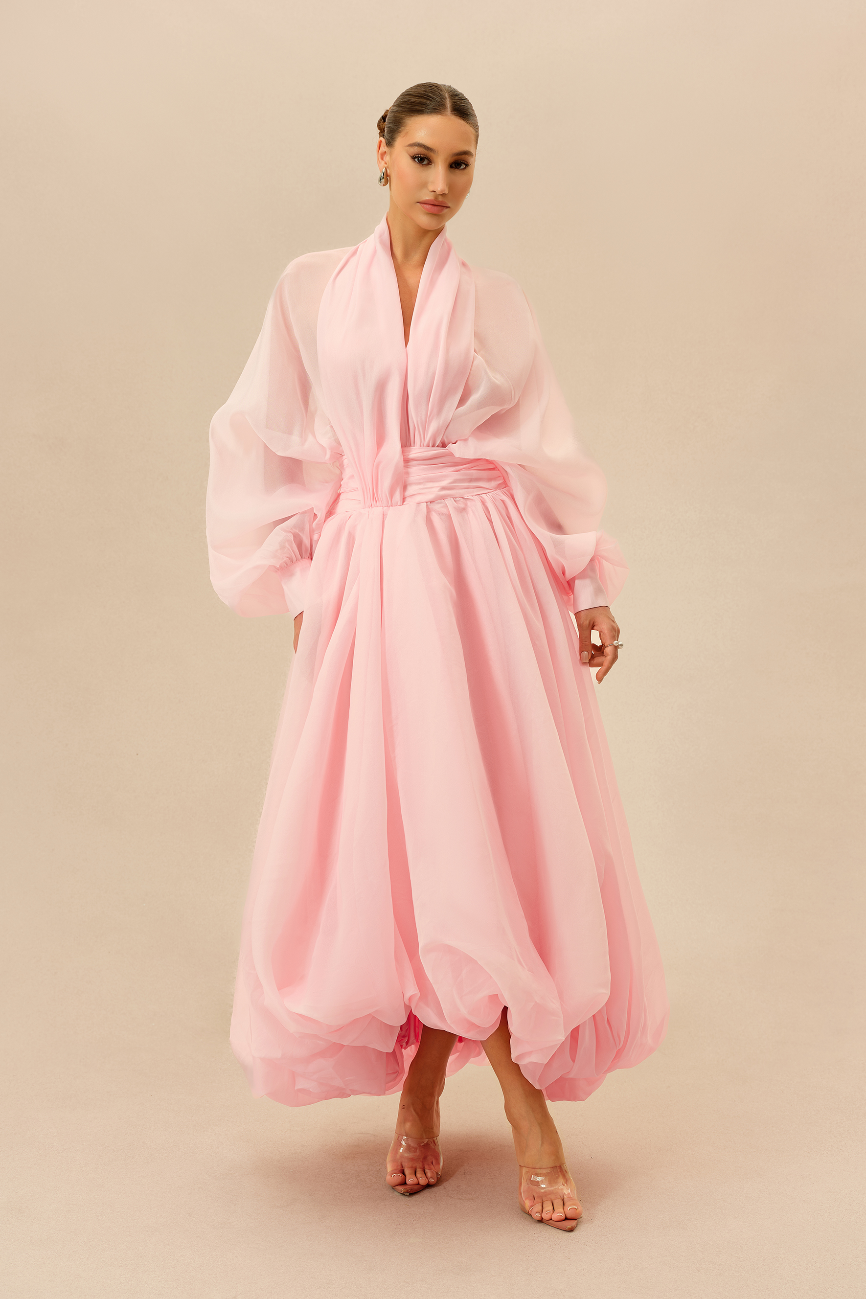
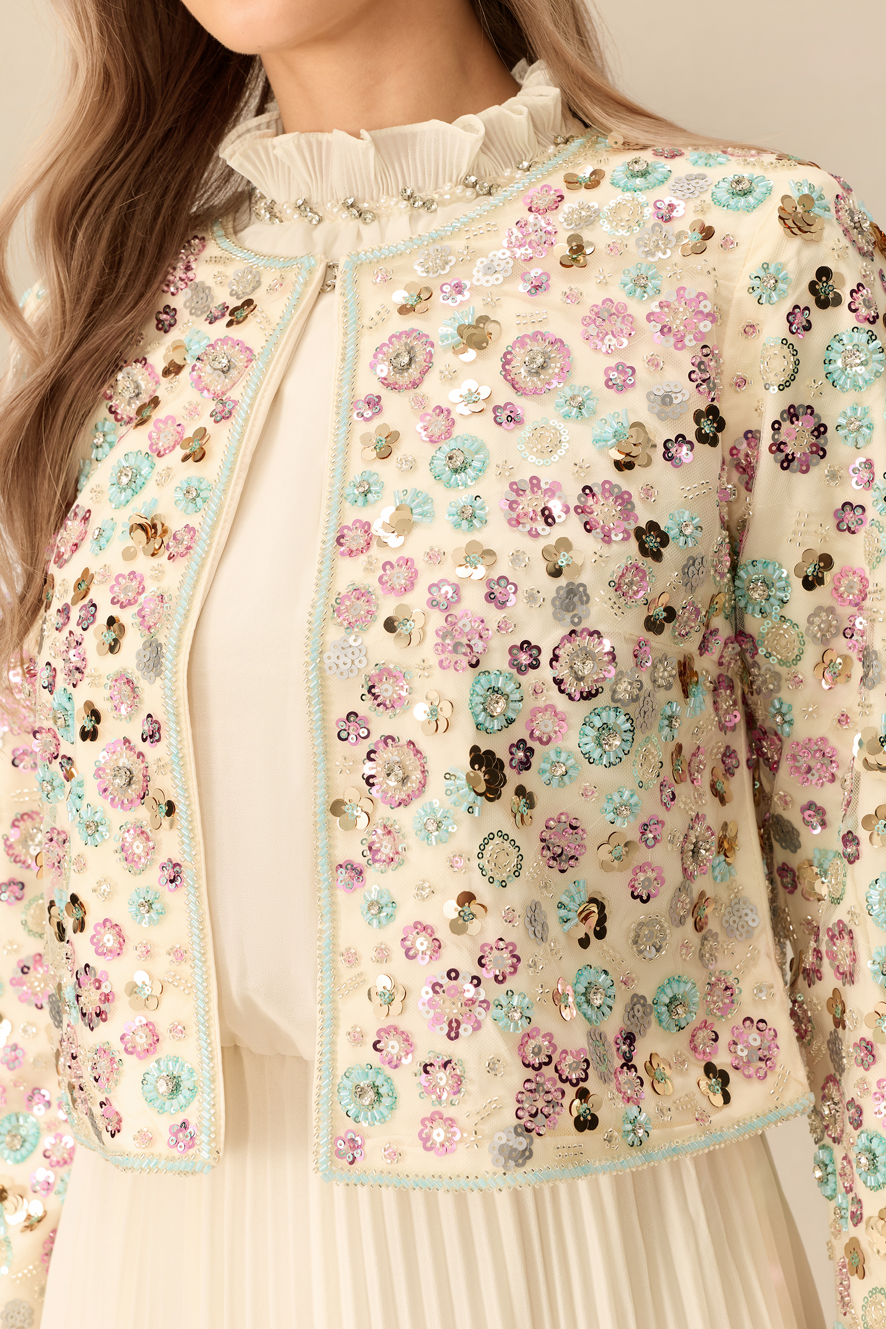
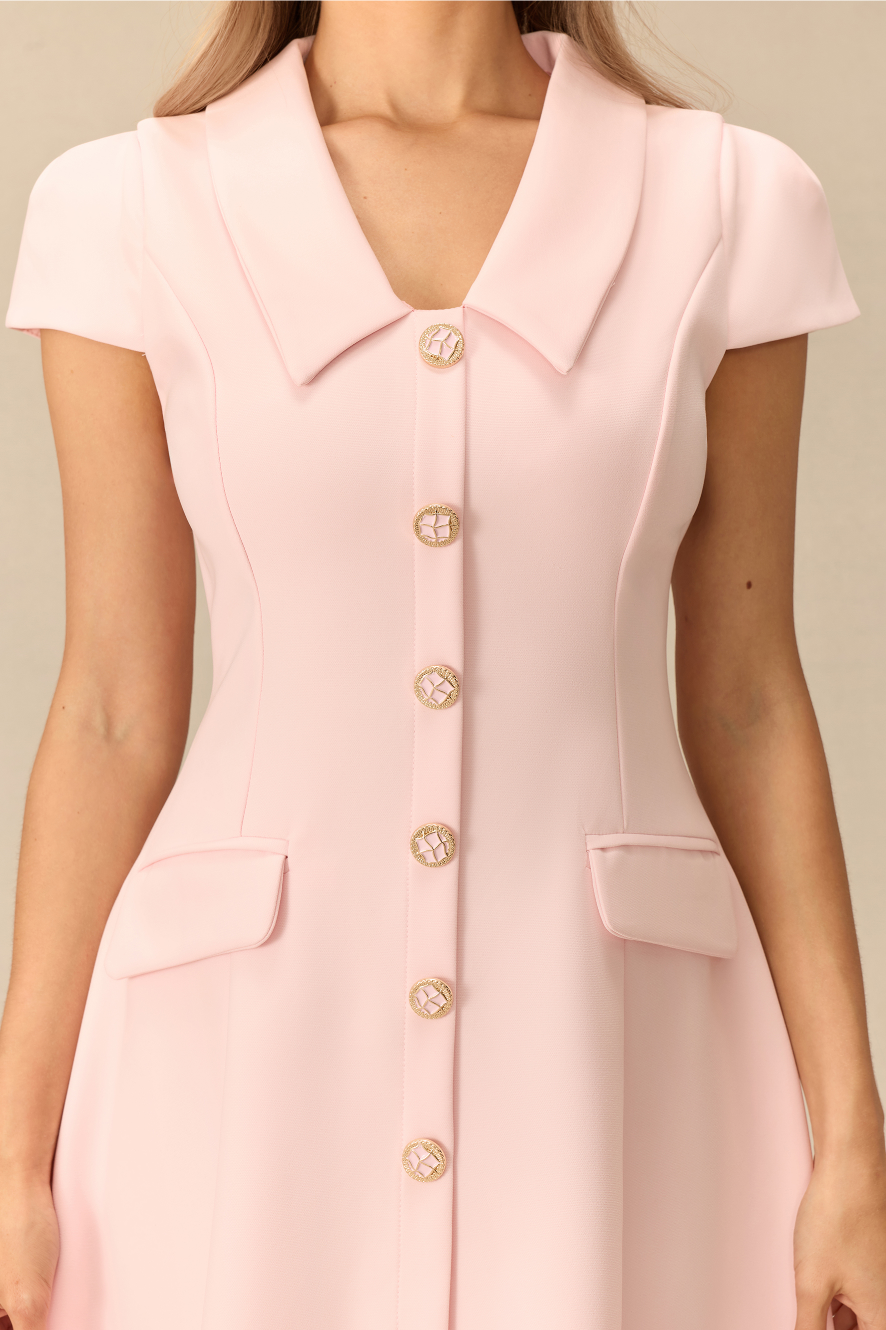
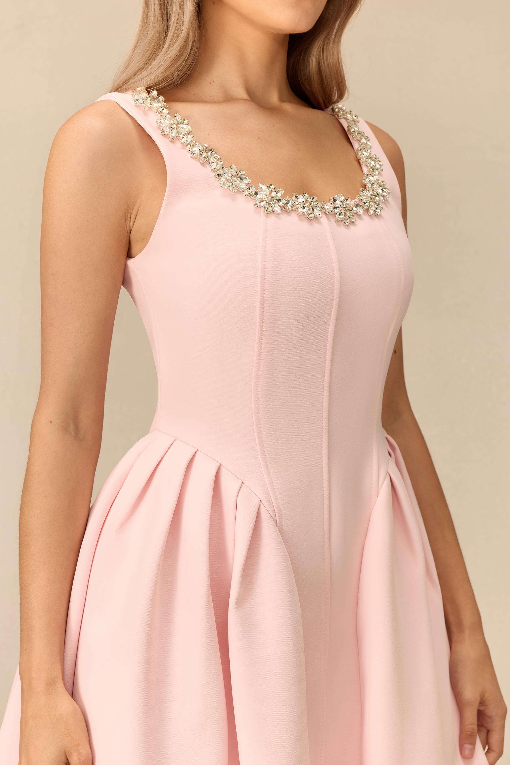
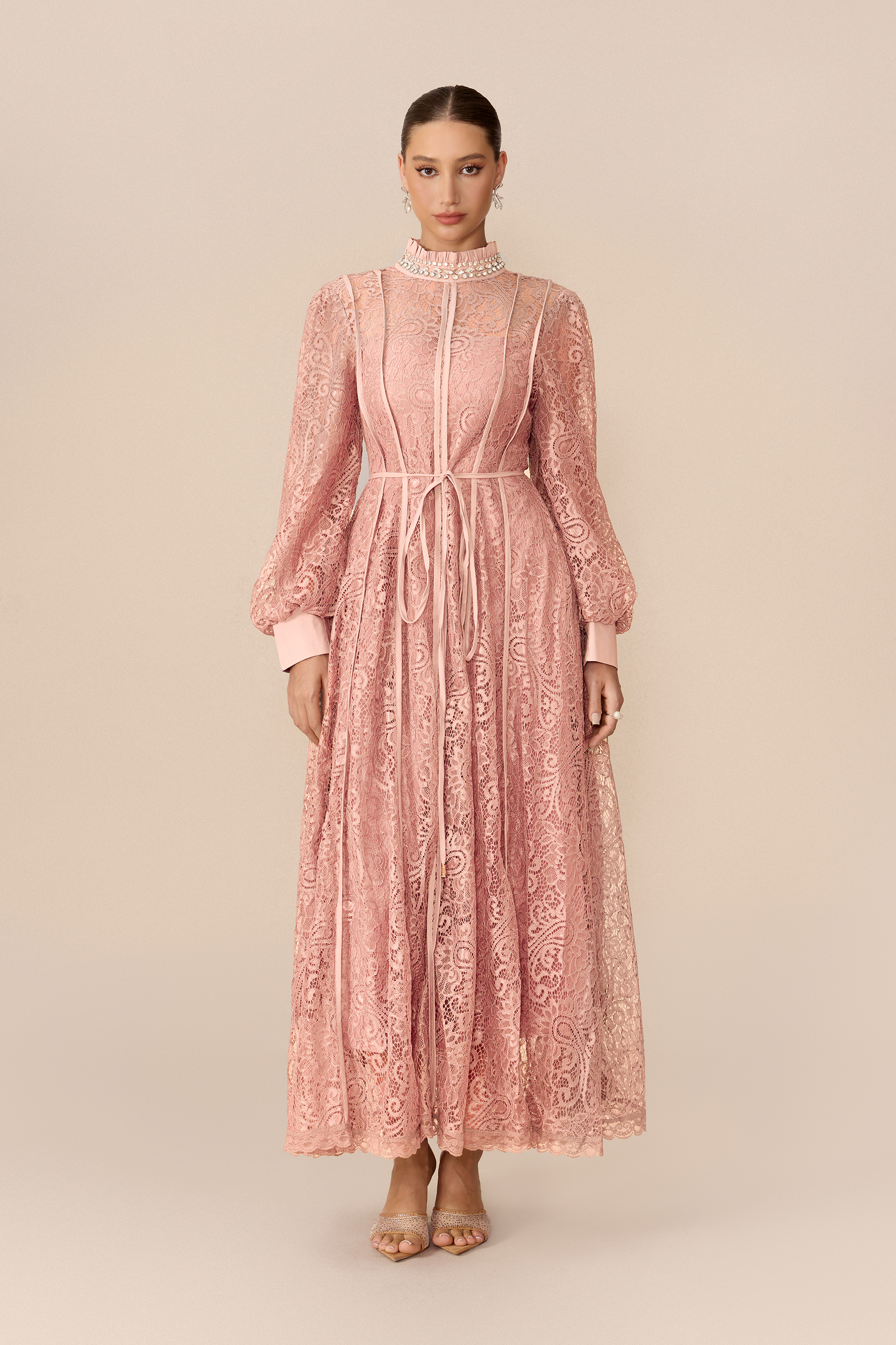
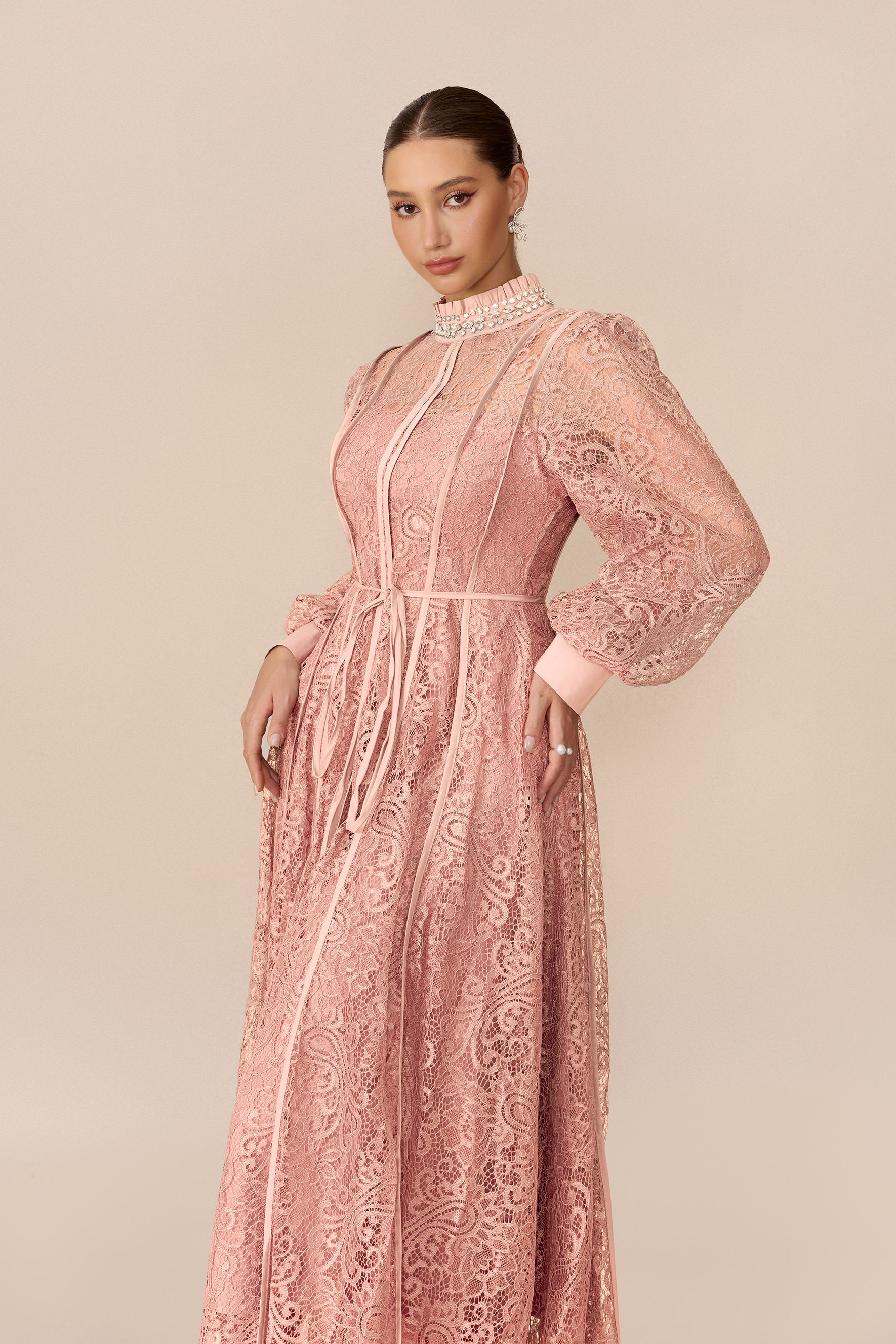
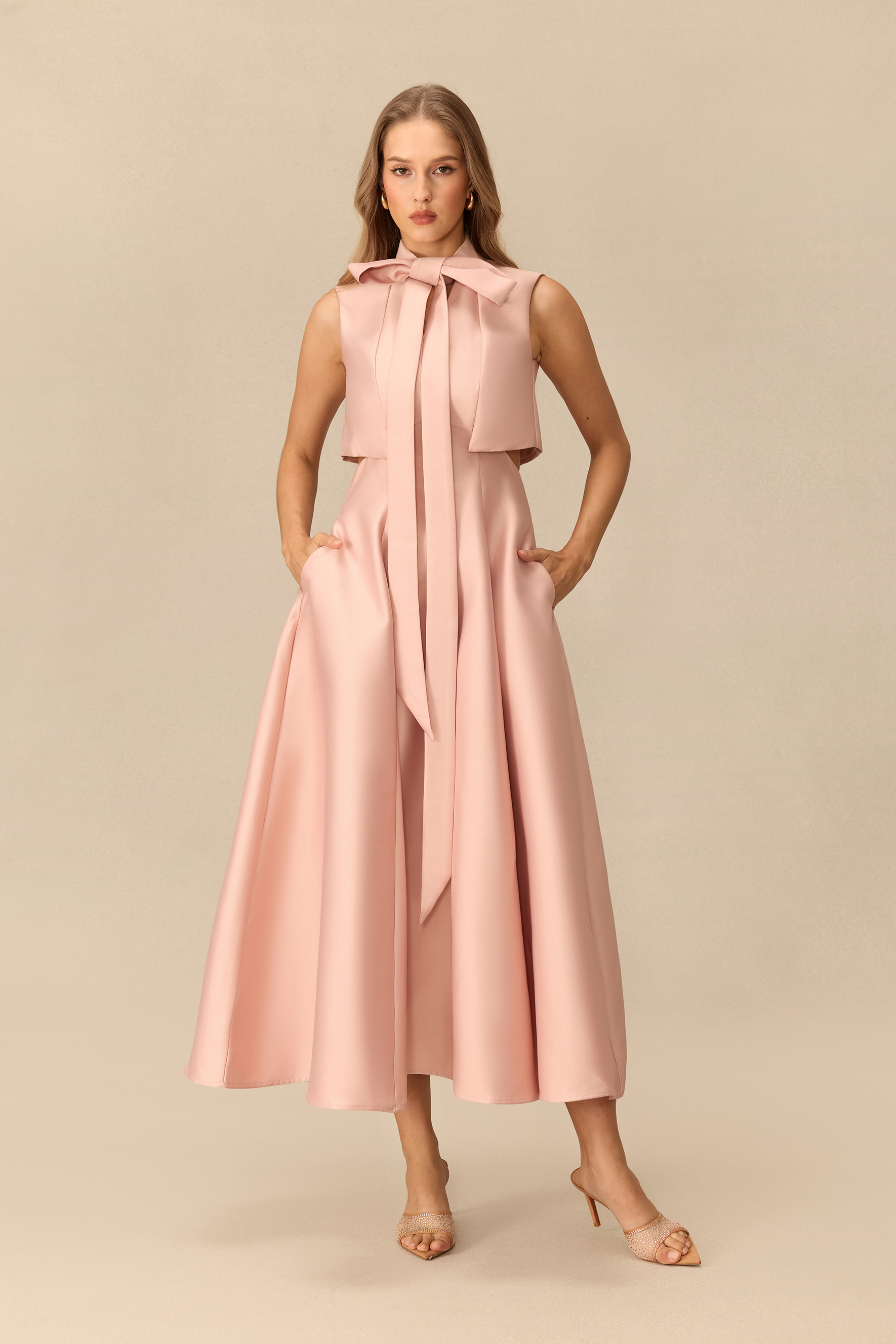
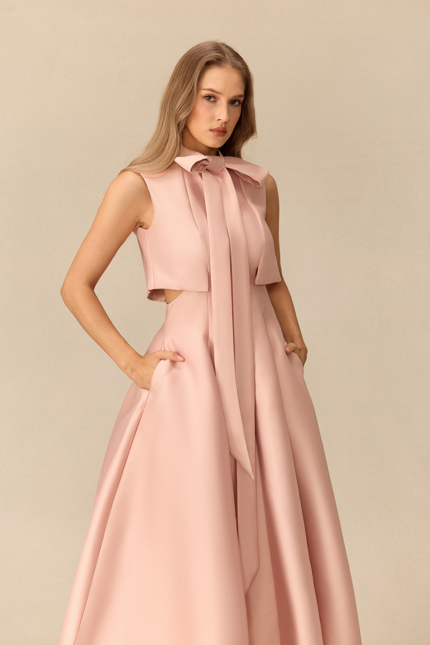
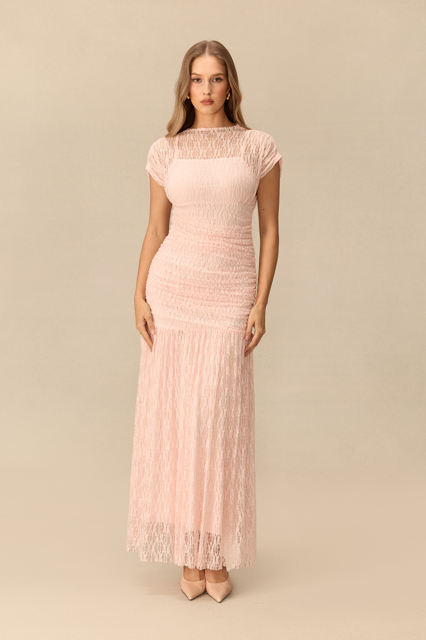
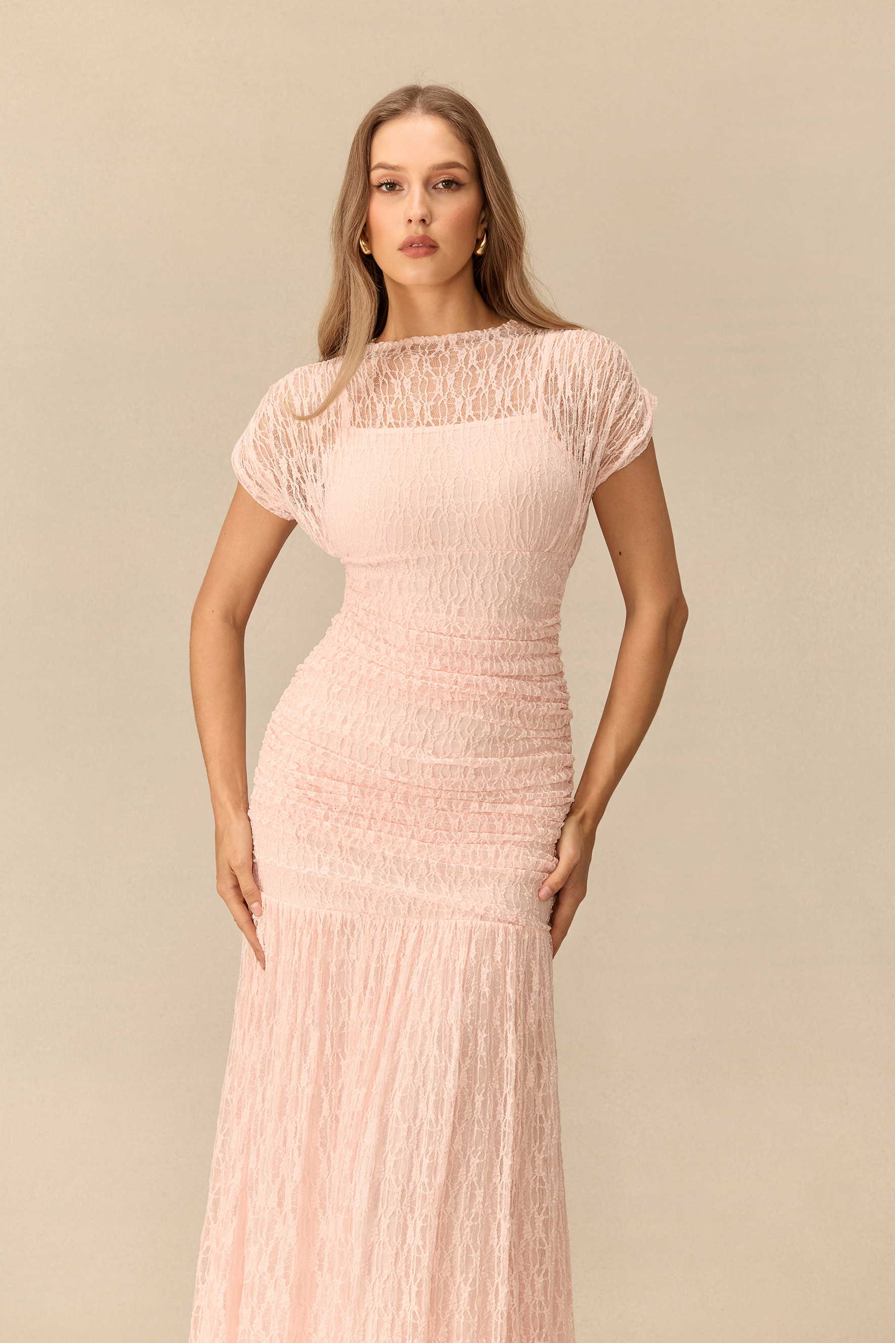
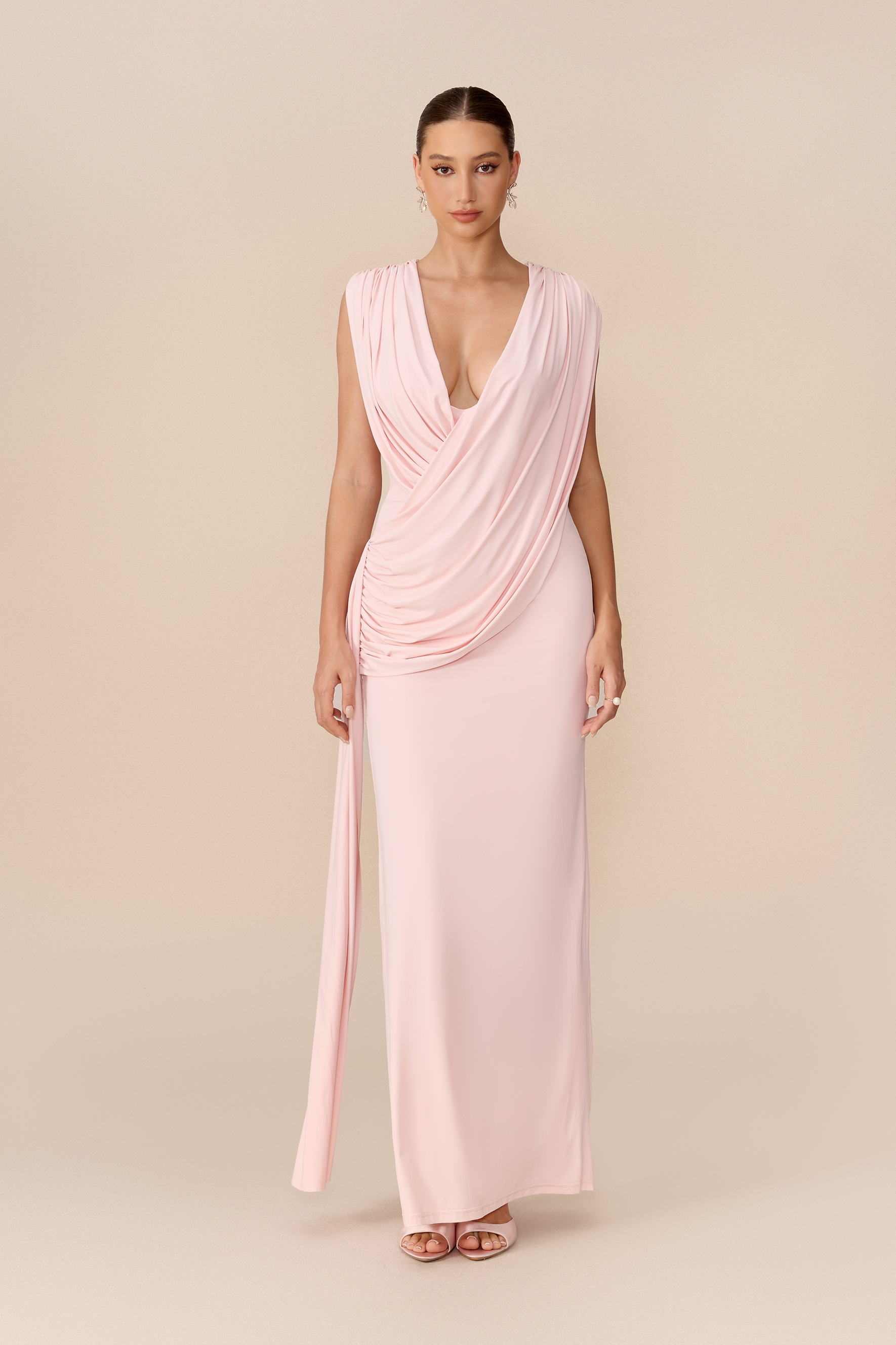
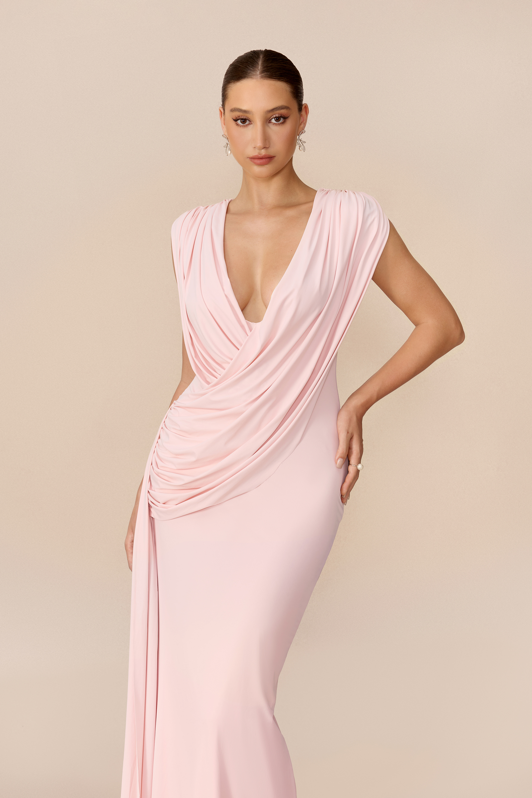
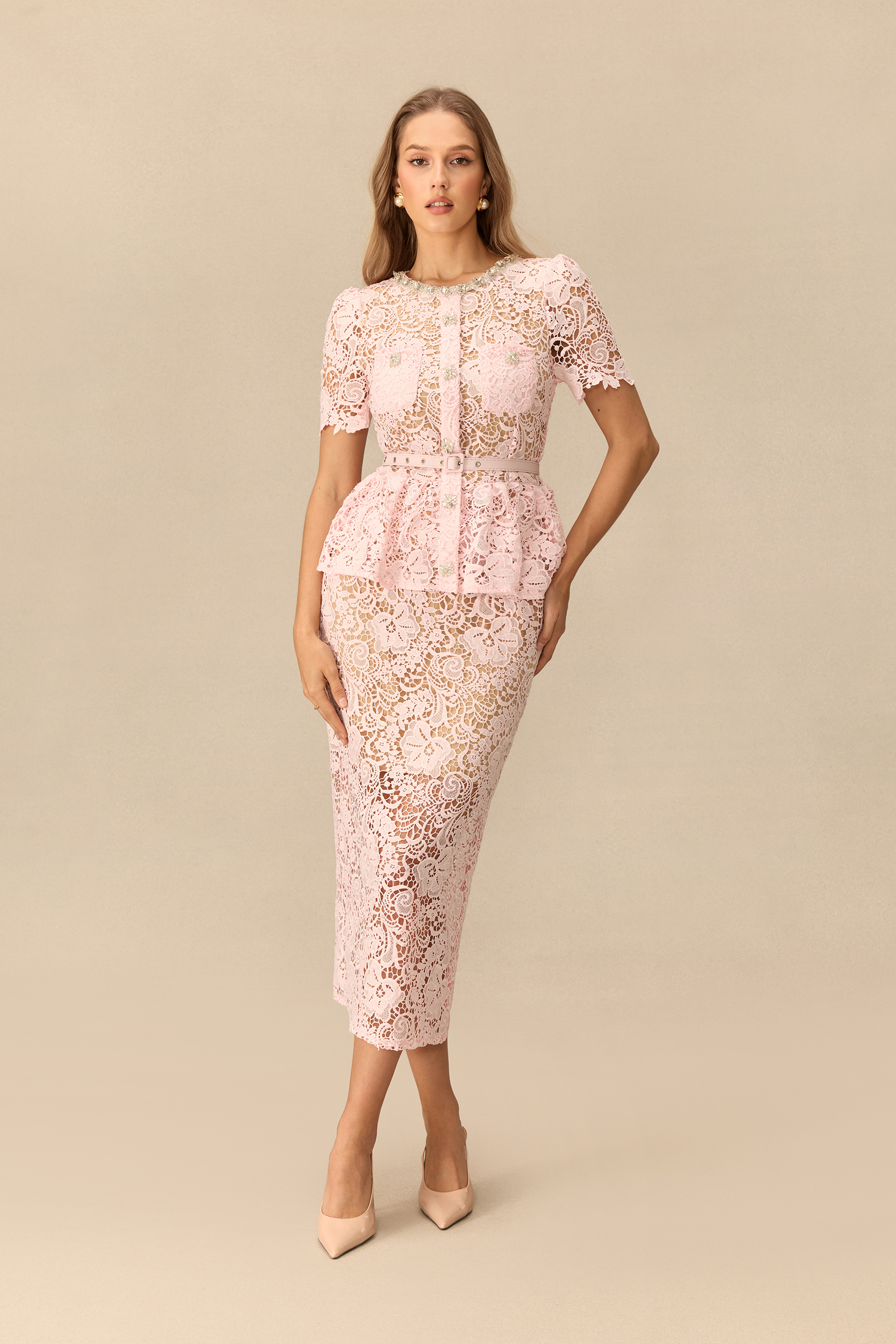
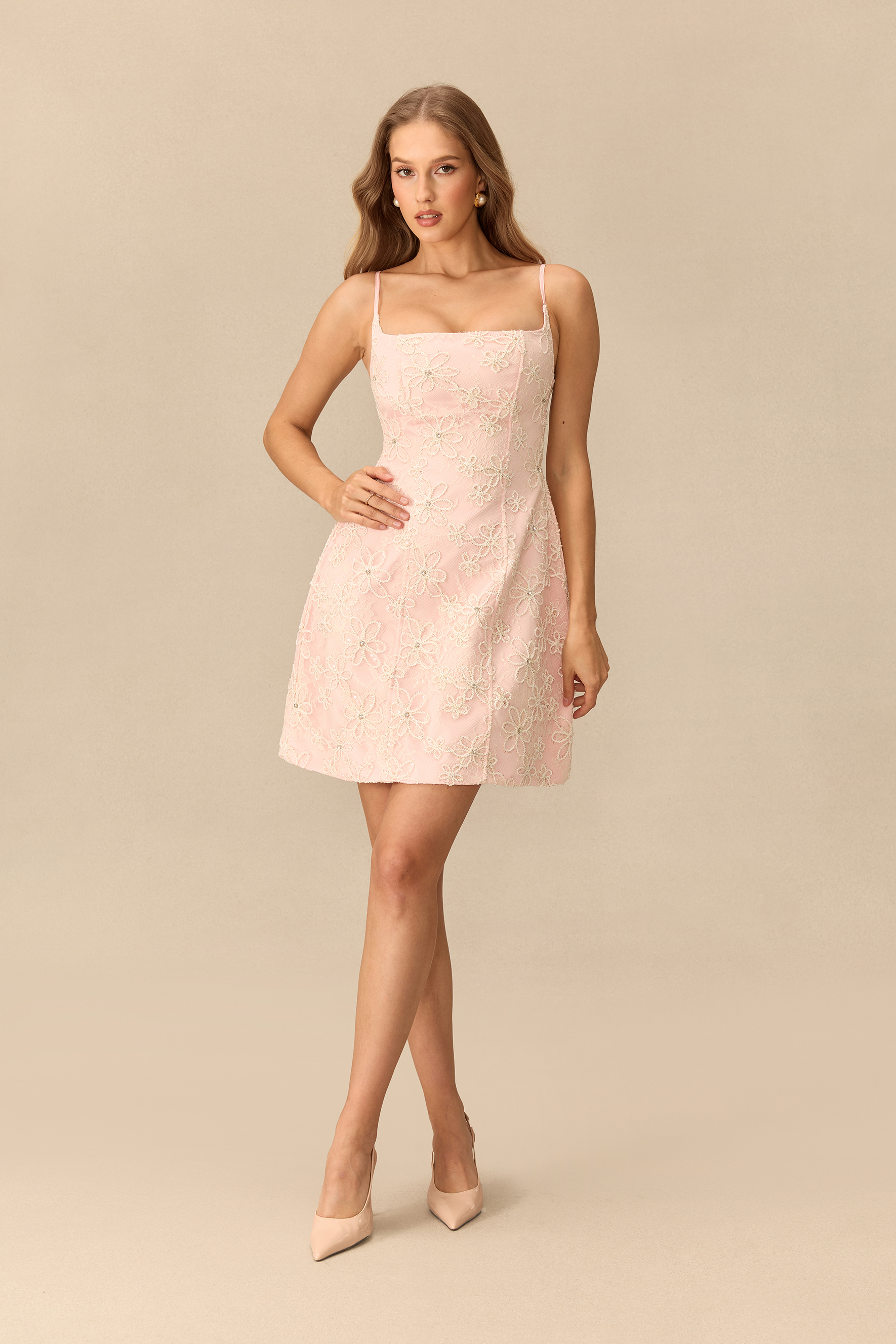
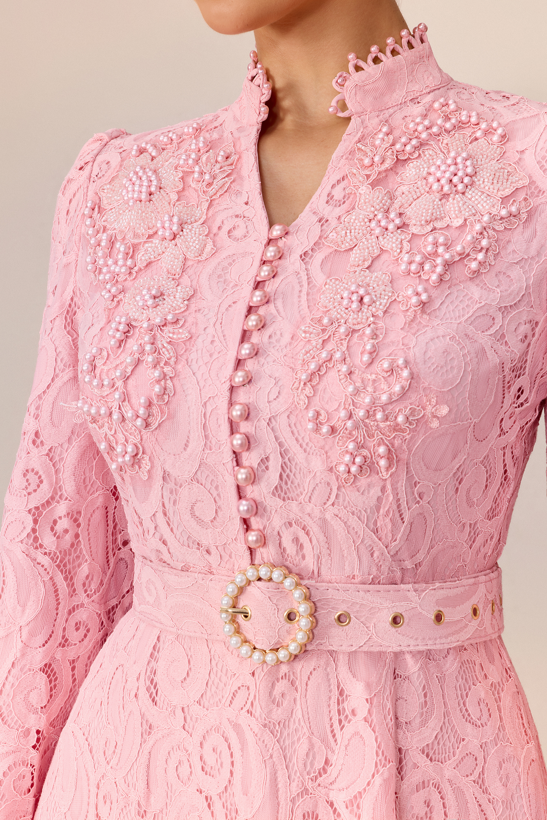
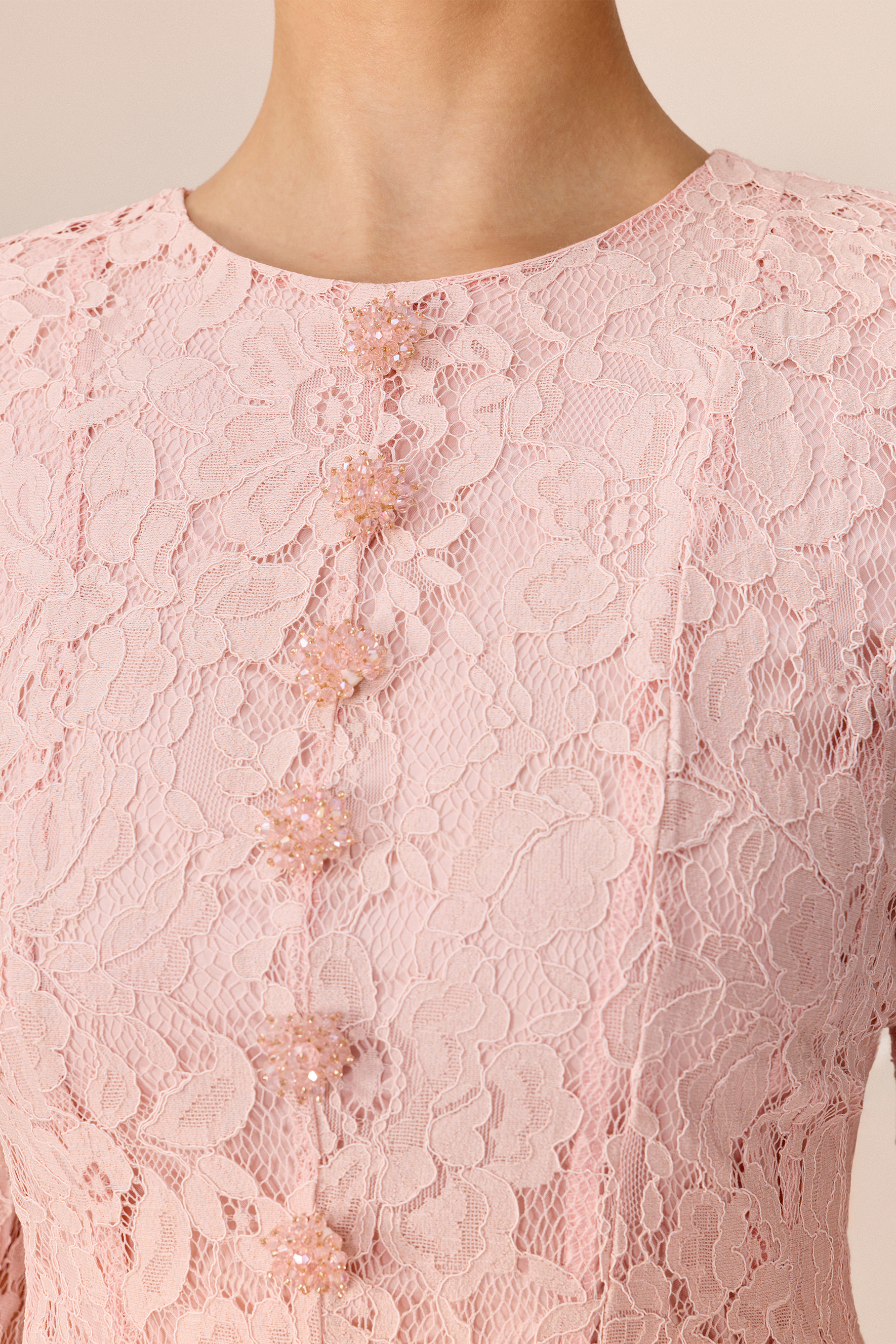
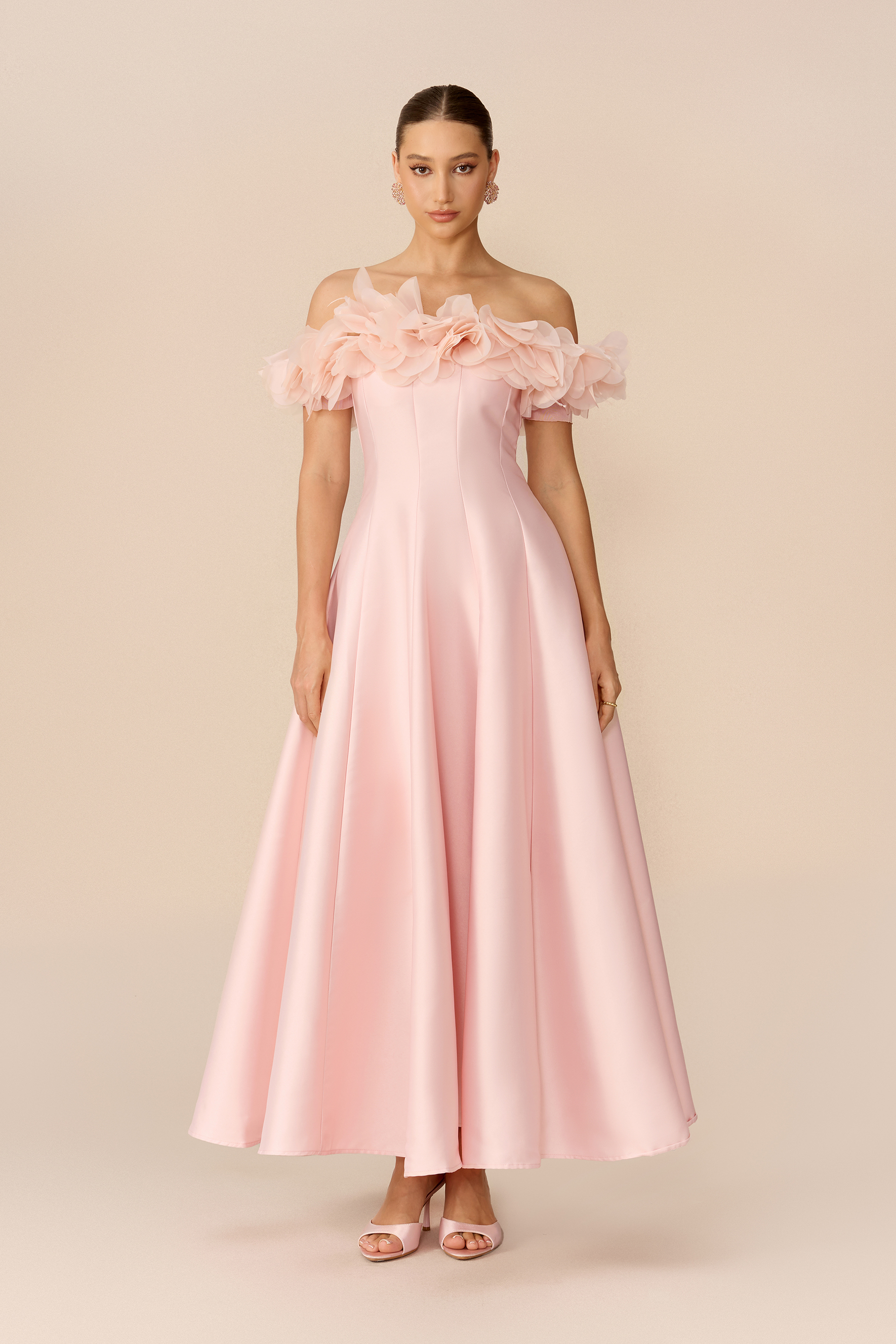
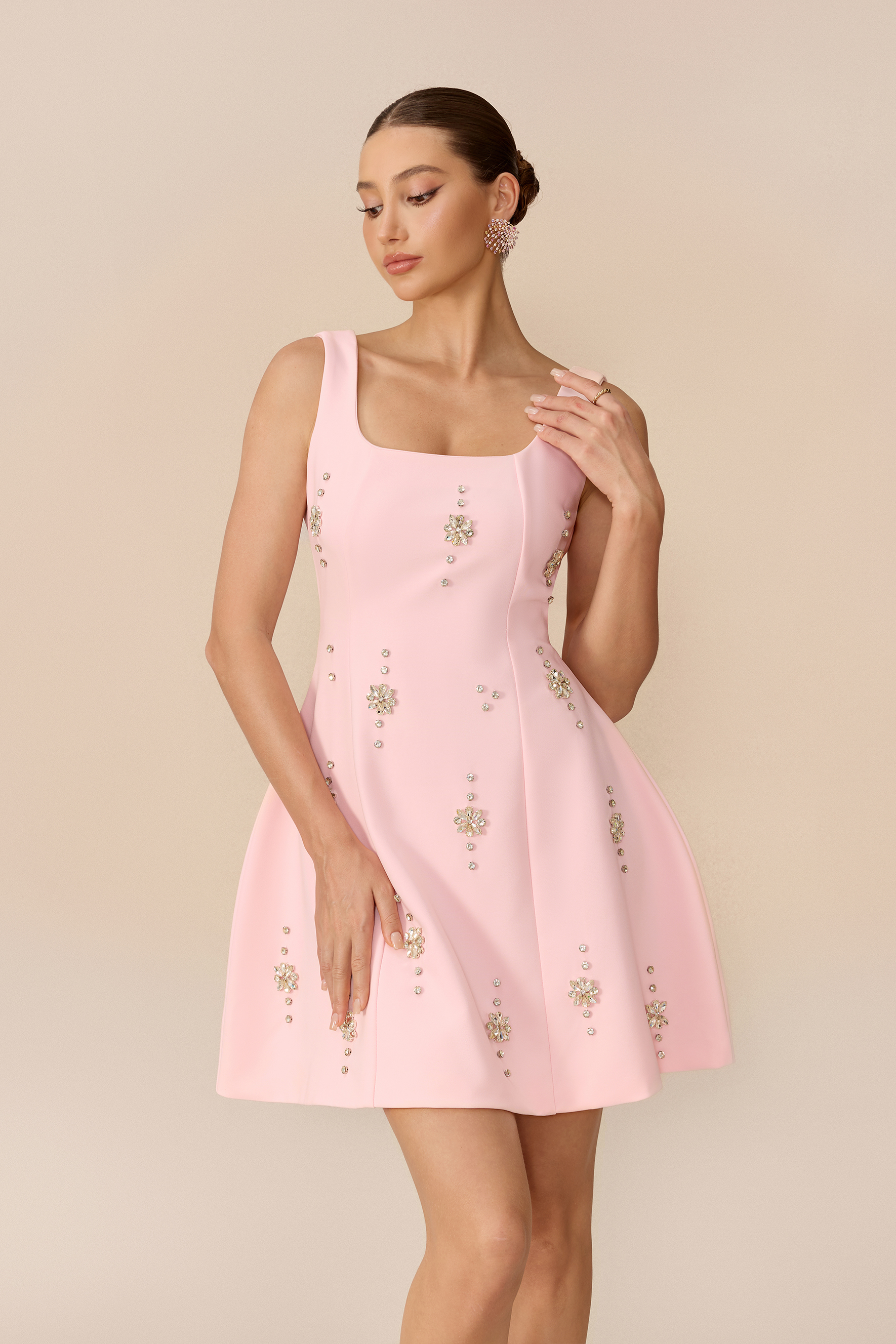
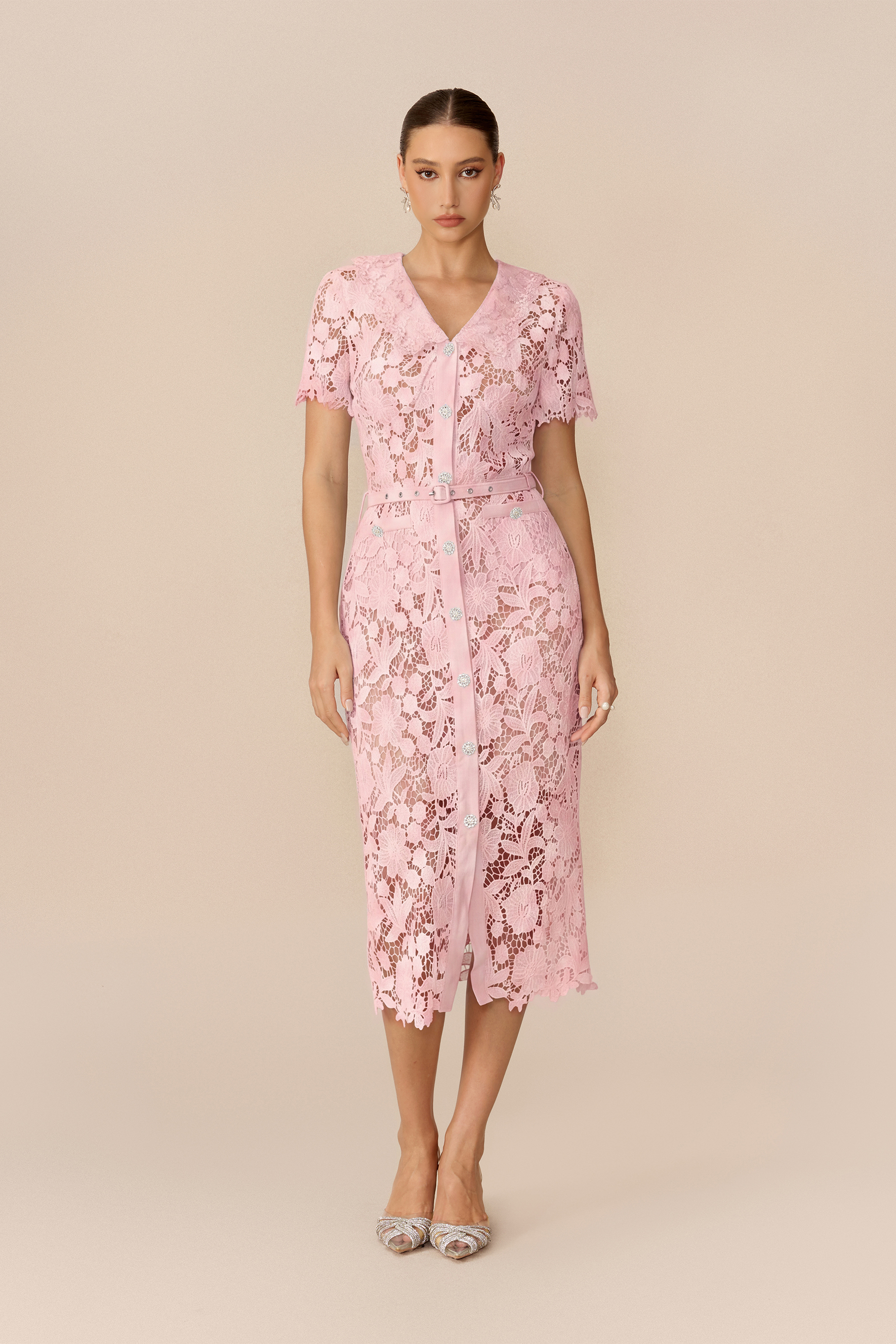
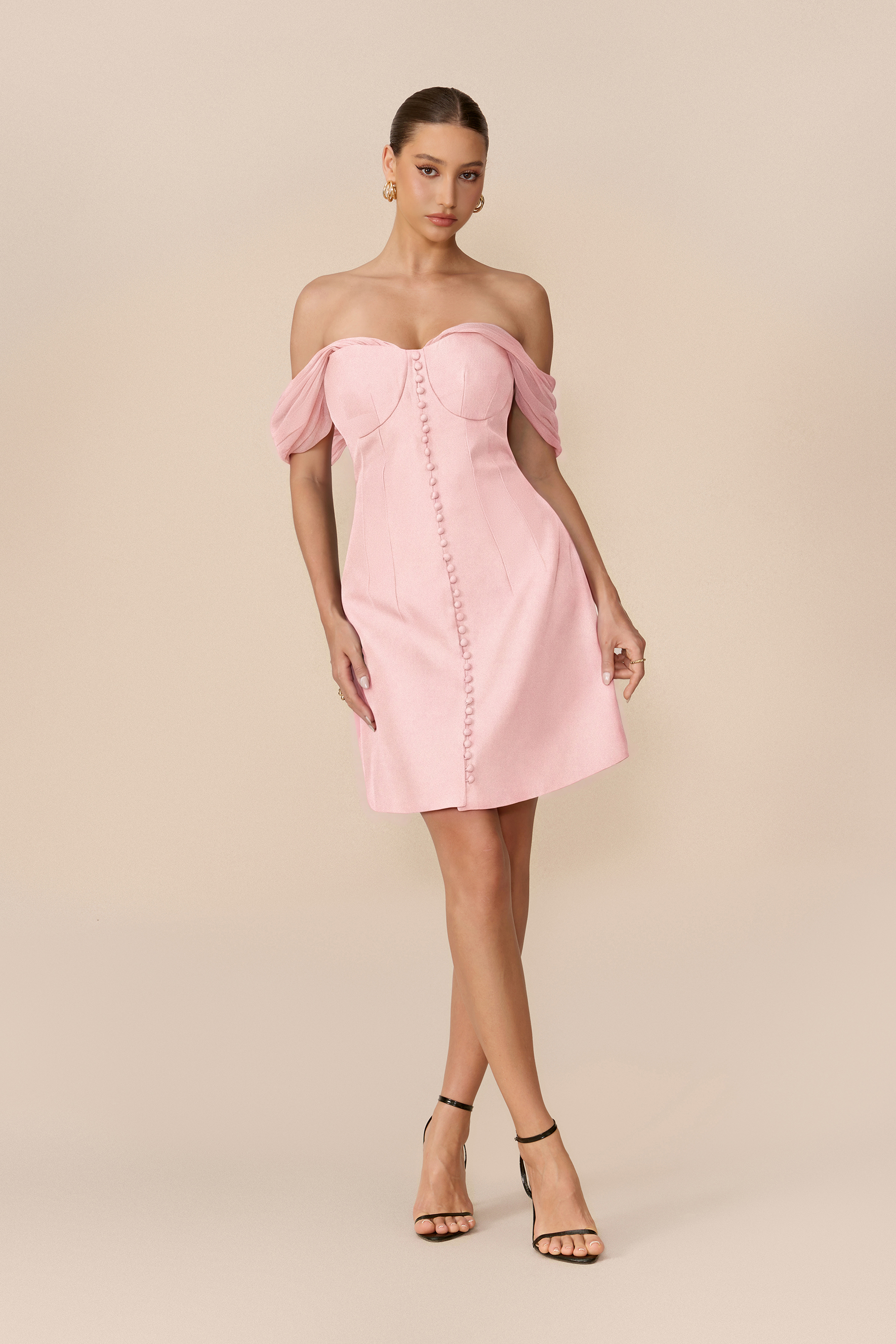
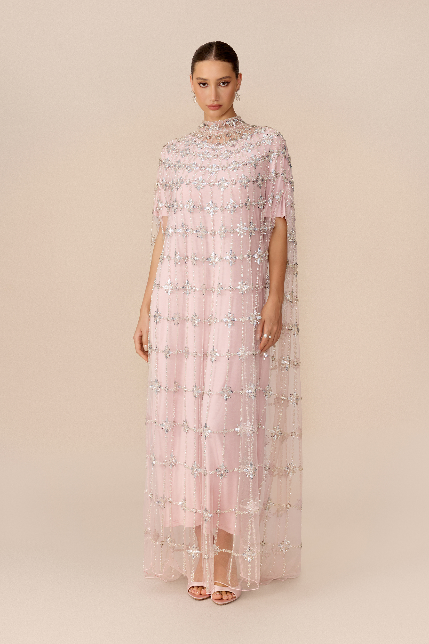
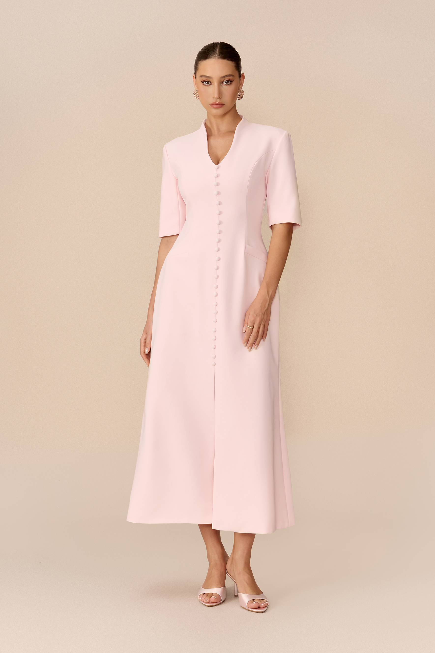
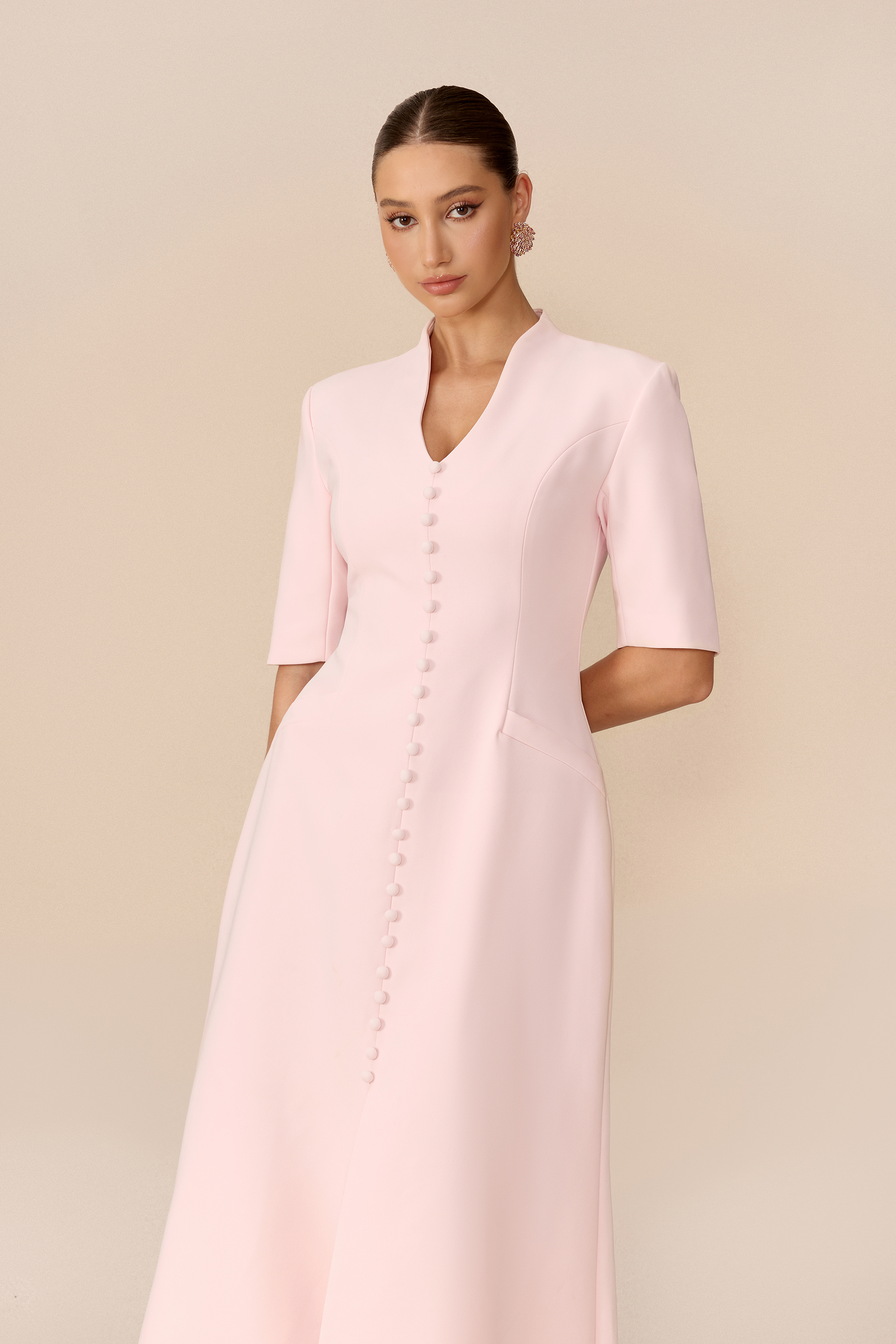
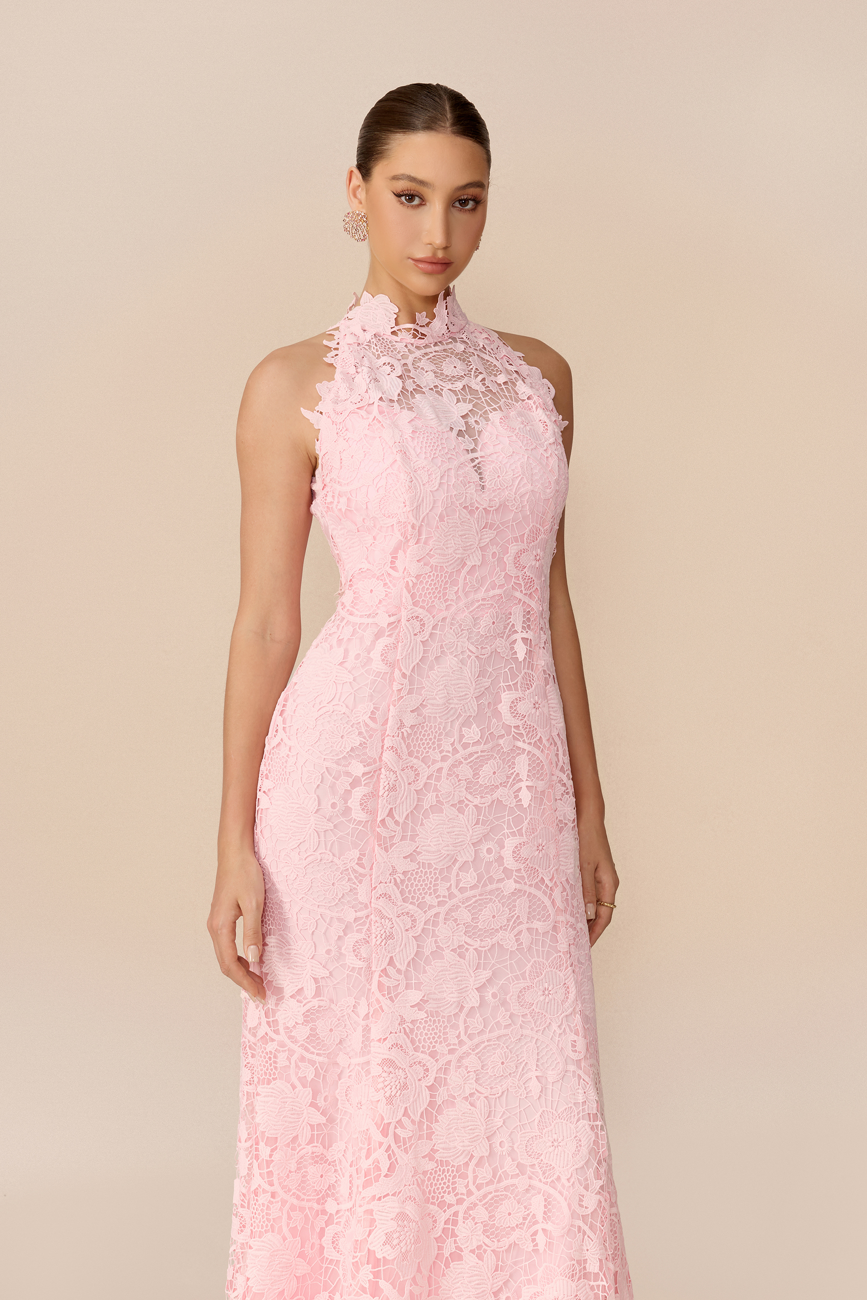
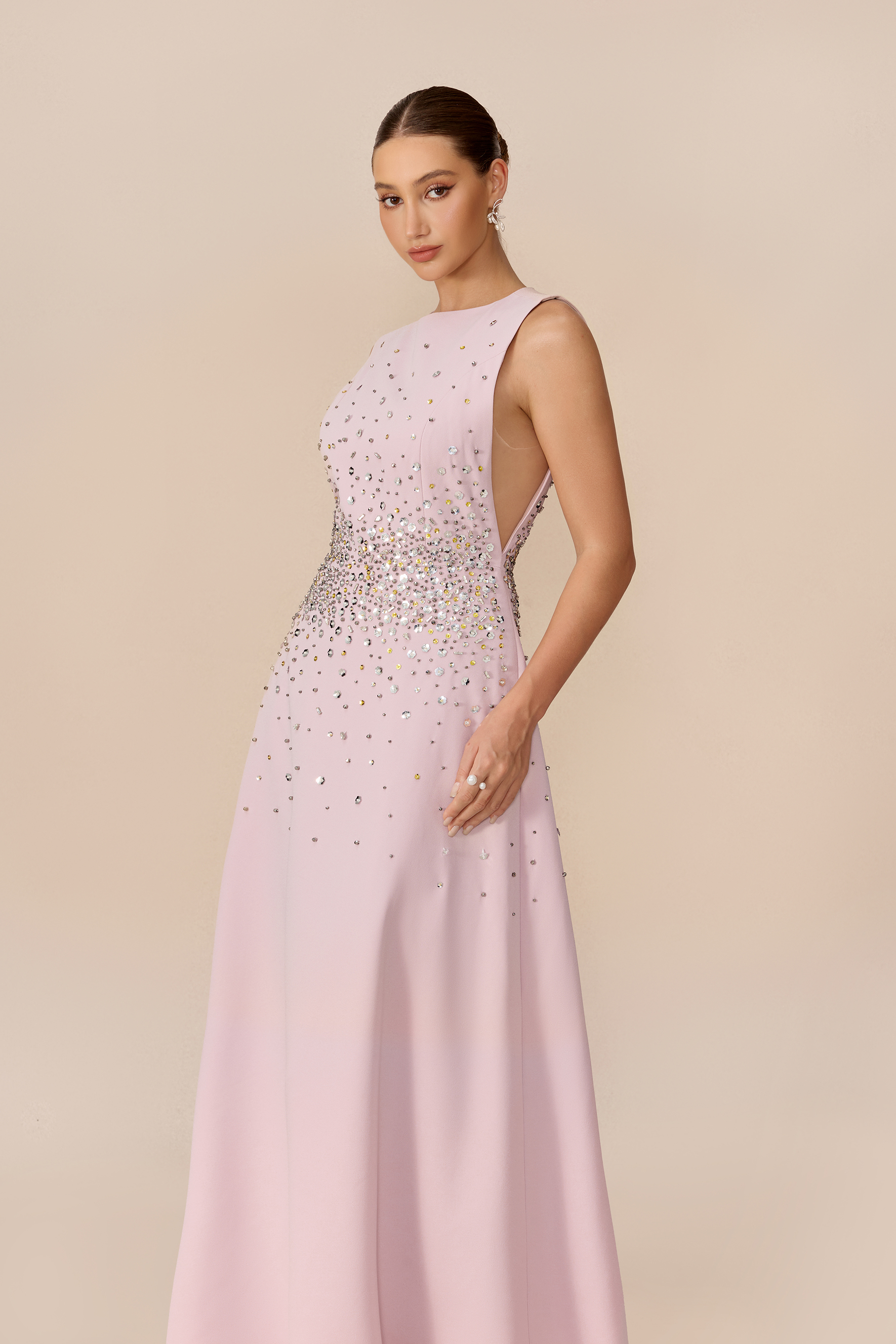
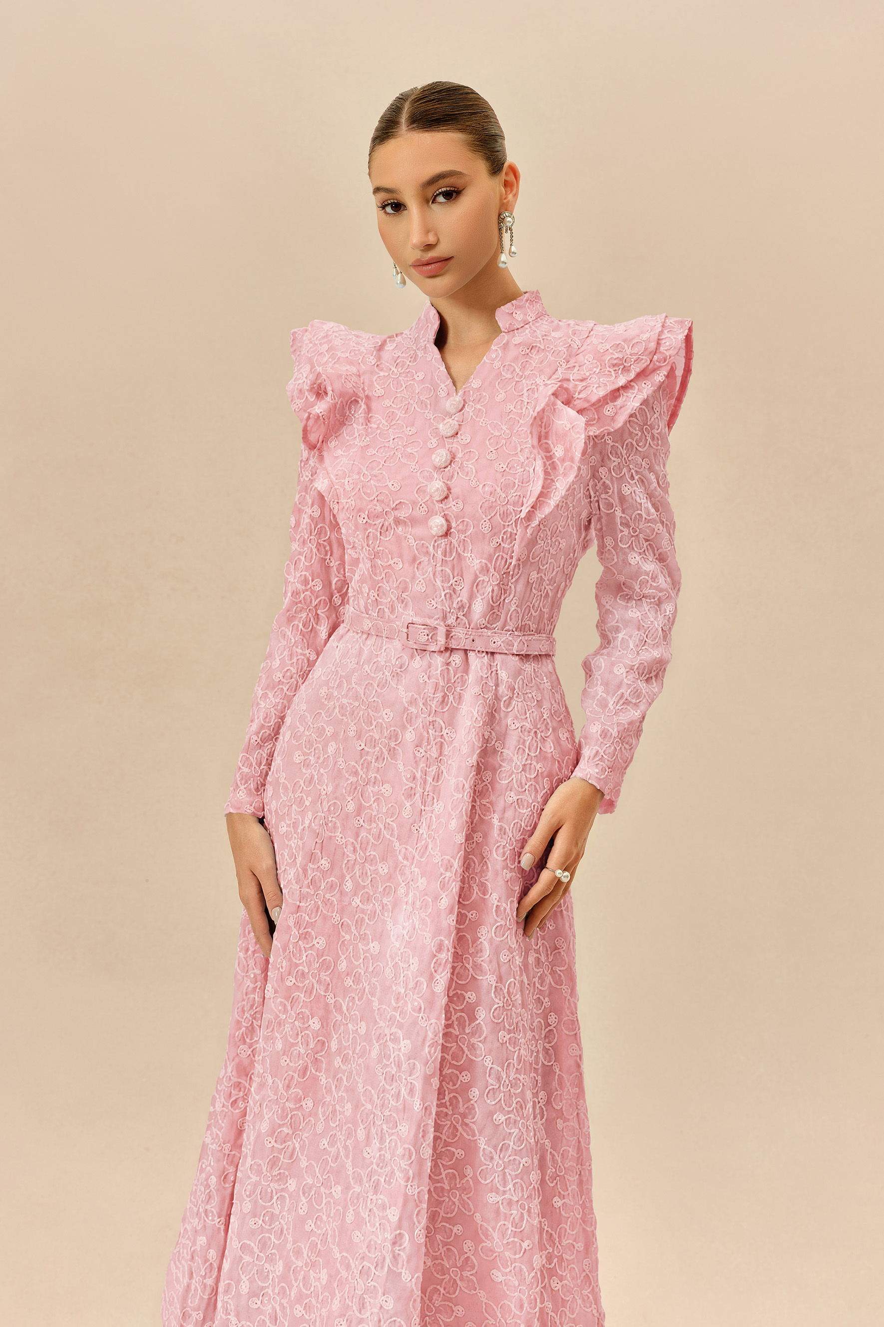
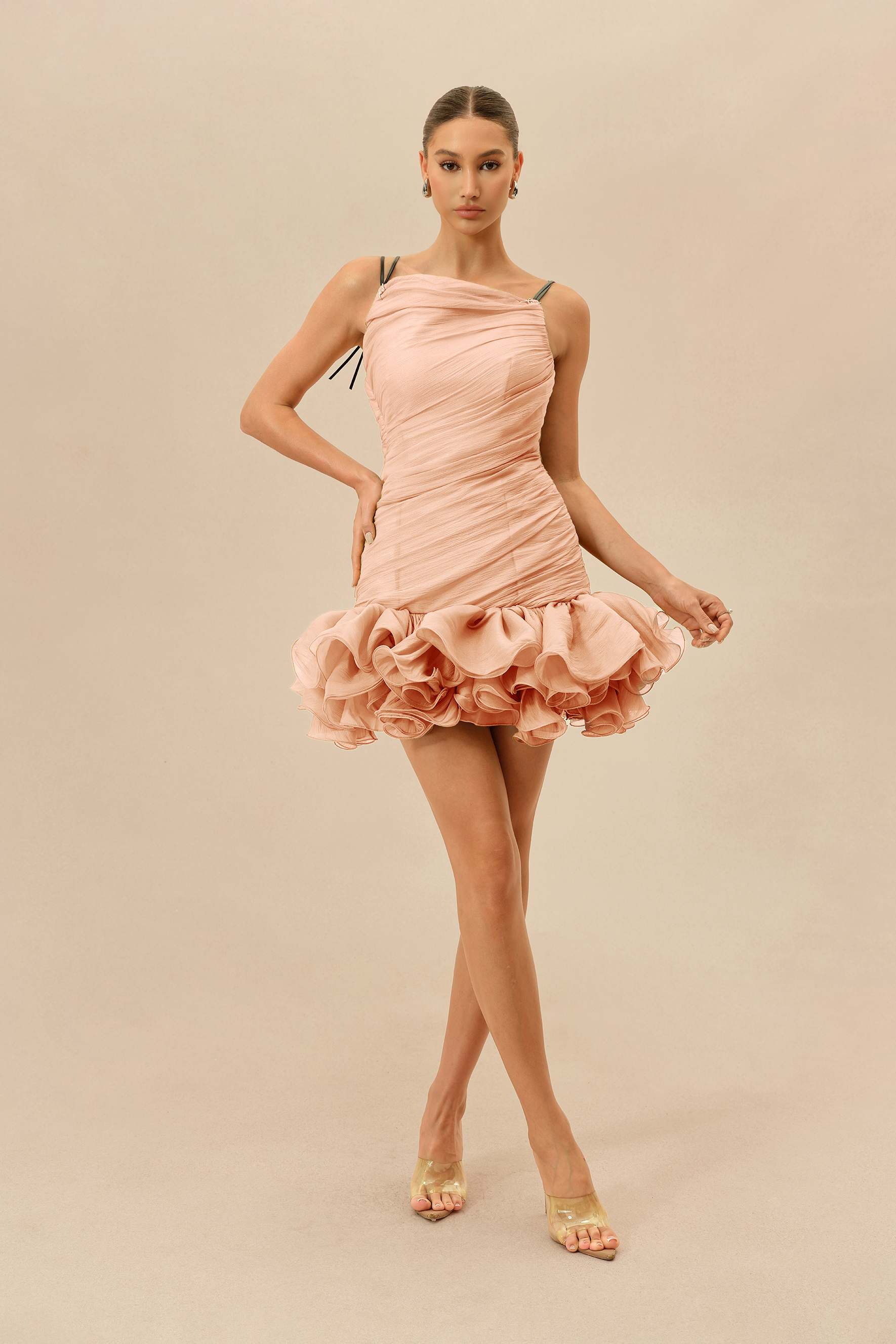
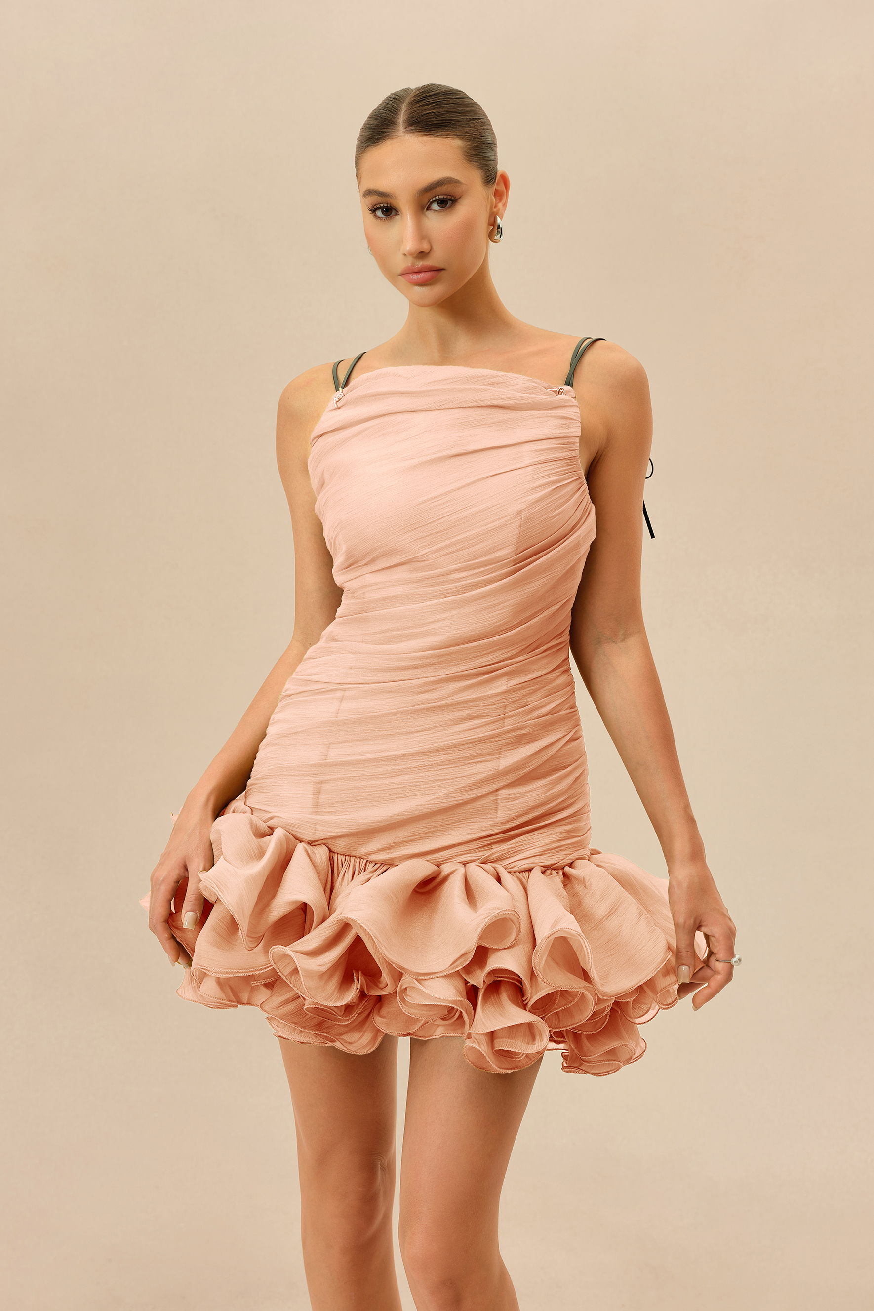
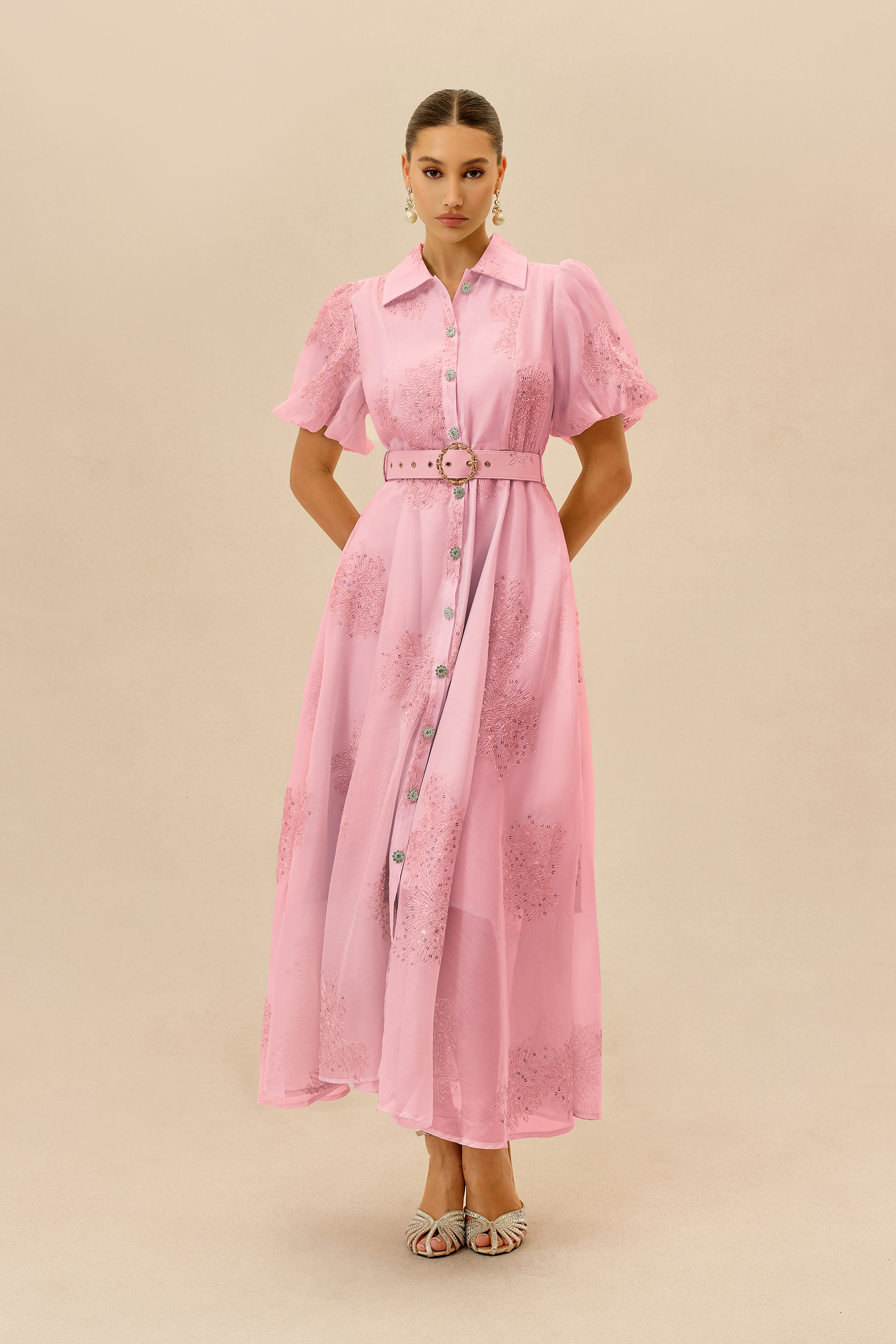
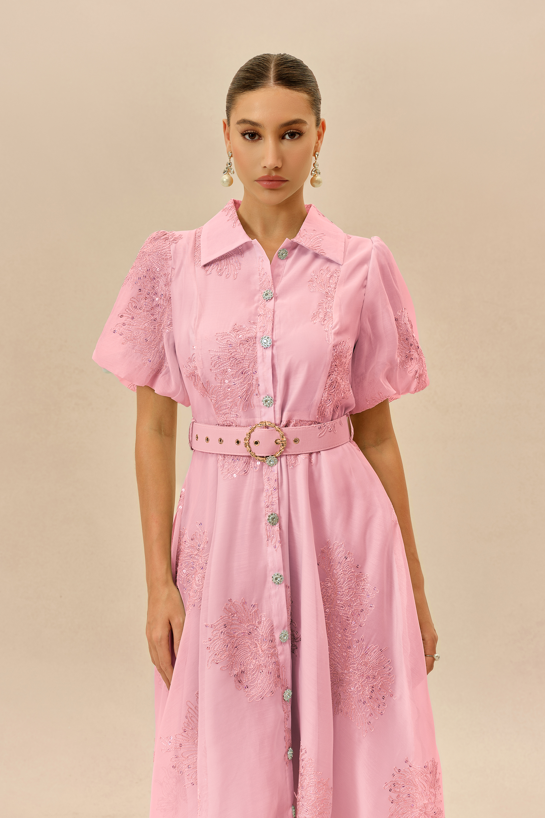
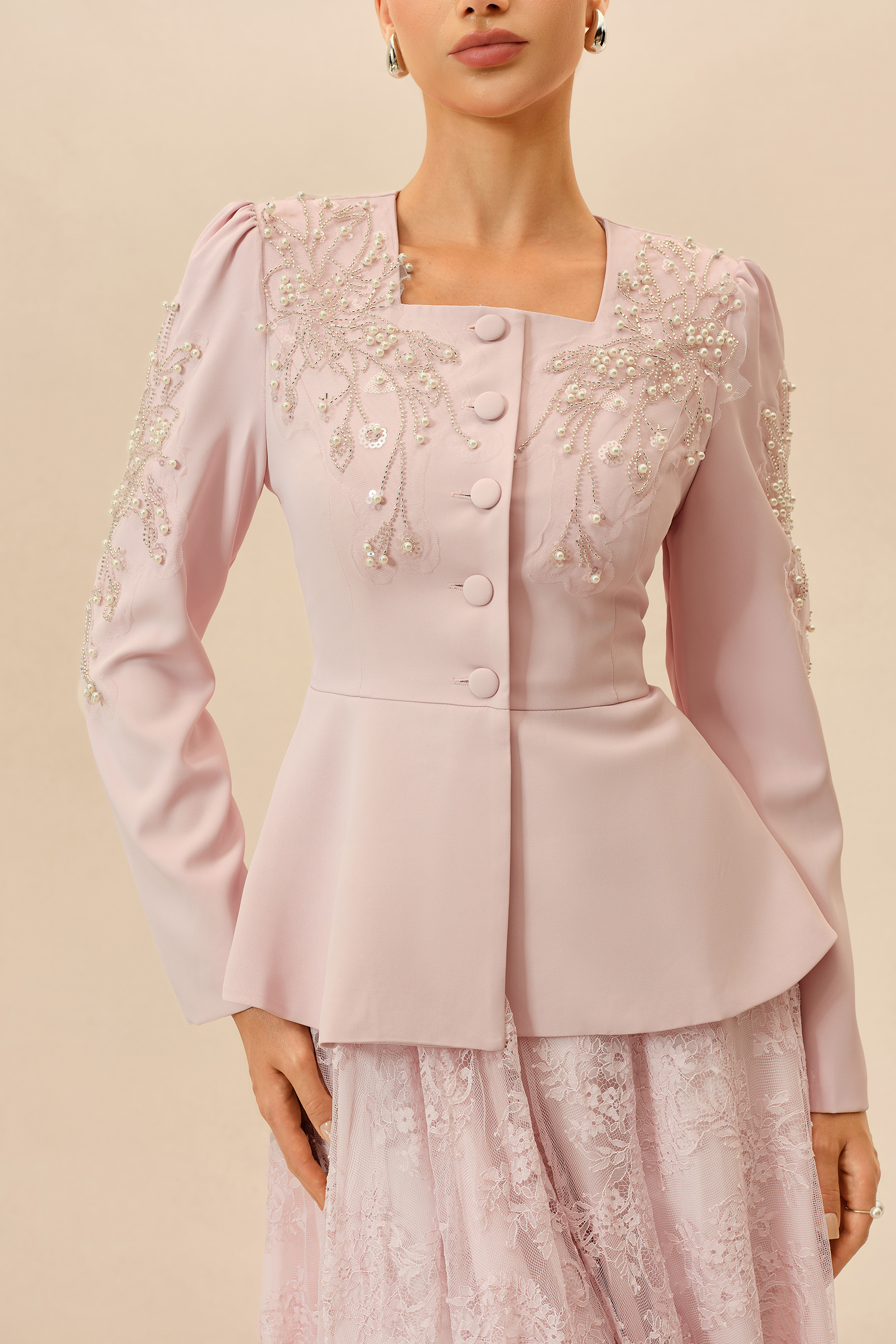
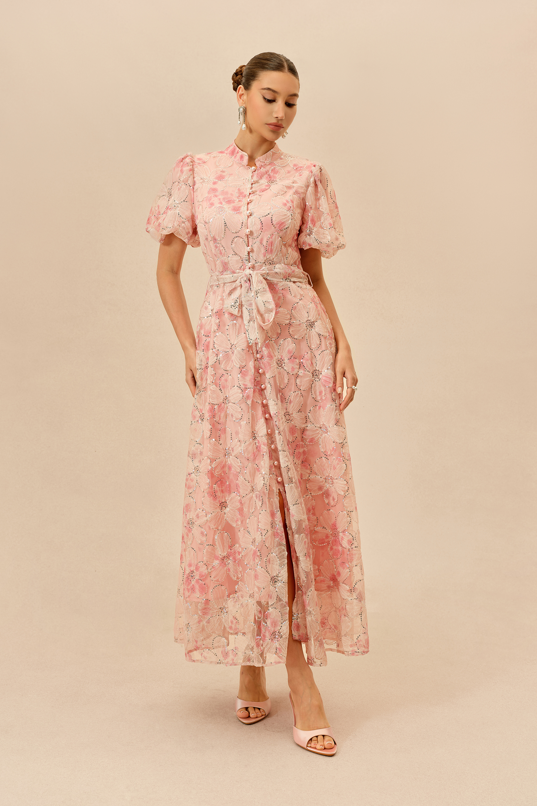
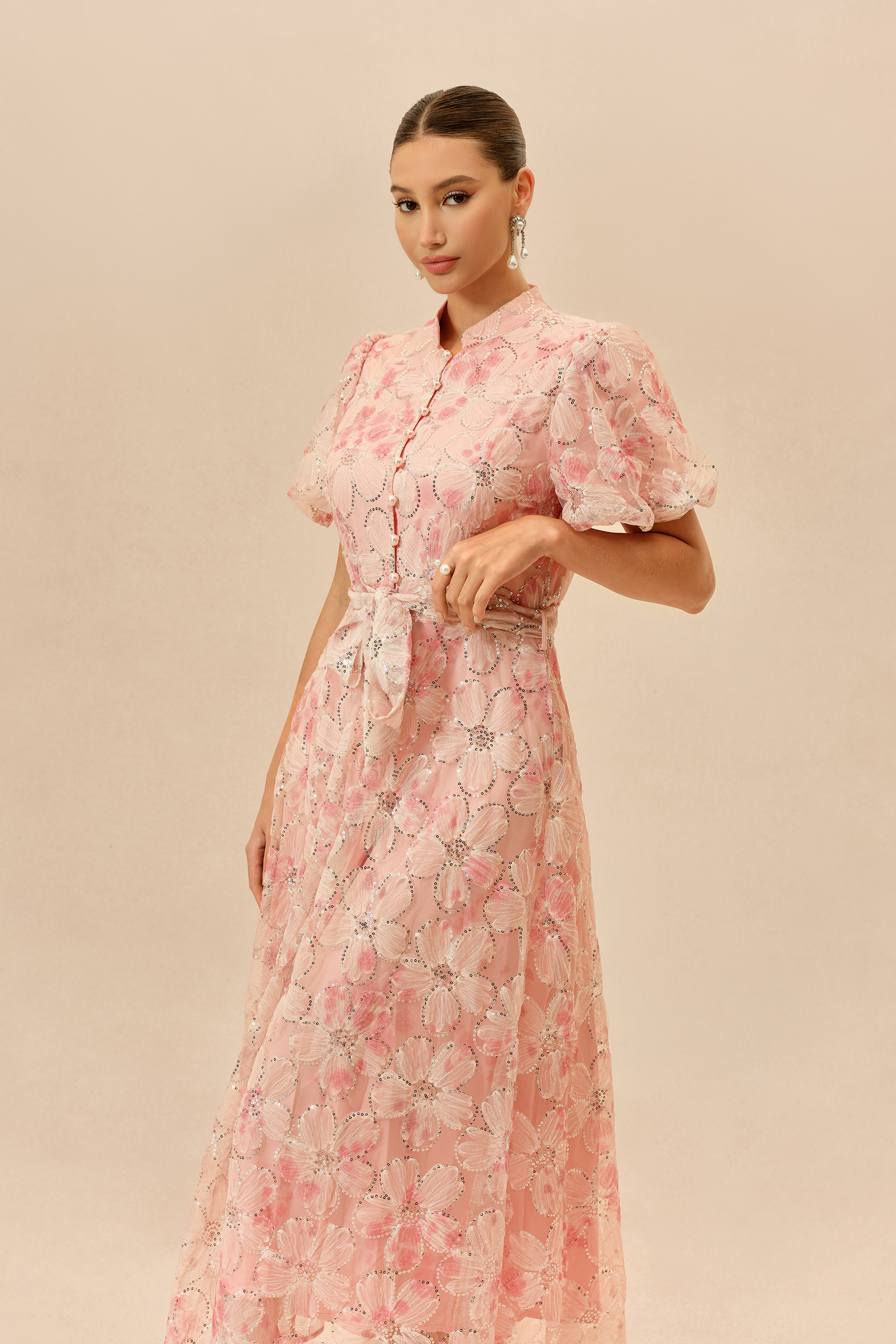
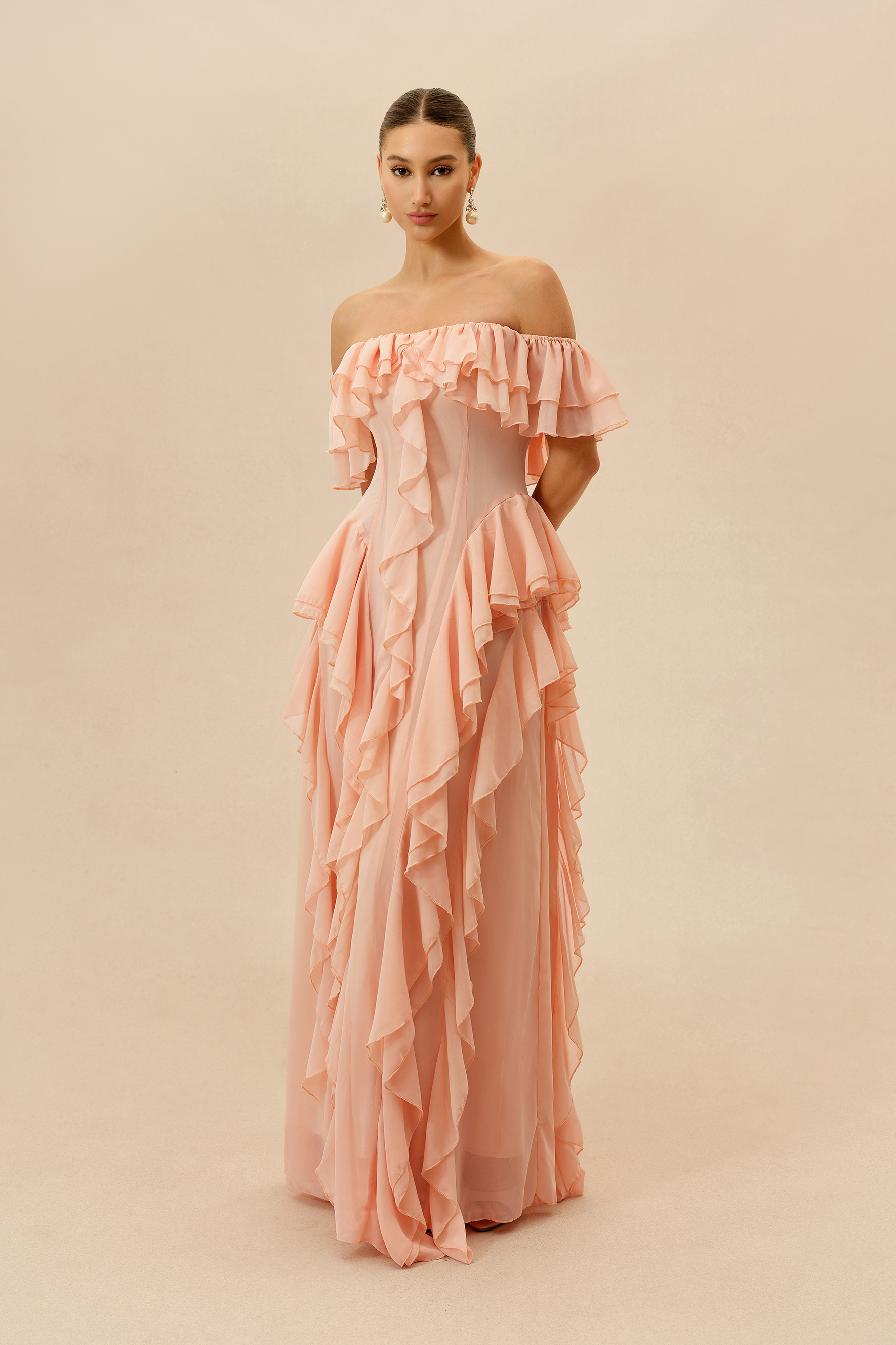
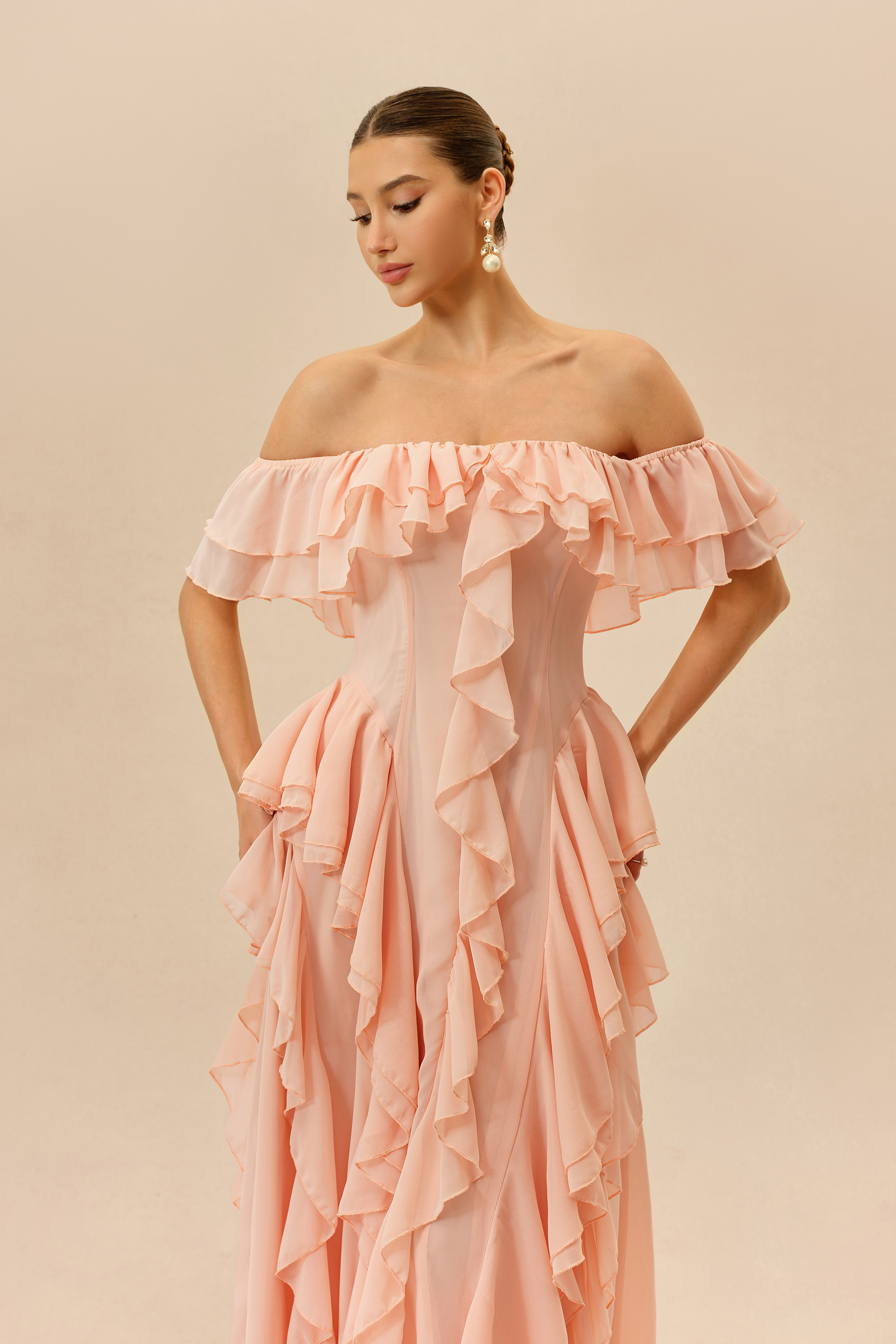
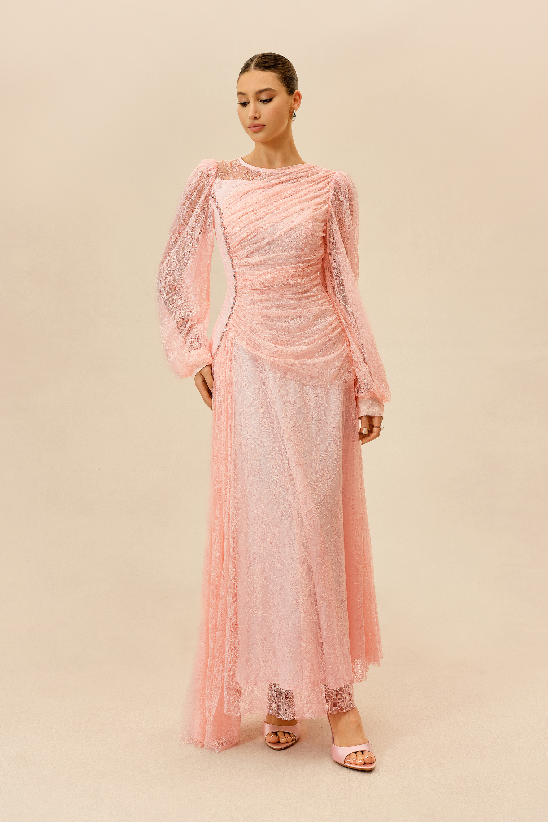
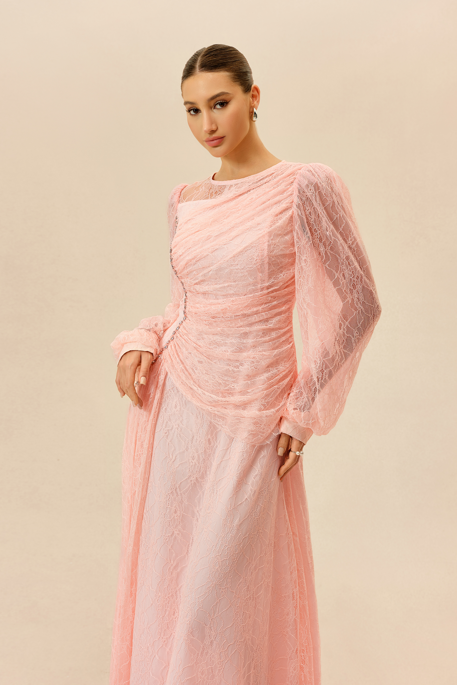
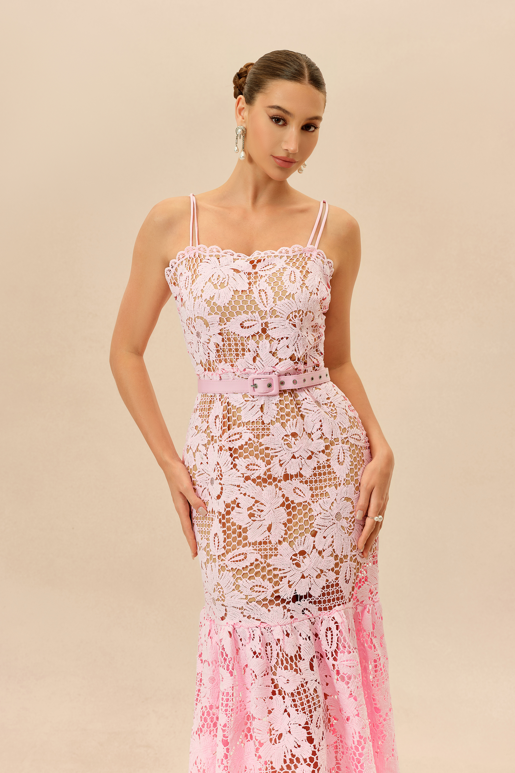
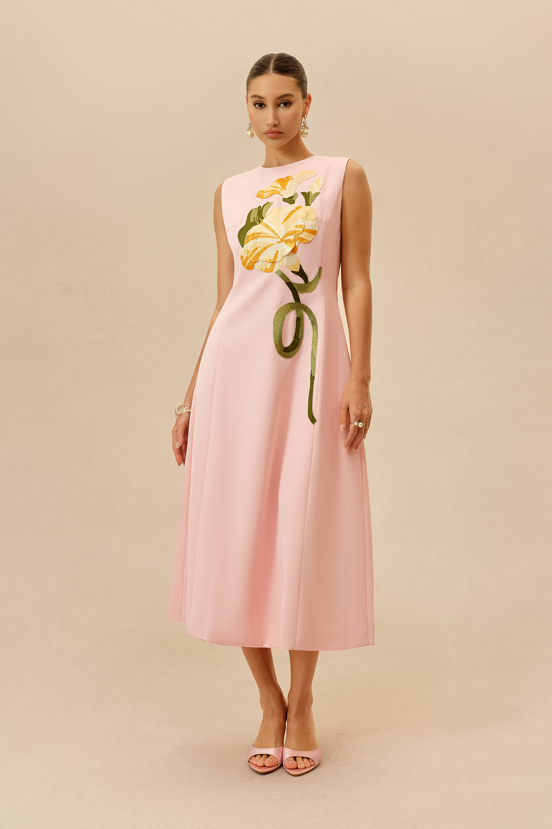
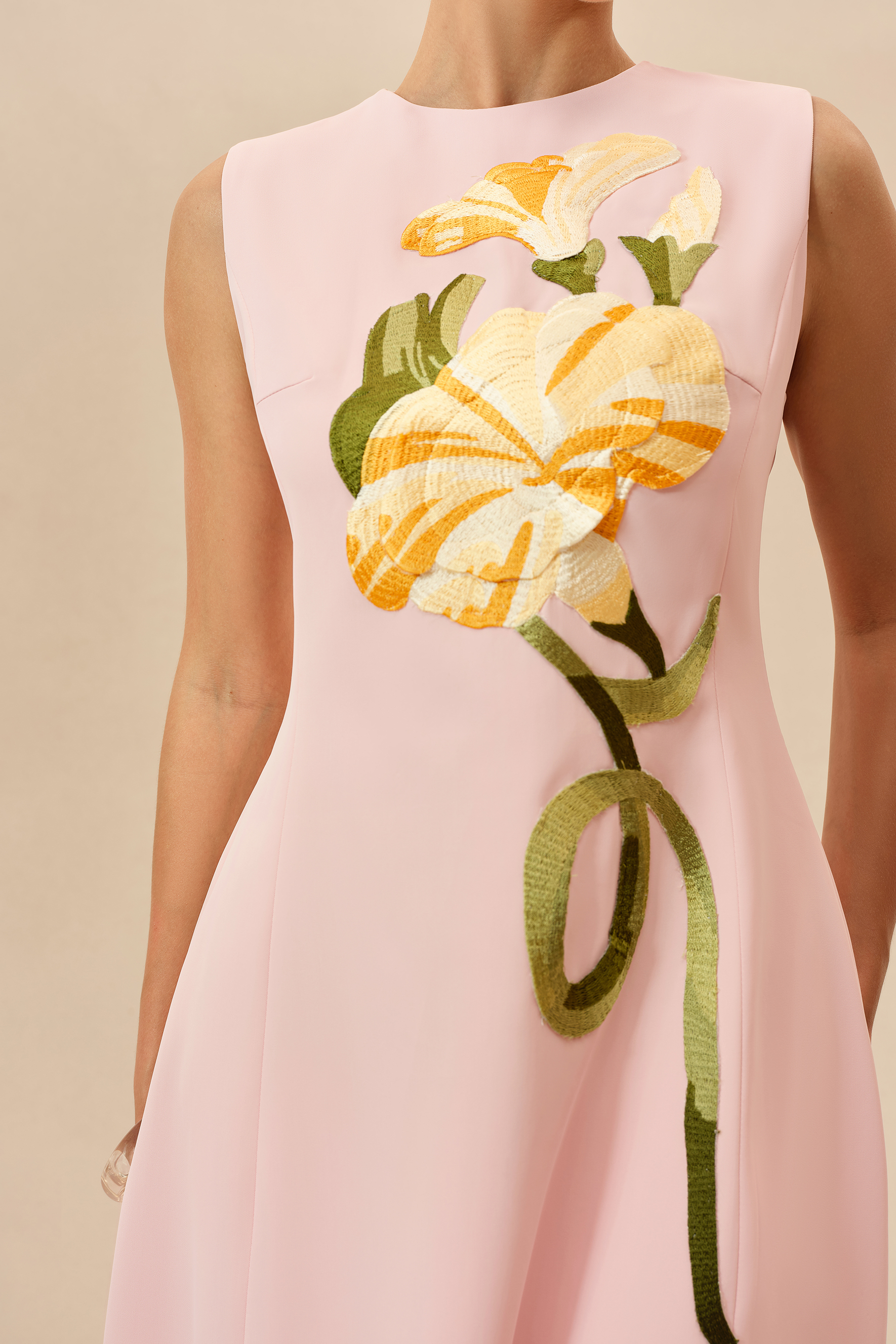
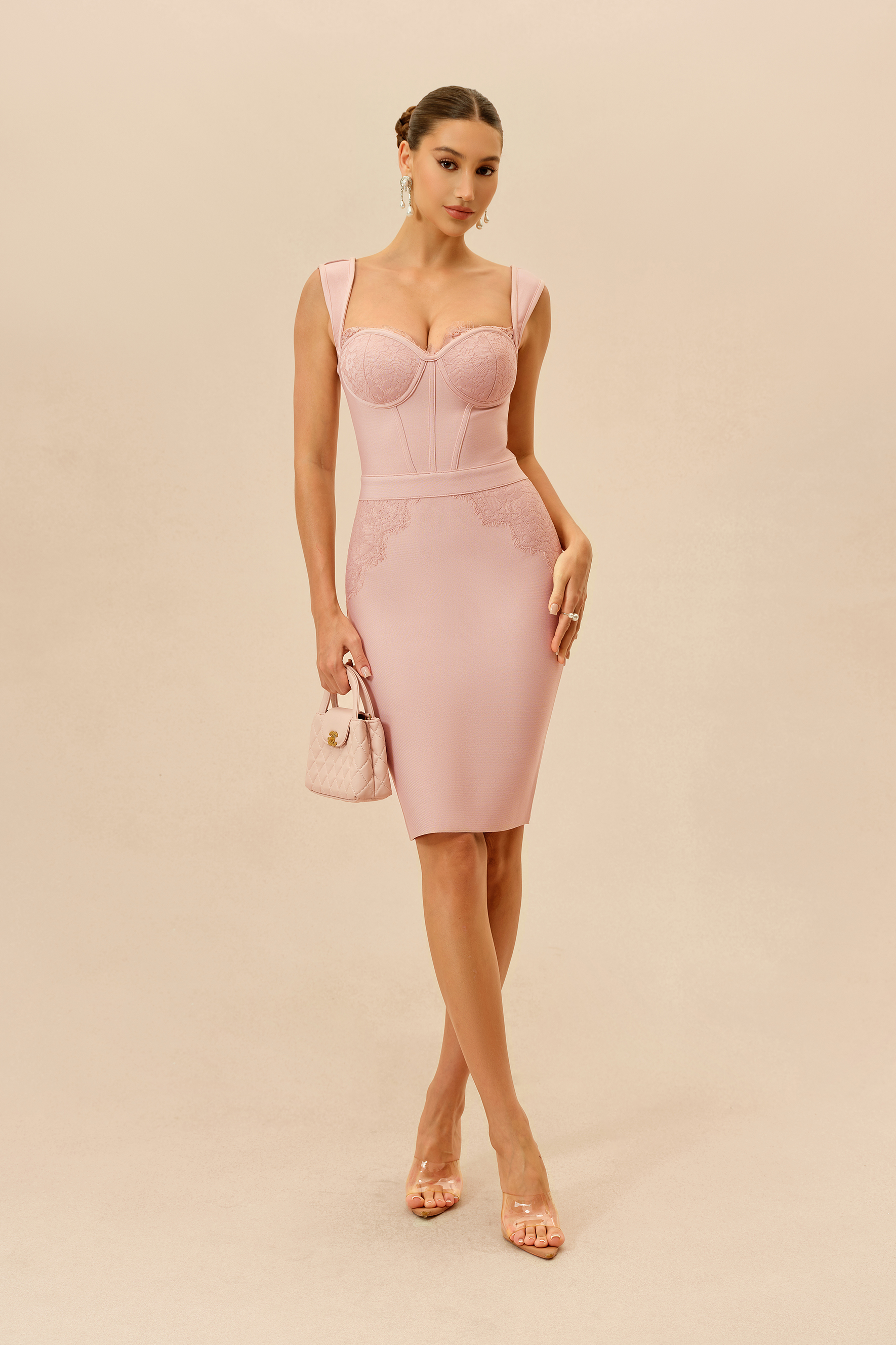
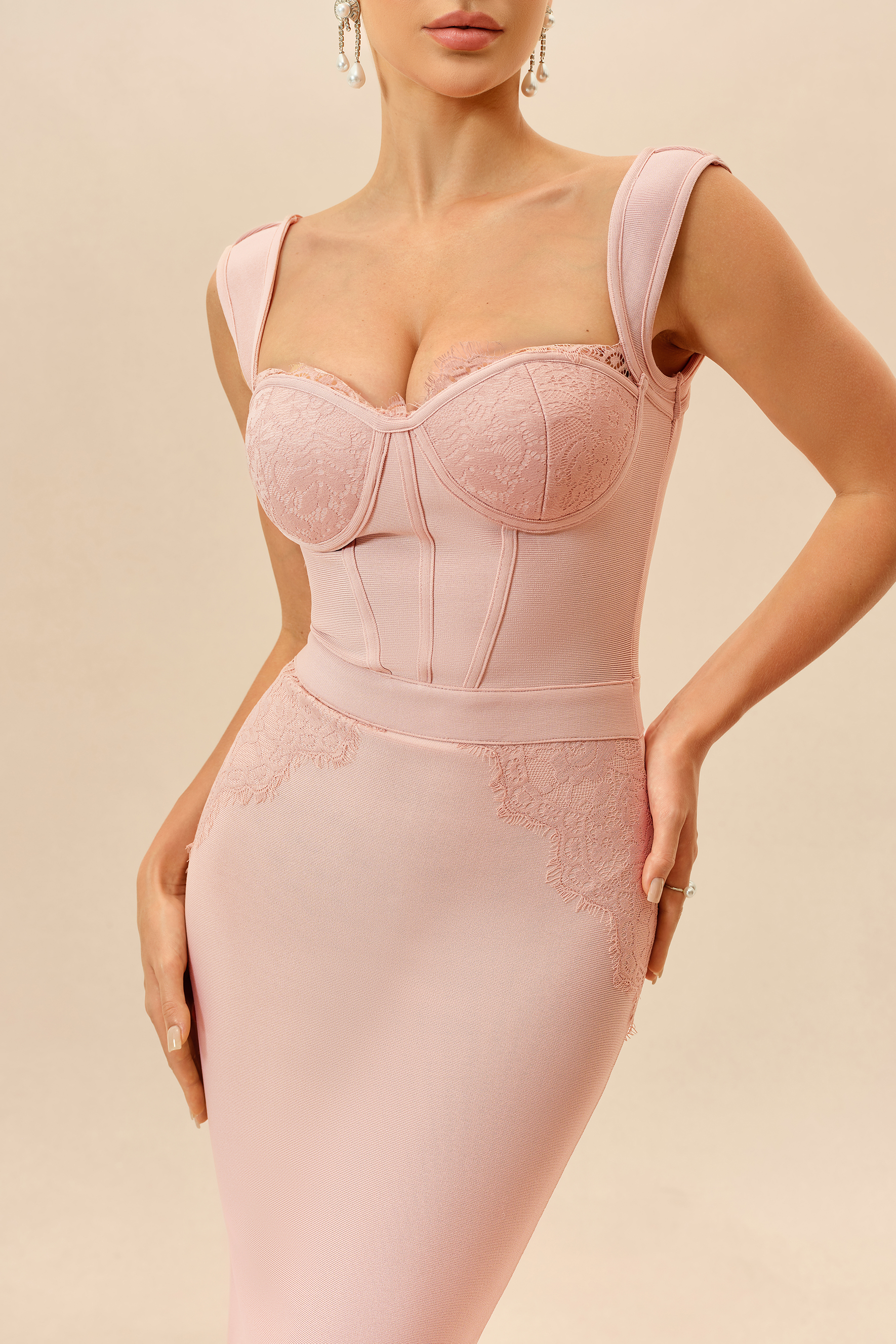
Rather than relying only on names such as “blush” or “rose,” compare the product images side by side. Color names can describe a general family, but the photographs usually give a better indication of whether a shade leans warm, cool, muted or vivid.
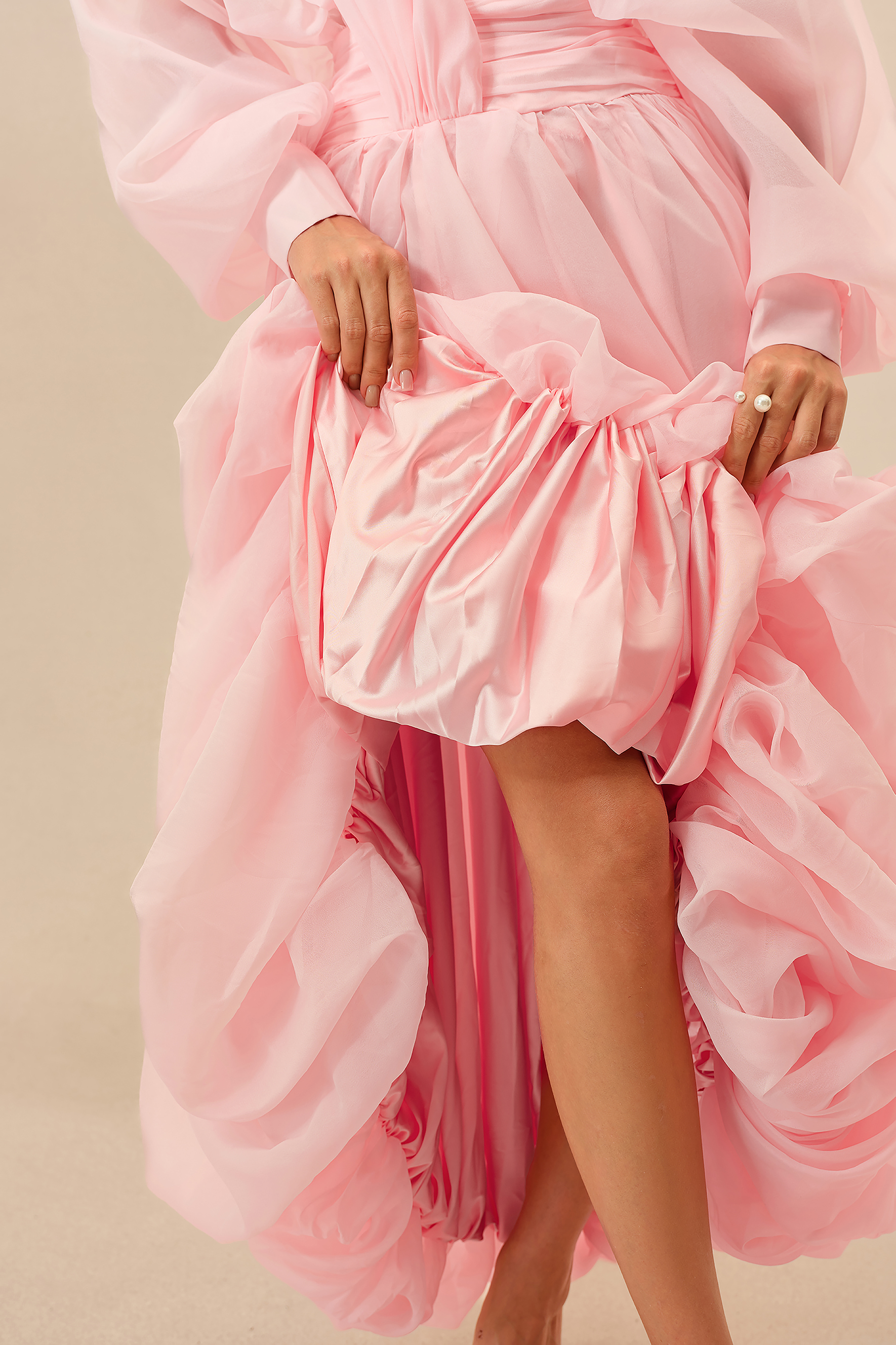
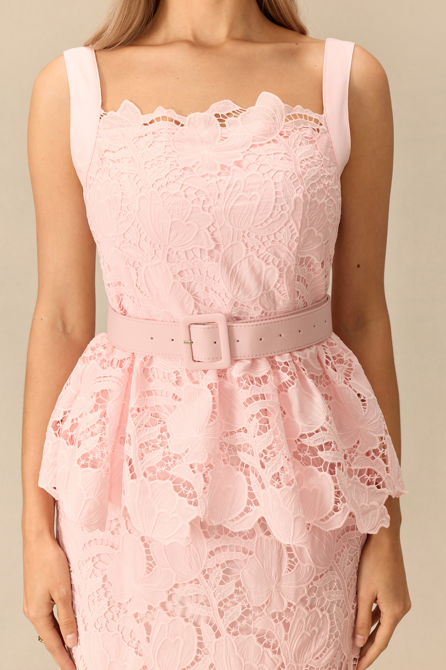
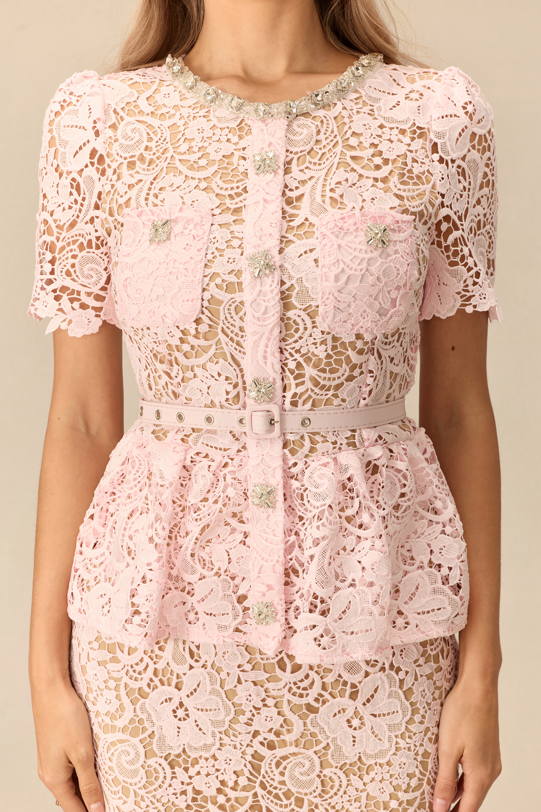
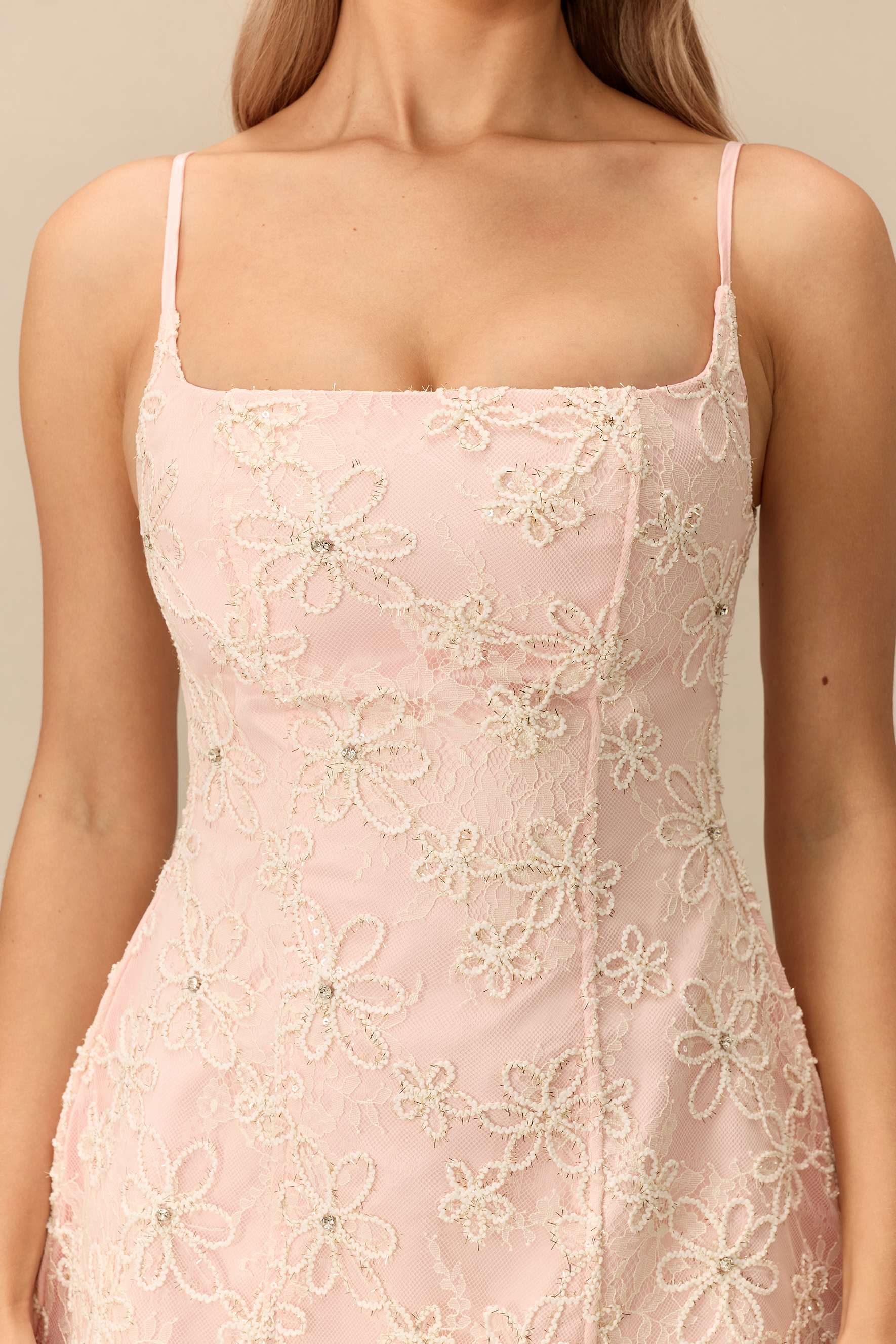
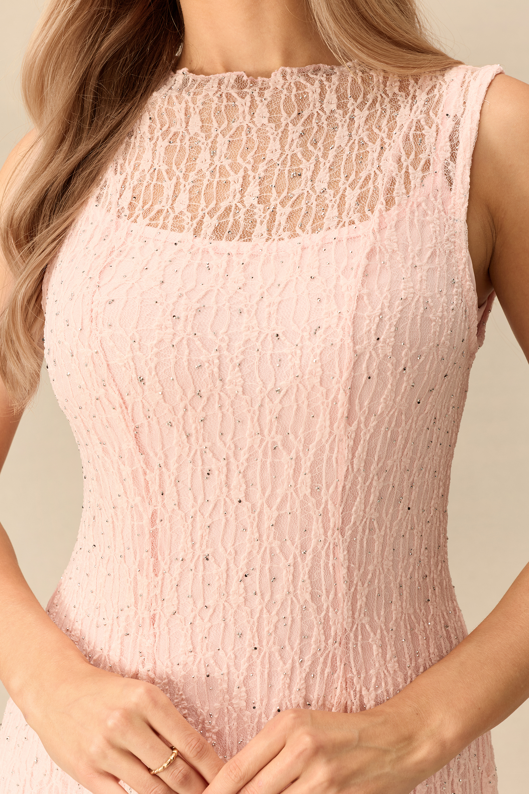
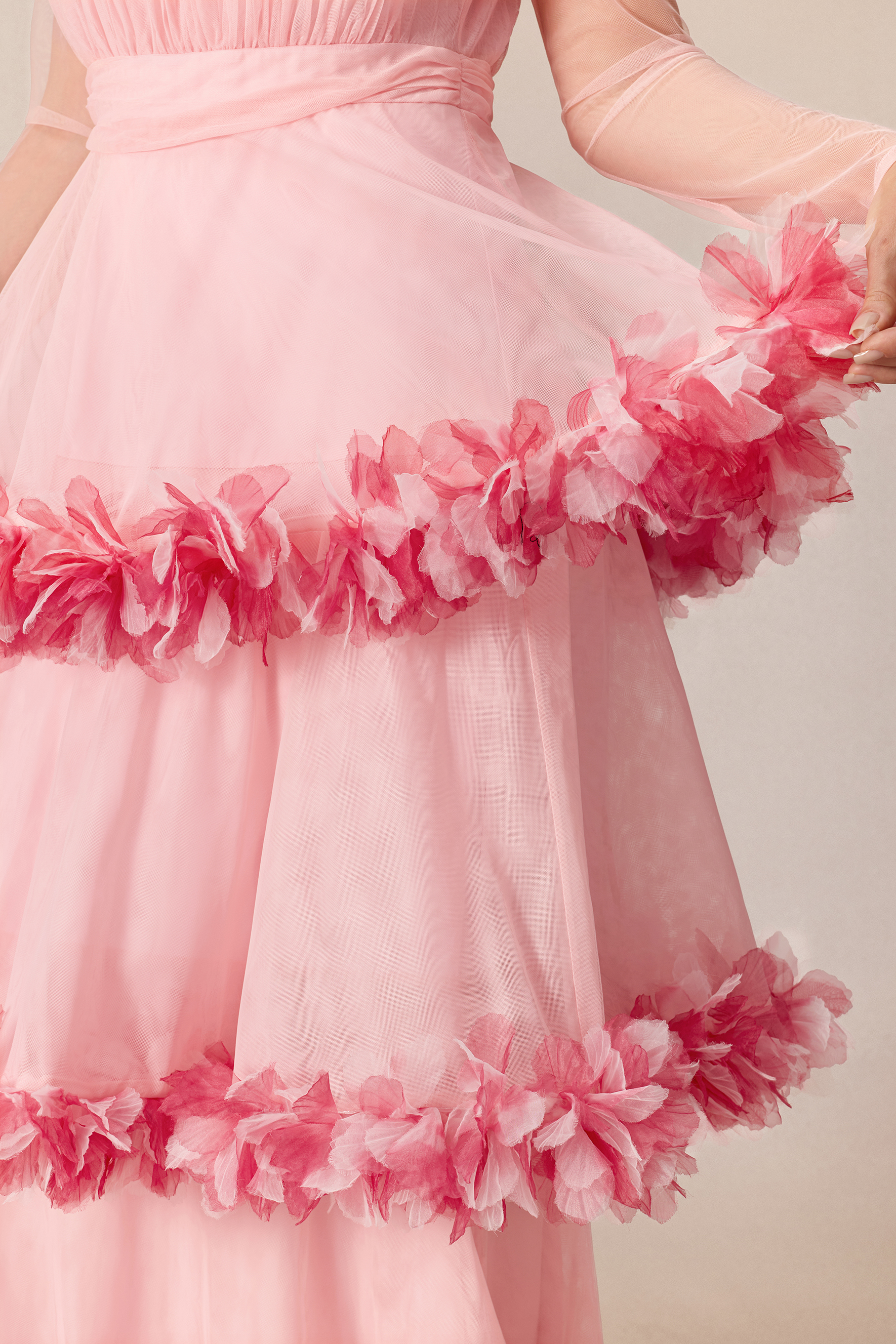
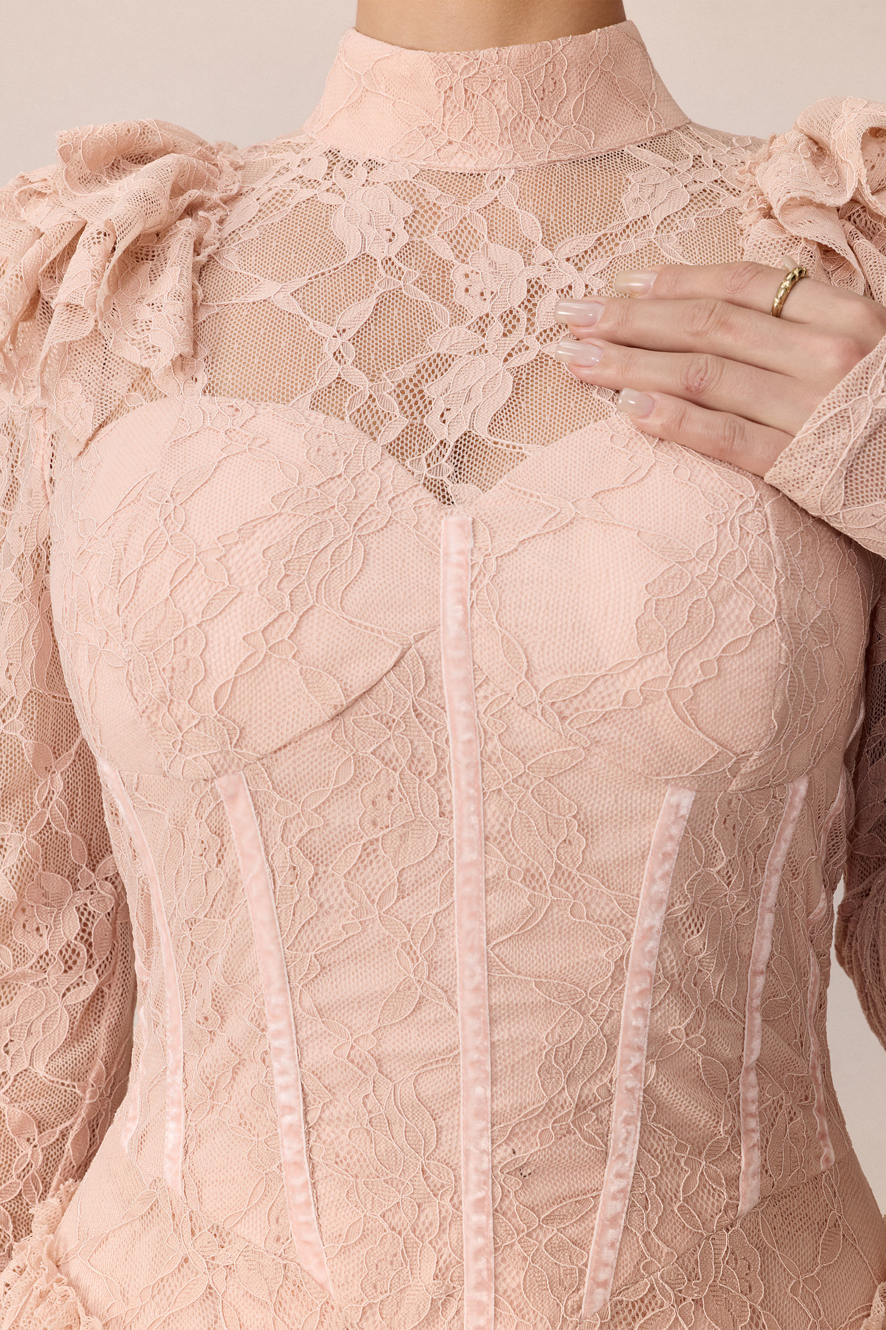
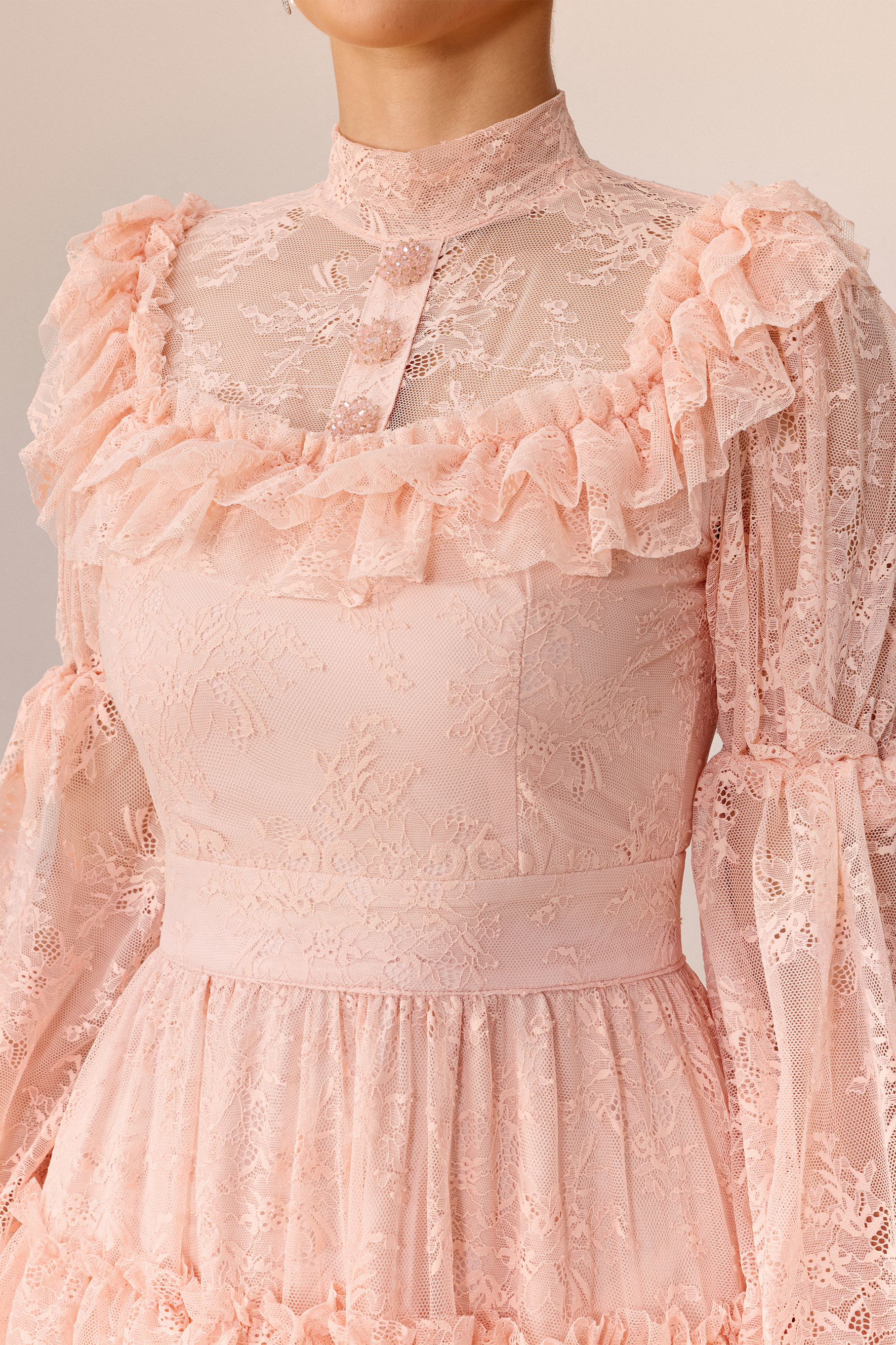
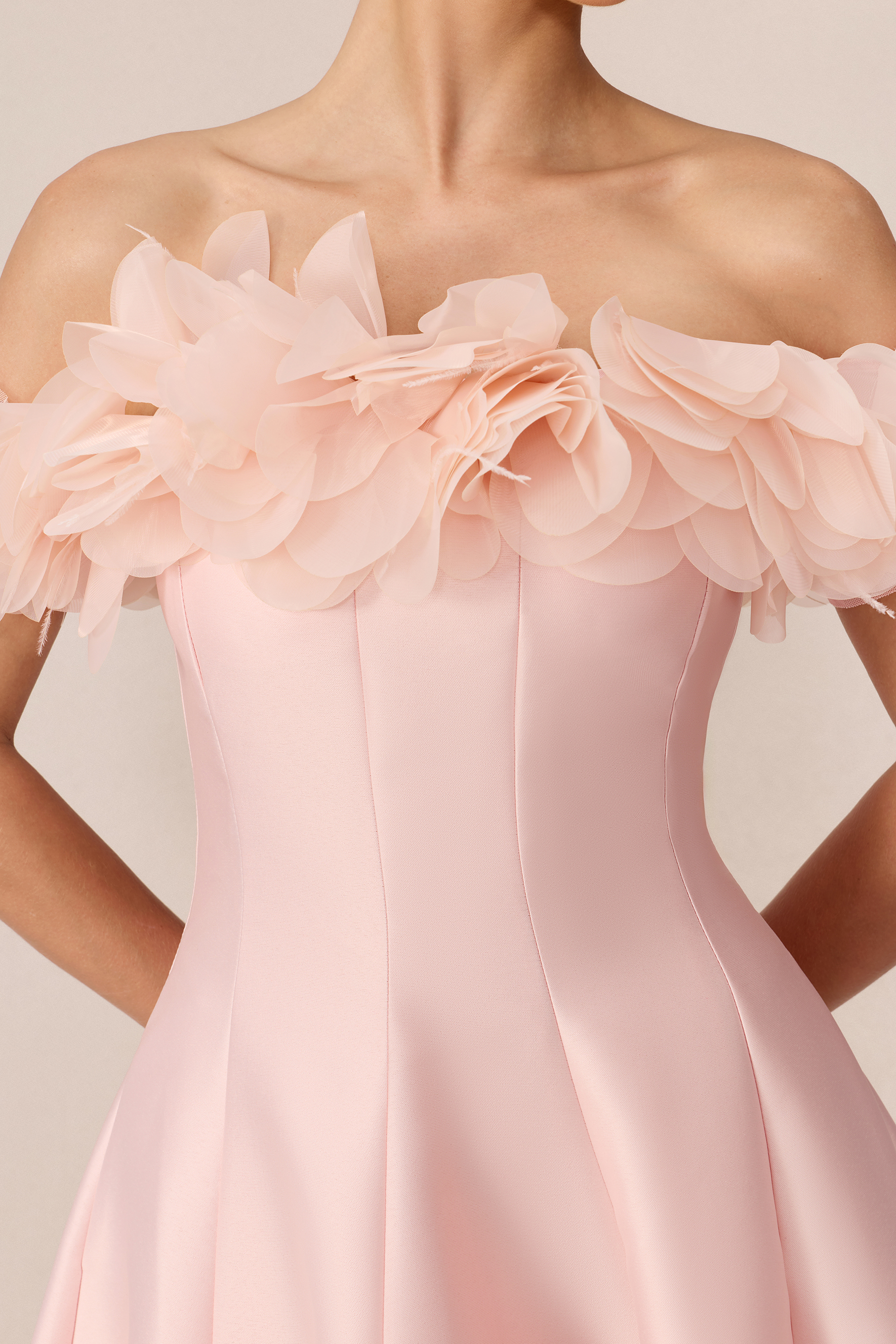
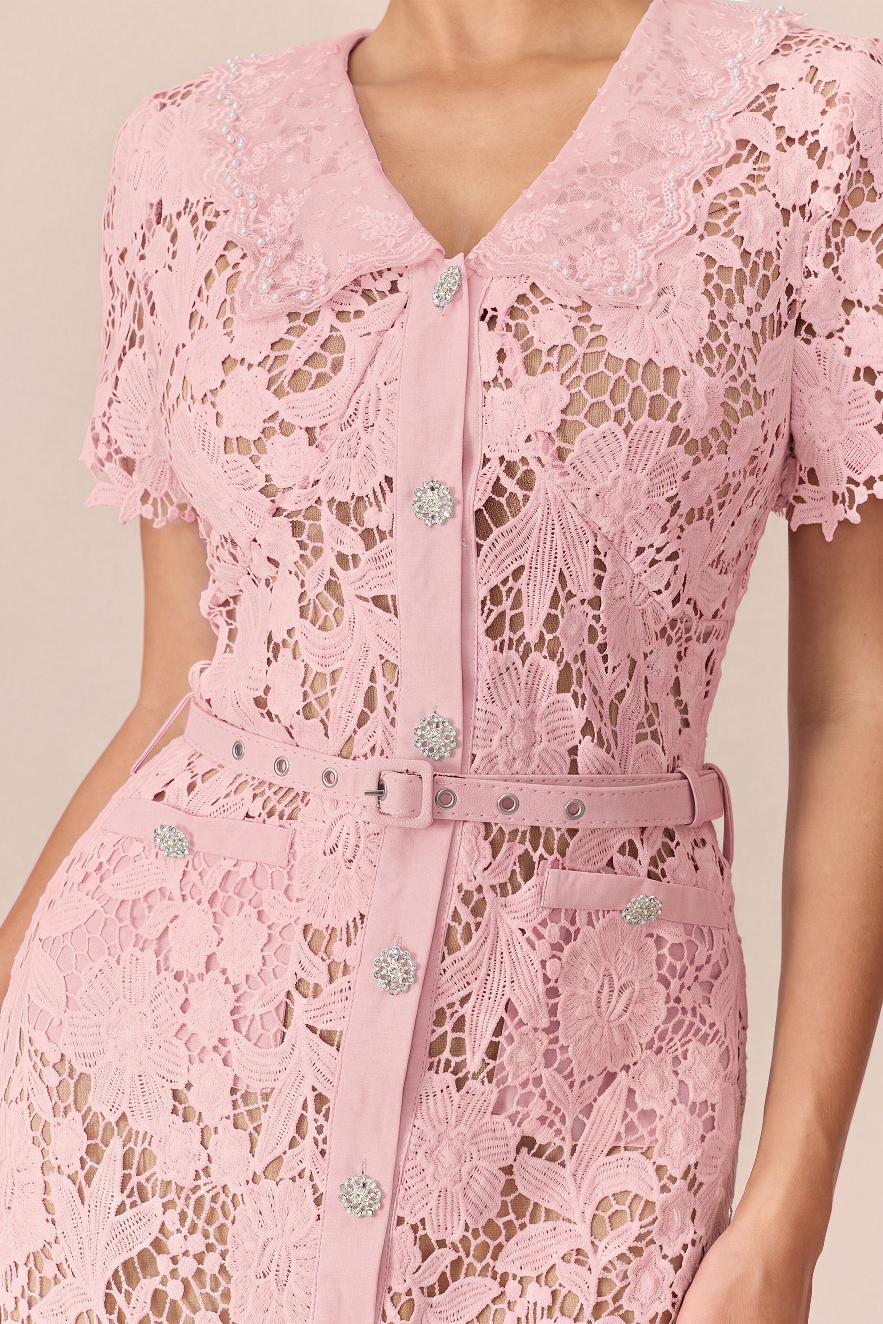
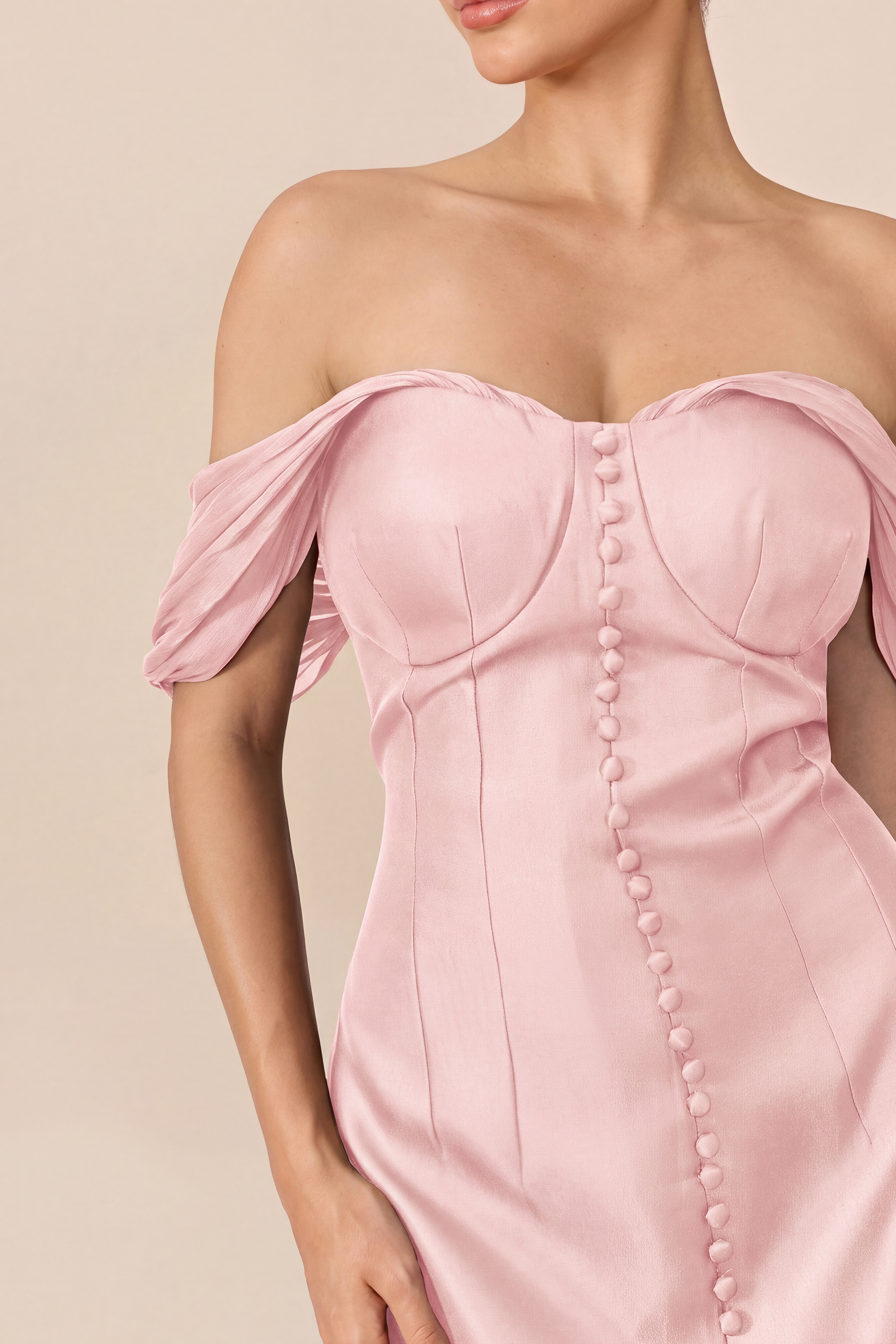
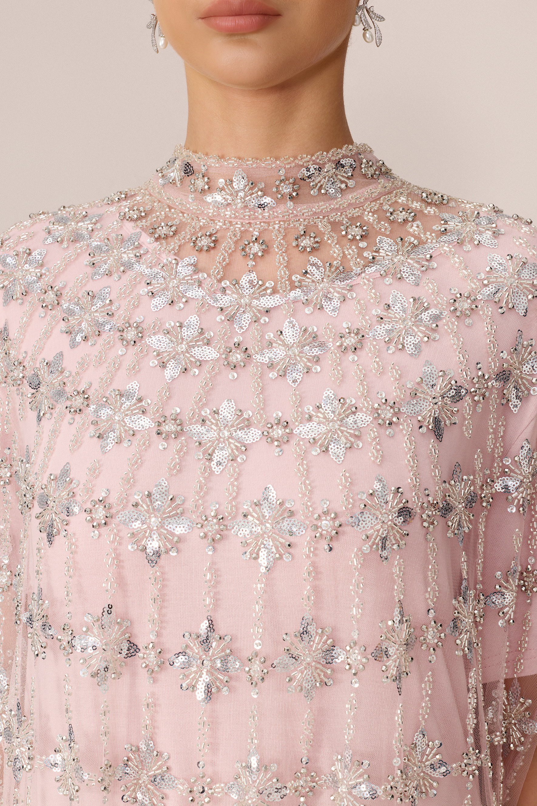
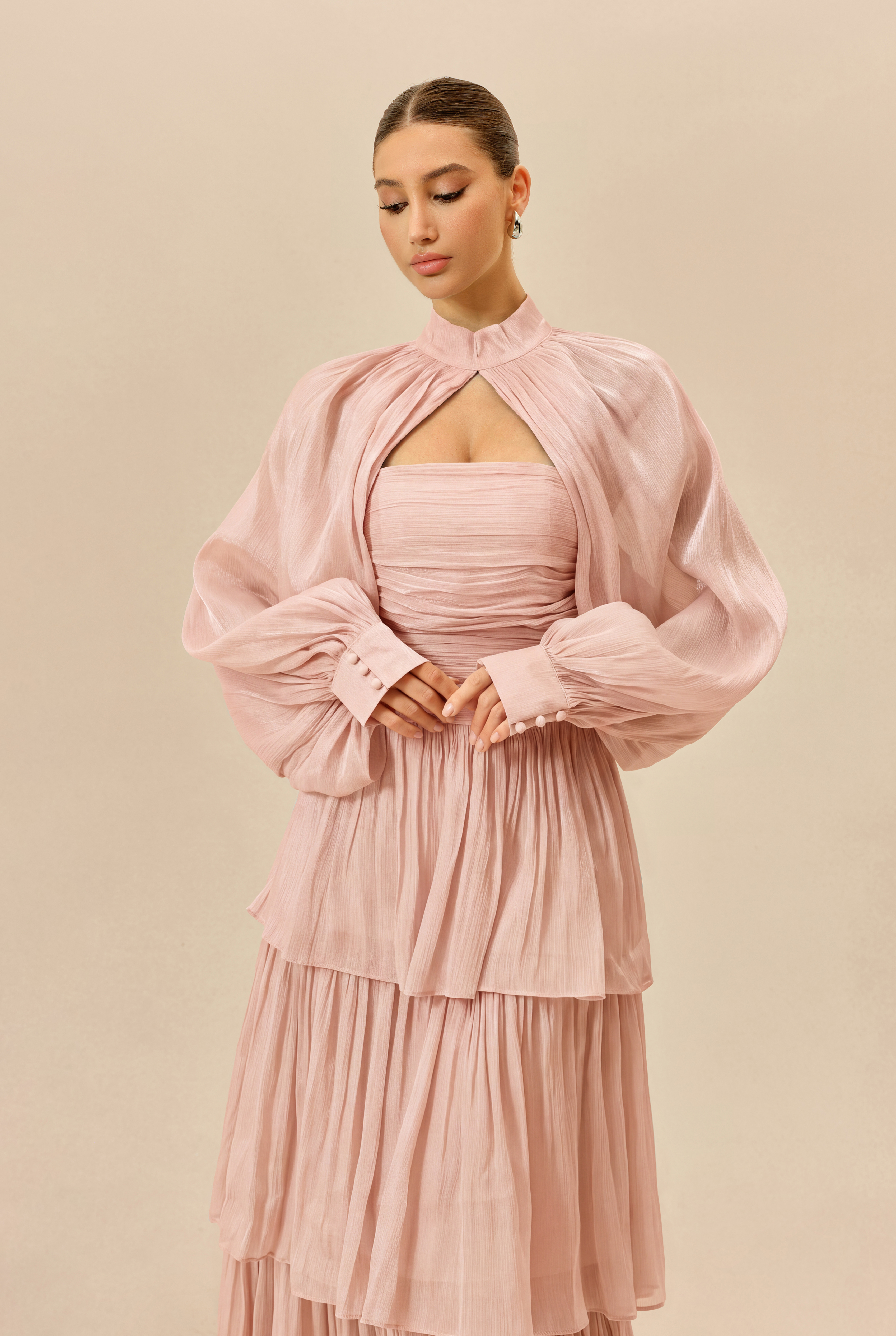
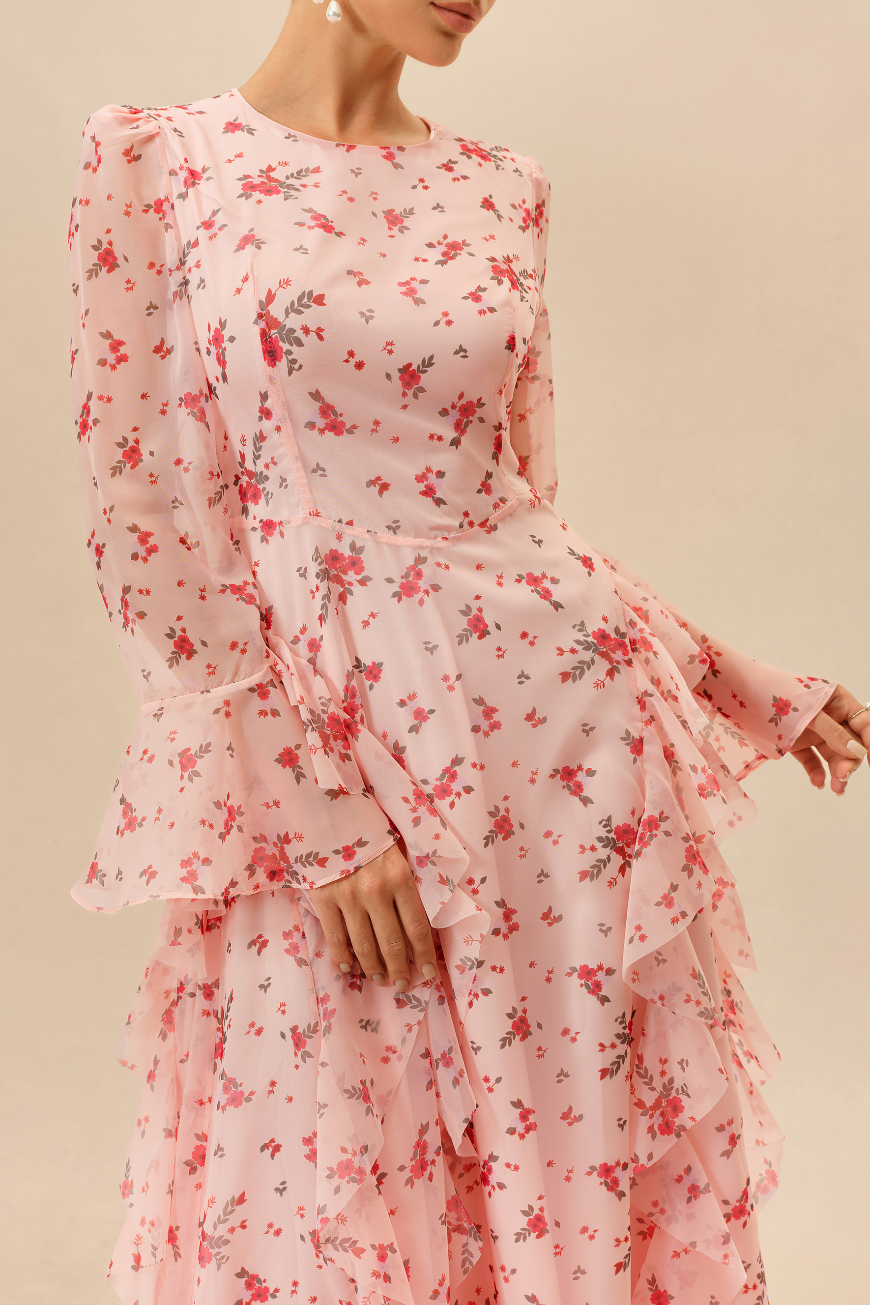
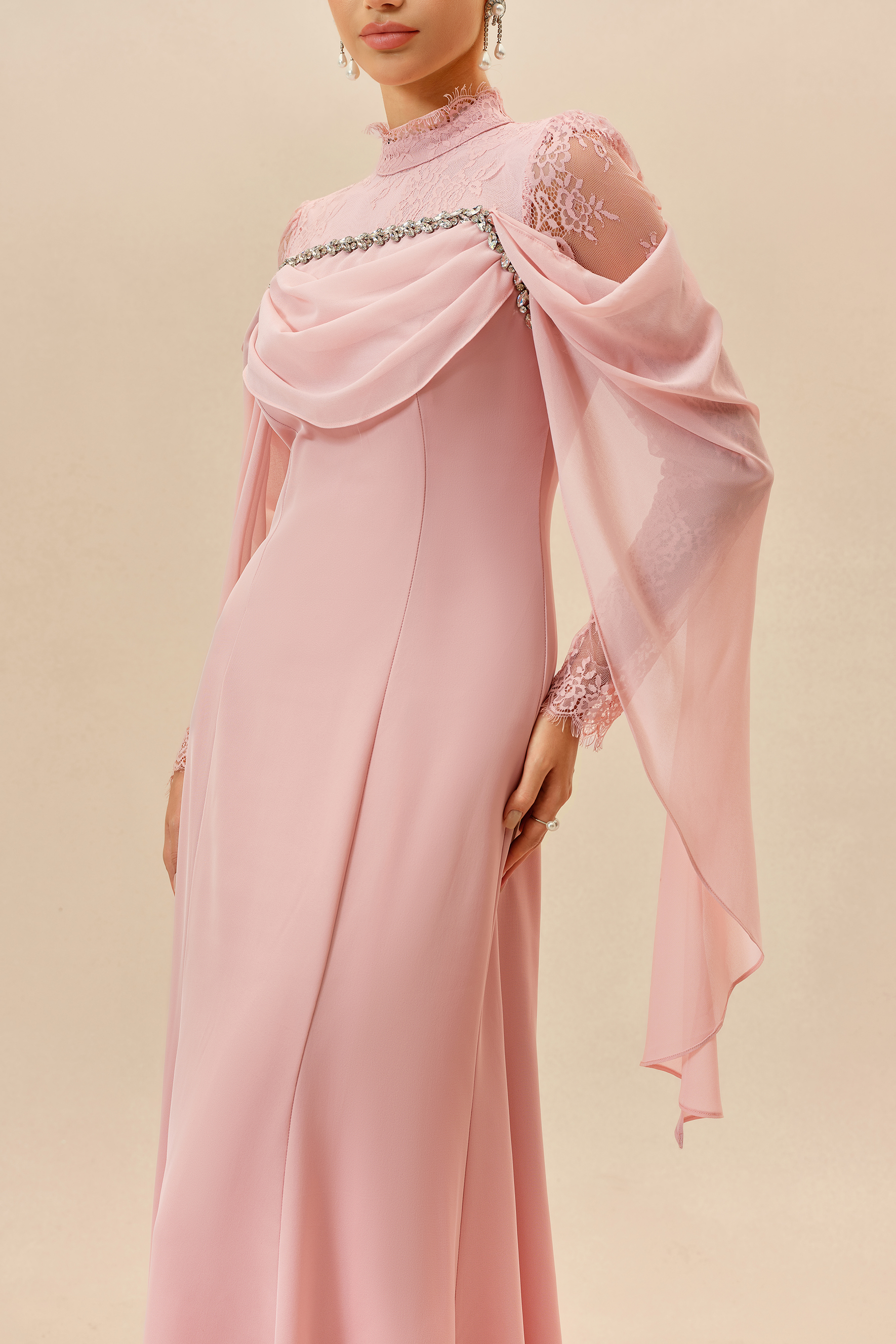
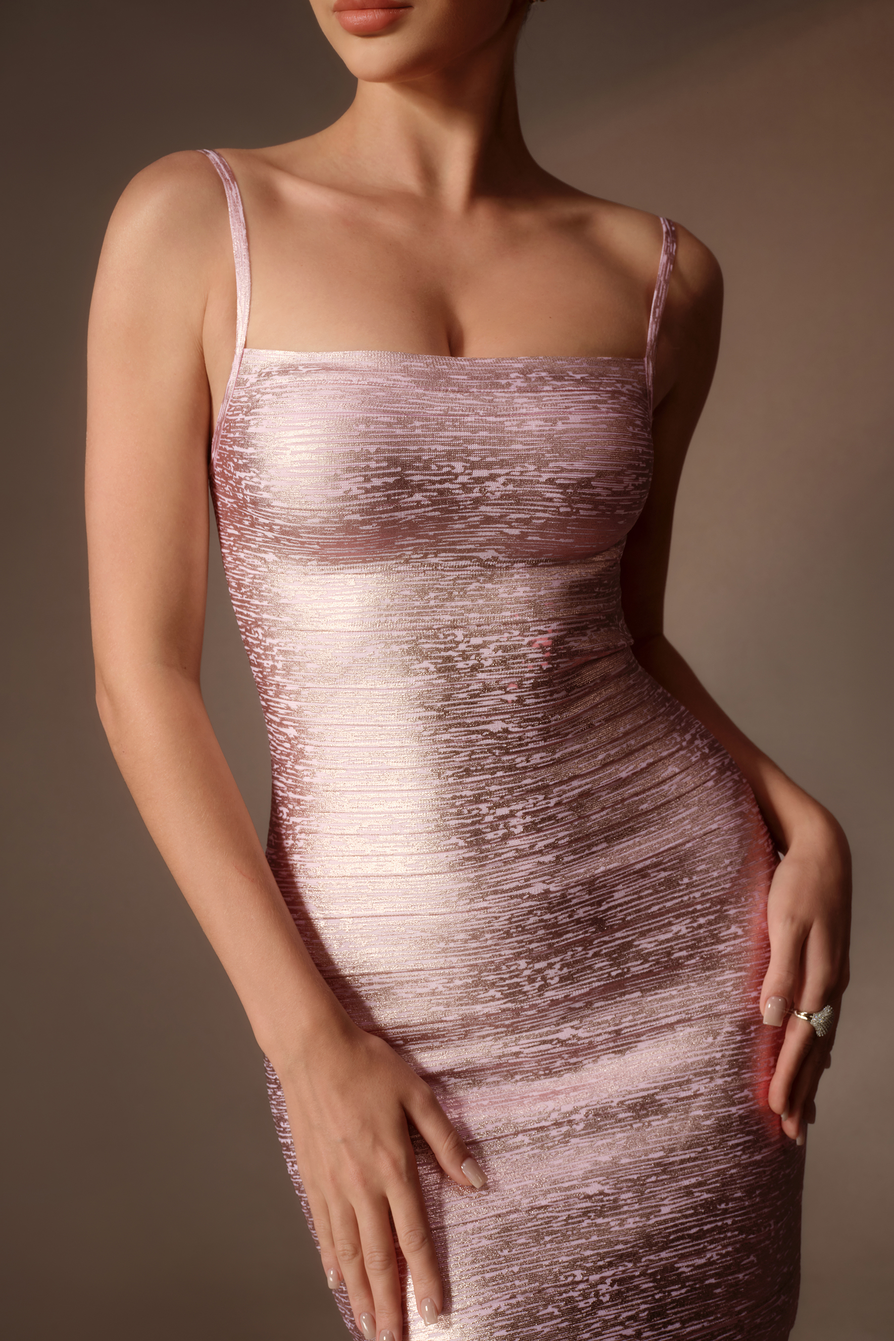
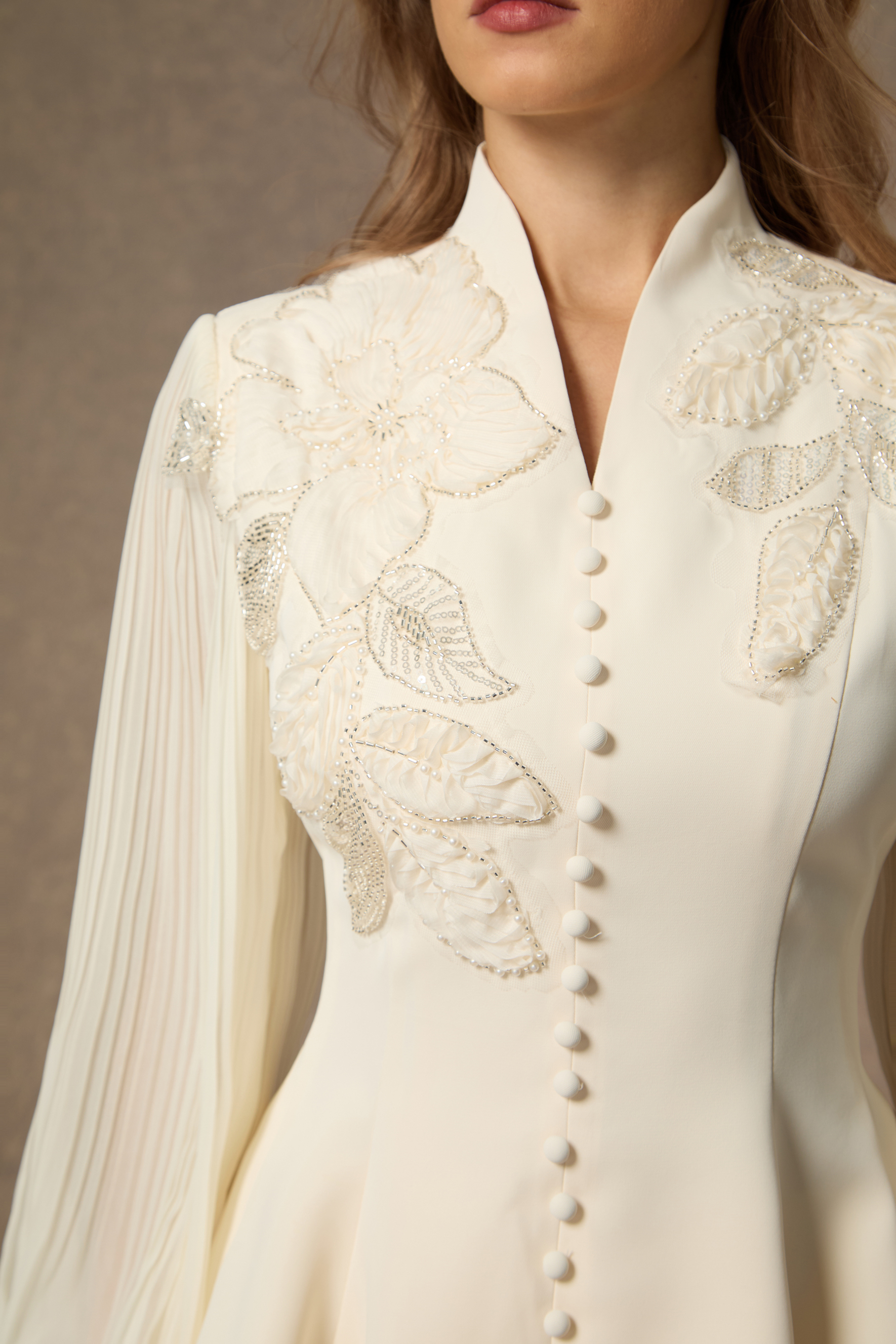
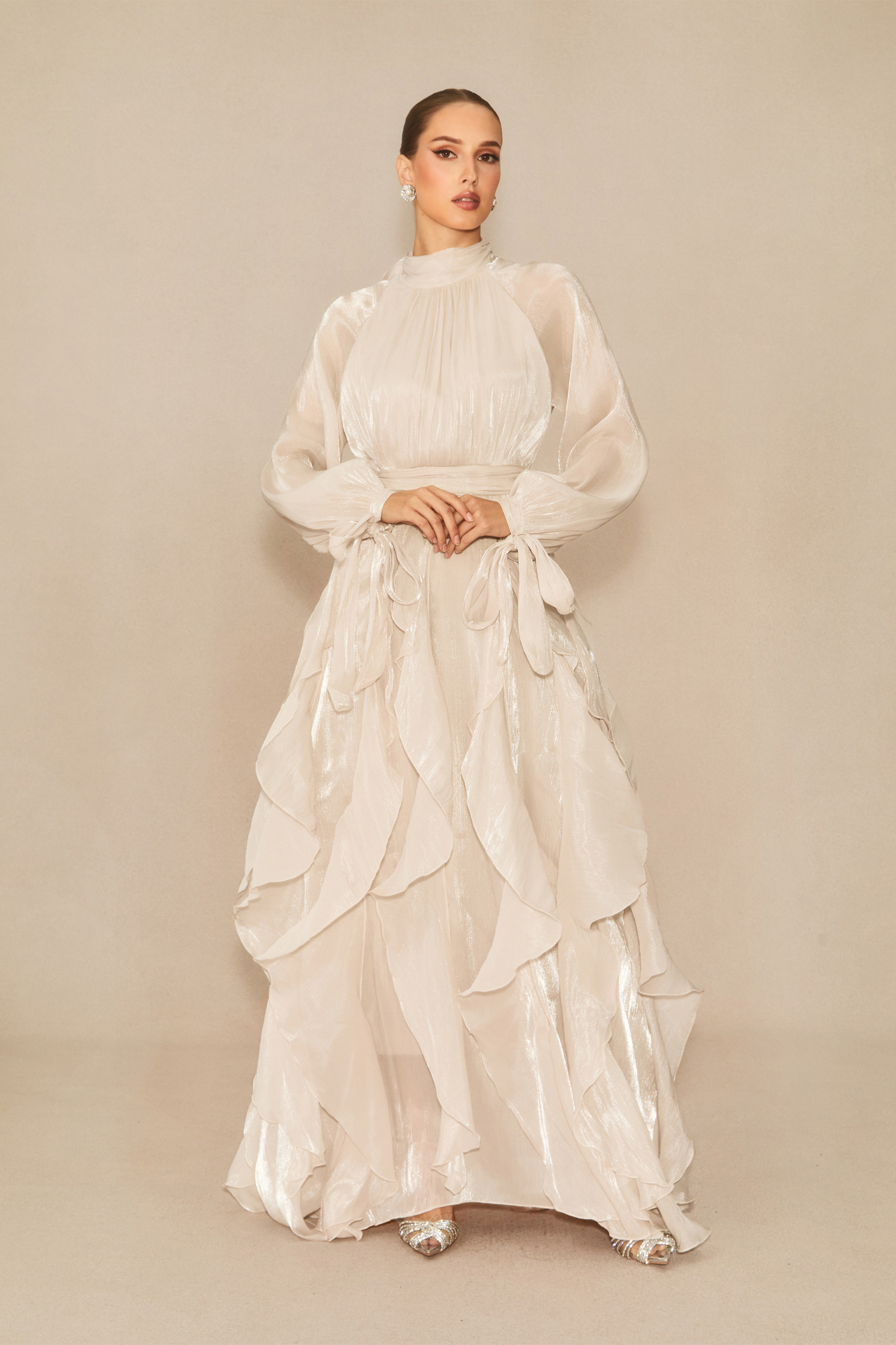
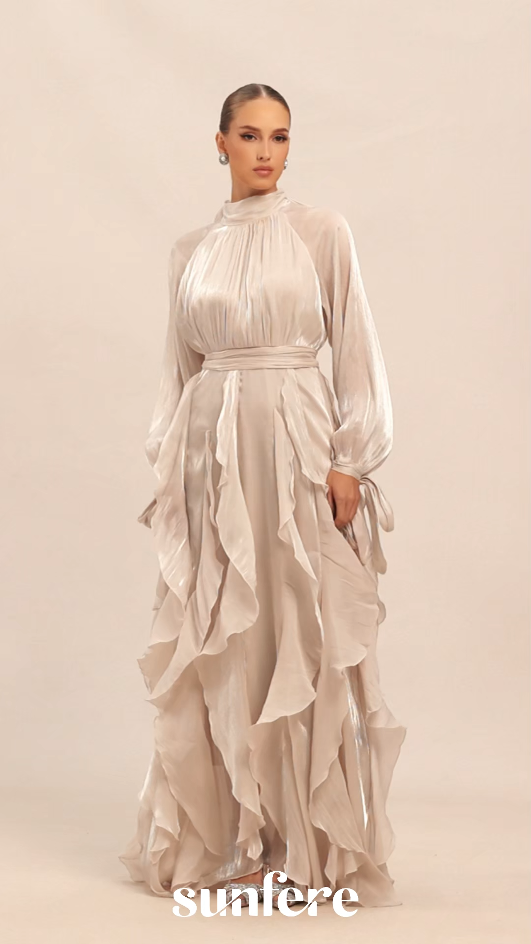
Fabric can noticeably change the character of pink. A smooth surface may catch more light and make the shade appear brighter, while chiffon, textured finishes or layered fabrics can soften the color and create more tonal variation.
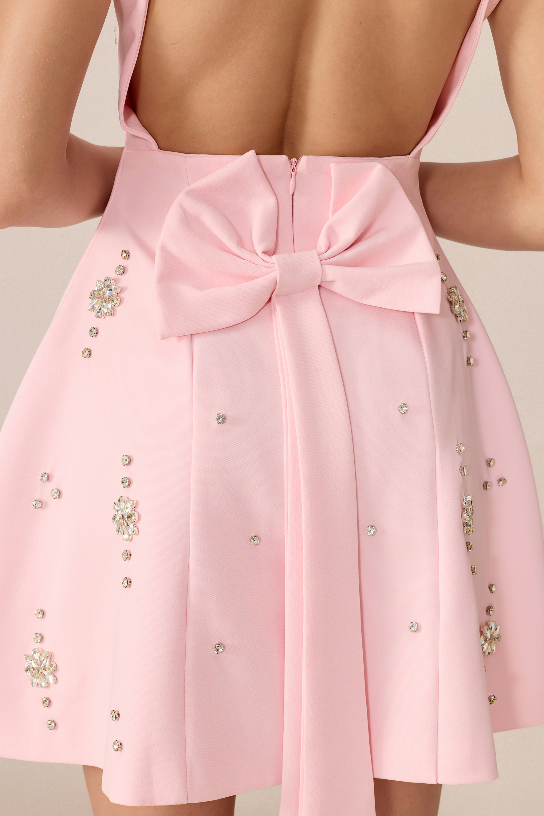
Lighting matters too. Natural daylight, indoor lighting and screen settings can all shift how pink appears, especially with very pale or highly saturated shades. Looking through several product photos, including close-ups, can help give a more balanced impression of the actual color.
For more context on how different materials behave, see Sunfere’s Our Fabrics guide.
When comparing two similar pinks, pay attention to undertone, saturation and opacity rather than focusing only on the shade name. These details often make a bigger visual difference than expected, particularly when the garment includes lining, layered sections or semi-sheer fabric.
Once you have found the pink you prefer, use the individual product measurements and Sunfere’s Size Chart to confirm the fit.
.png?w=3633&h=3634)
.png?w=3623&h=3623)
.png?w=3623&h=3623)
.png?w=3633&h=3634)
.png?w=3531&h=3531)
.png?w=3633&h=3633)
.png?w=3633&h=3634)
-.jpeg?w=1585&h=2378)
.jpeg?w=1700&h=2550)
-ZozCS5.jpg?w=1576&h=2365)
.jpeg?w=1700&h=2550)