
Vestidos de estampado abstracto

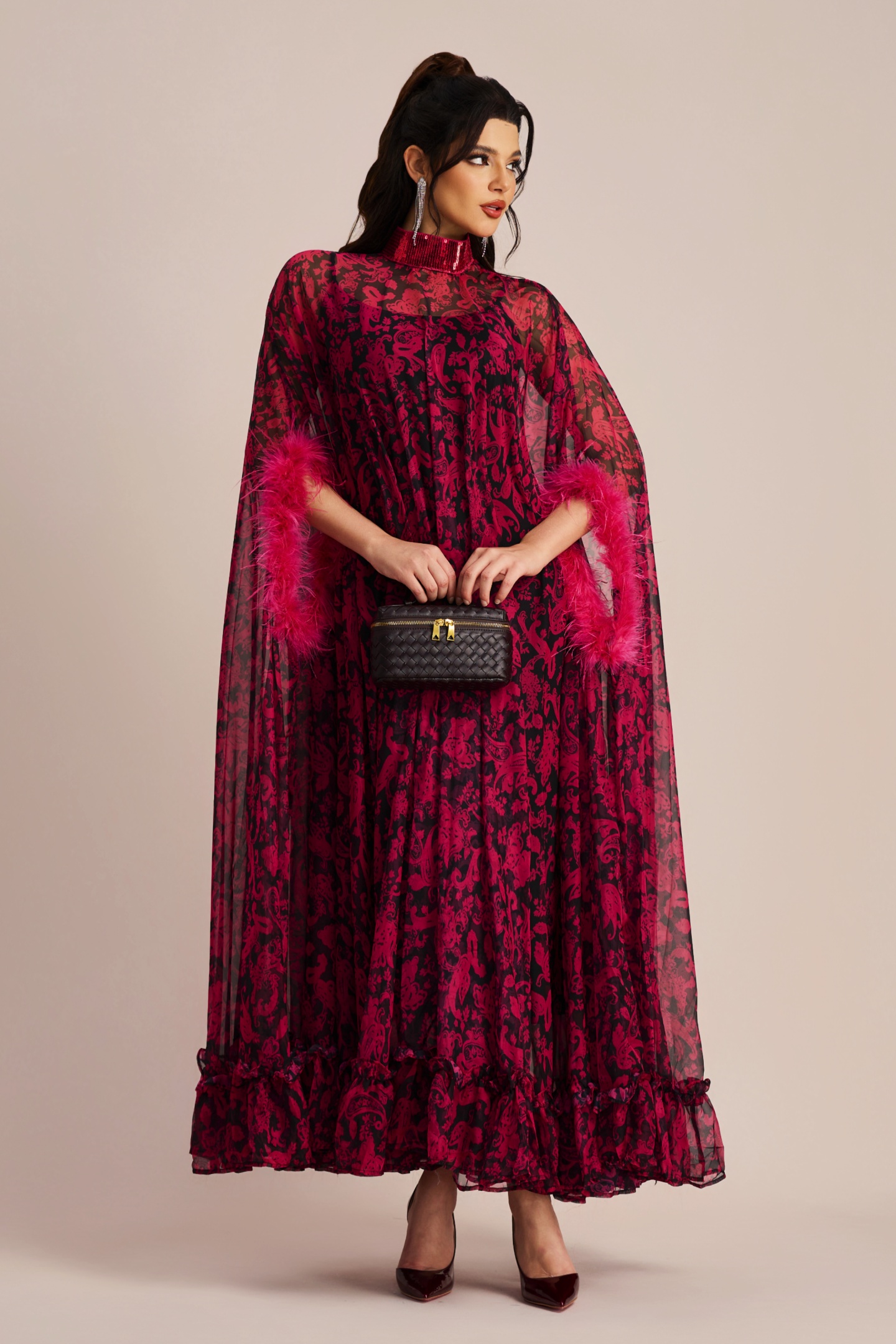
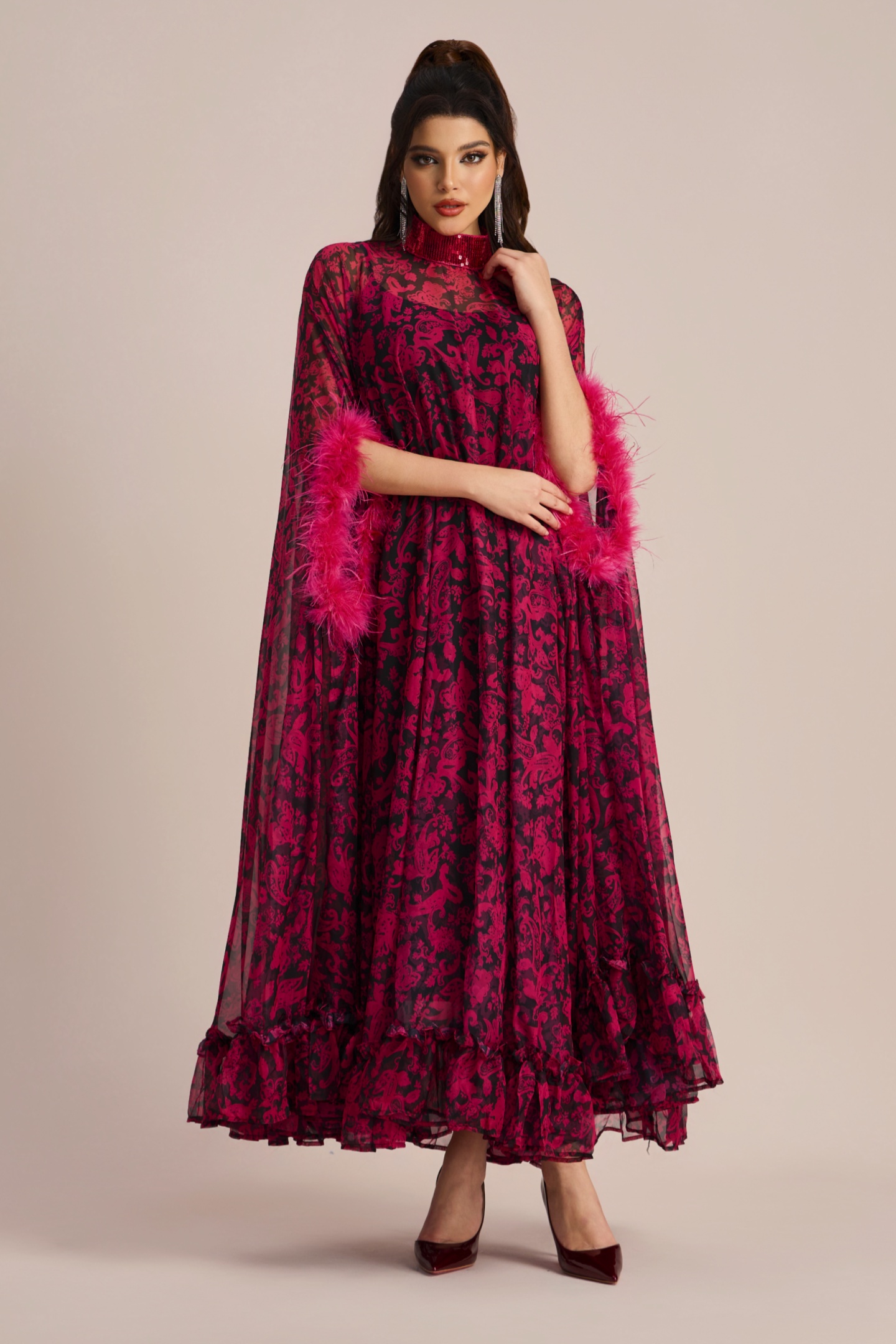
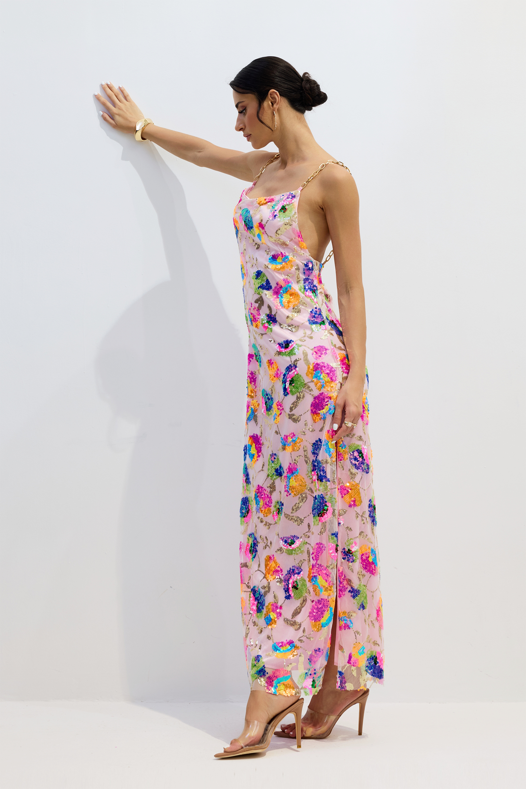
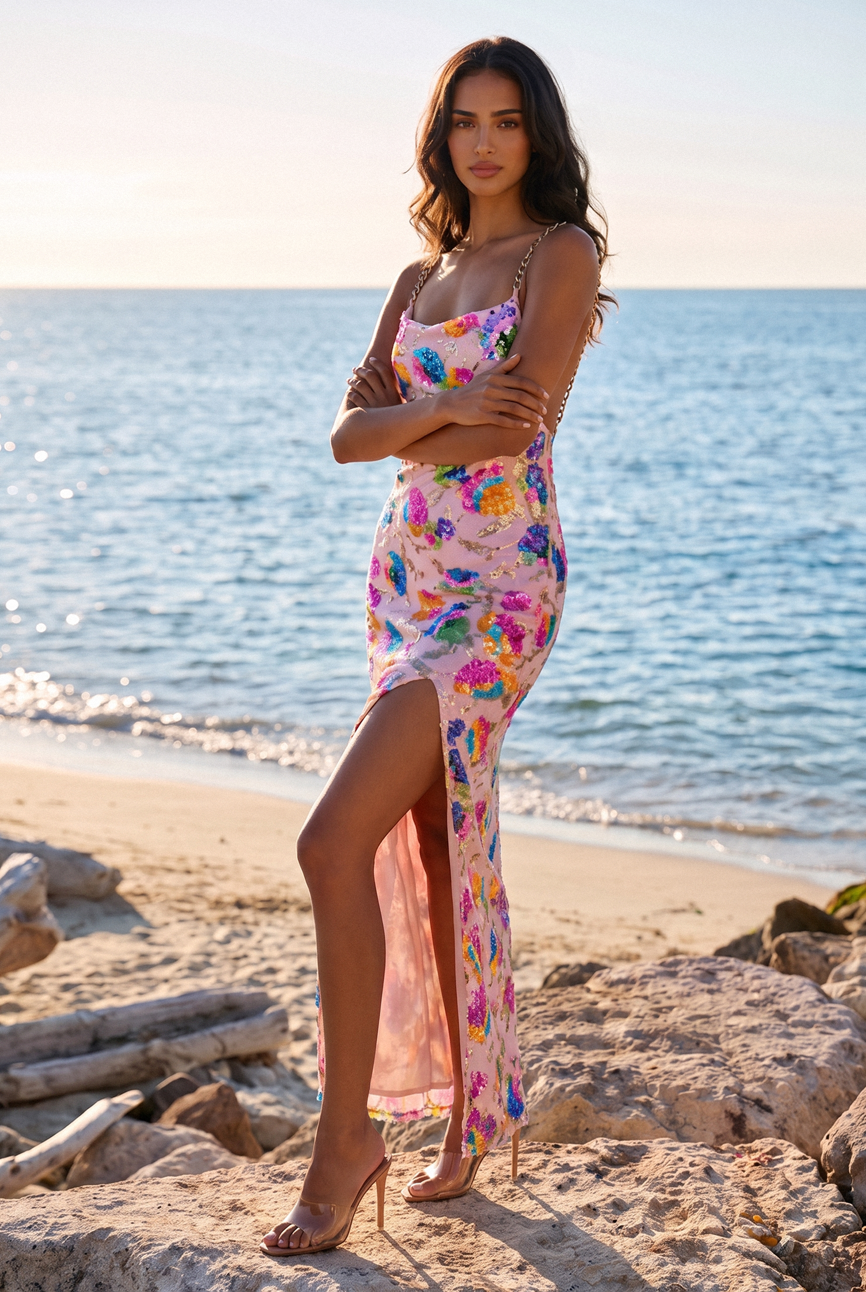
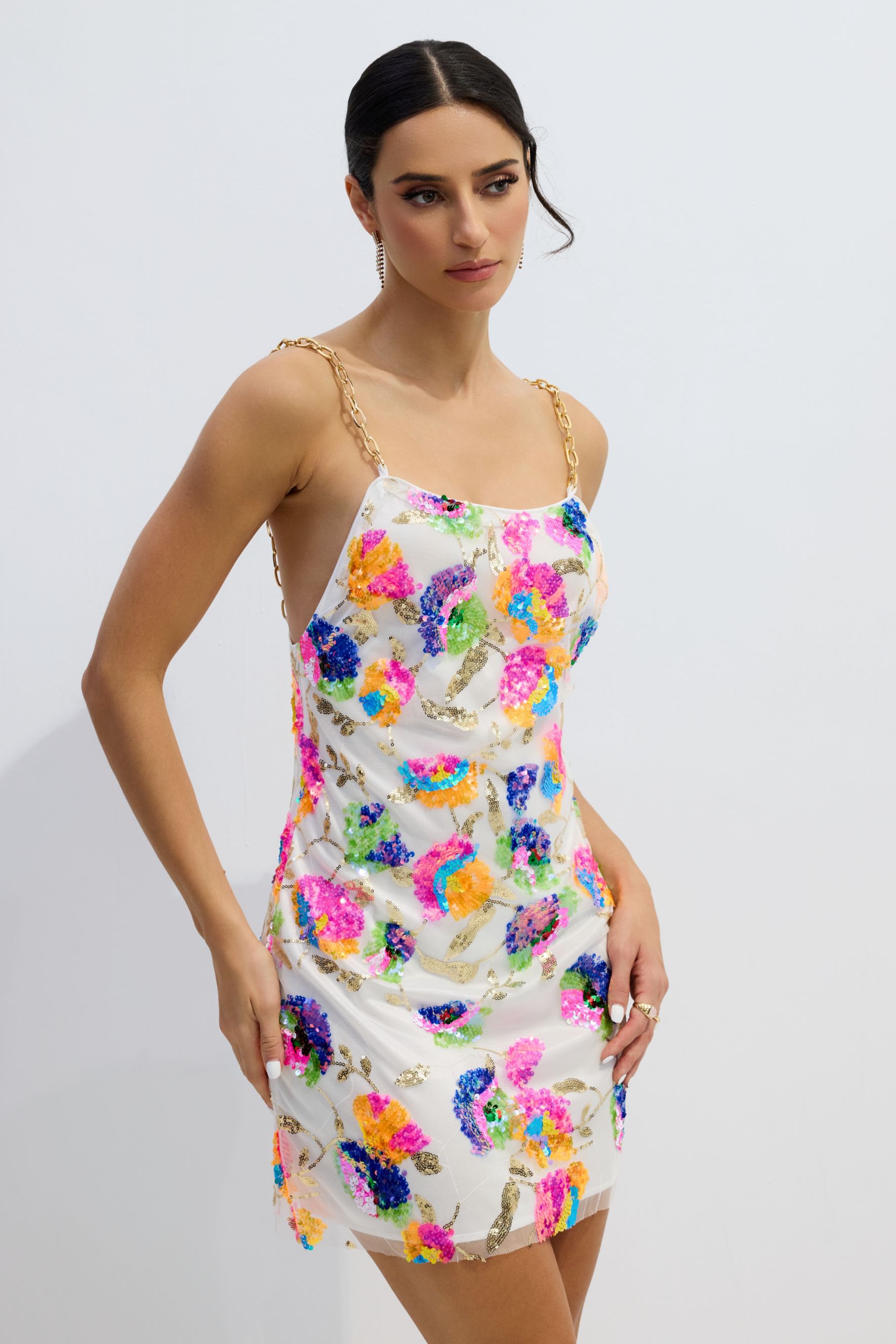
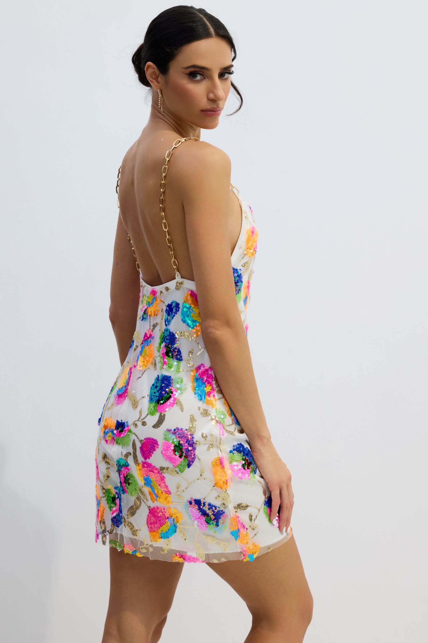
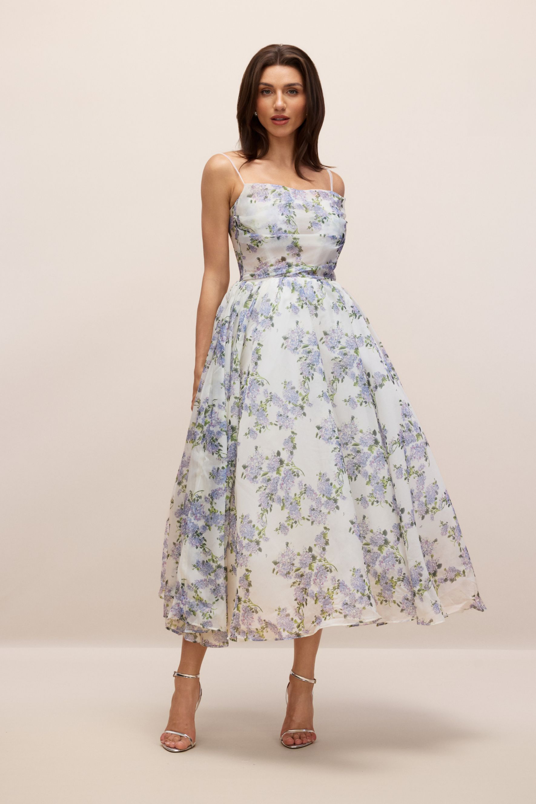
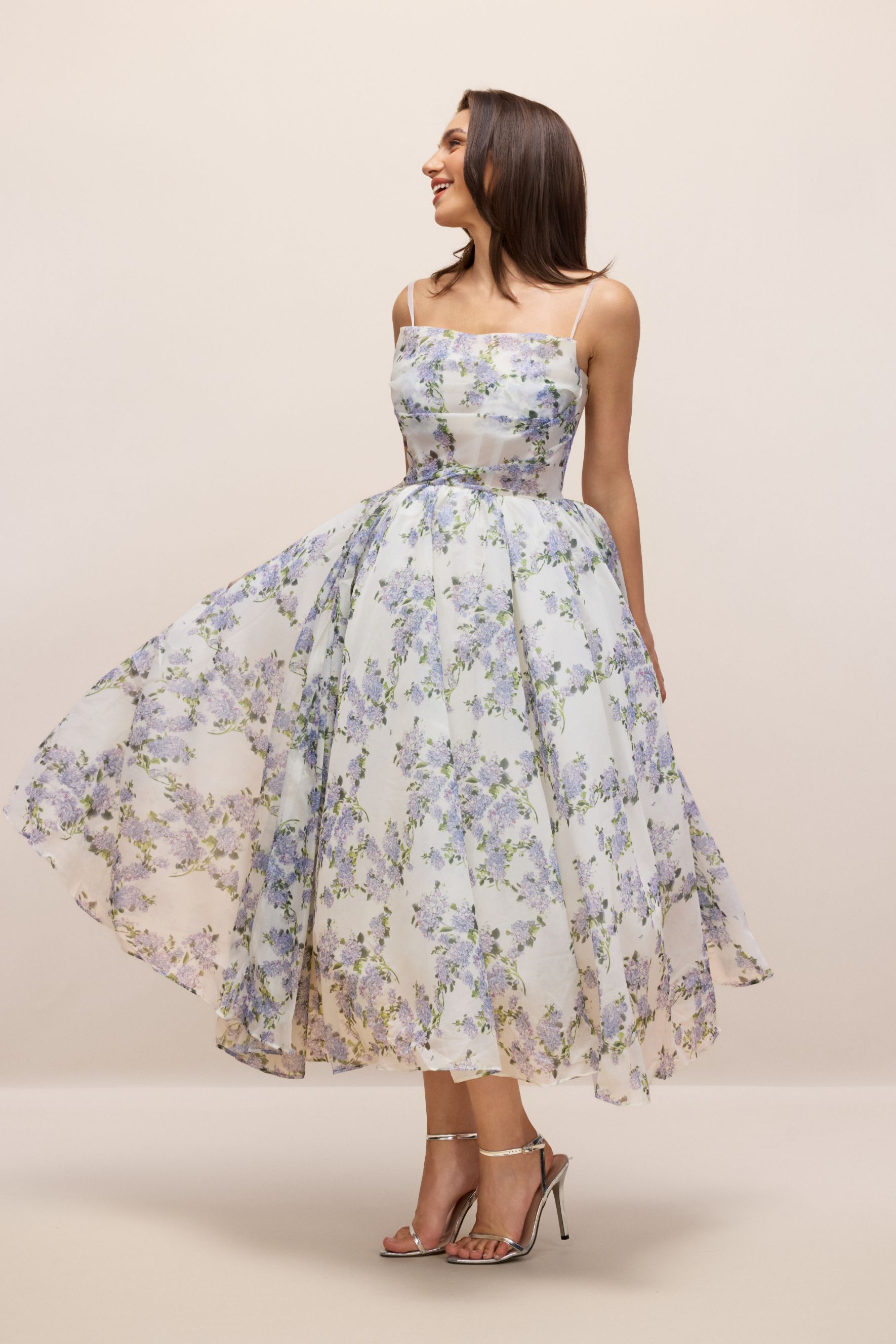
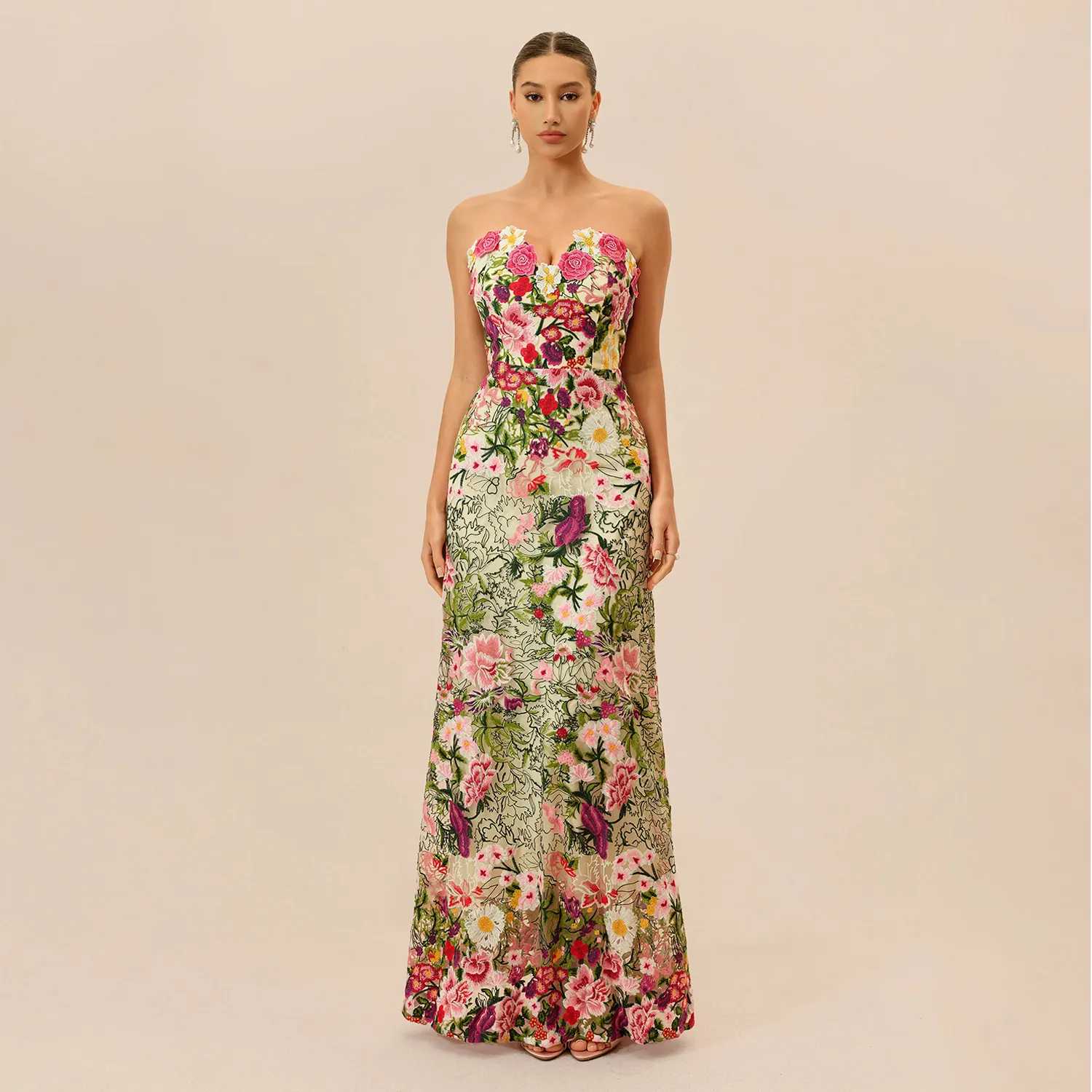
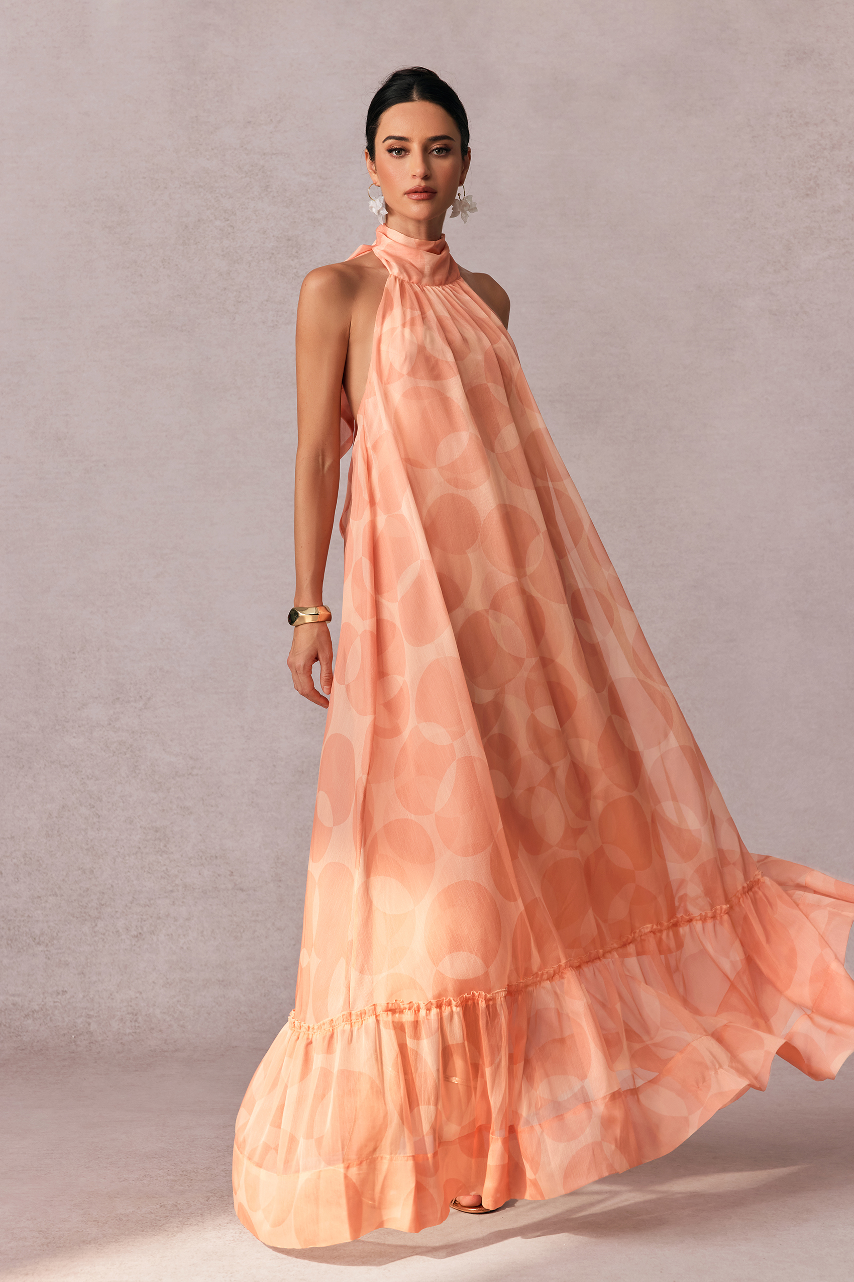
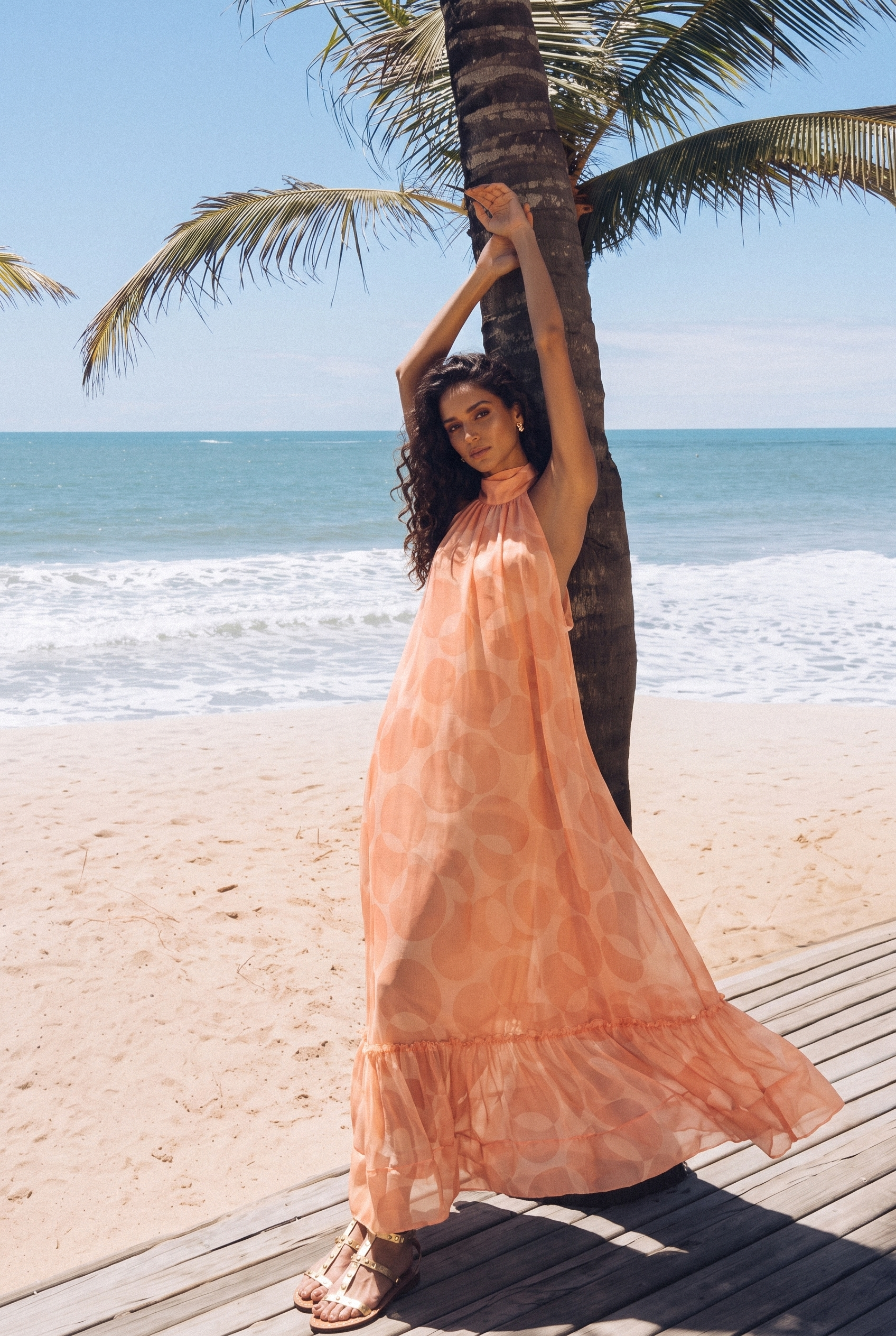
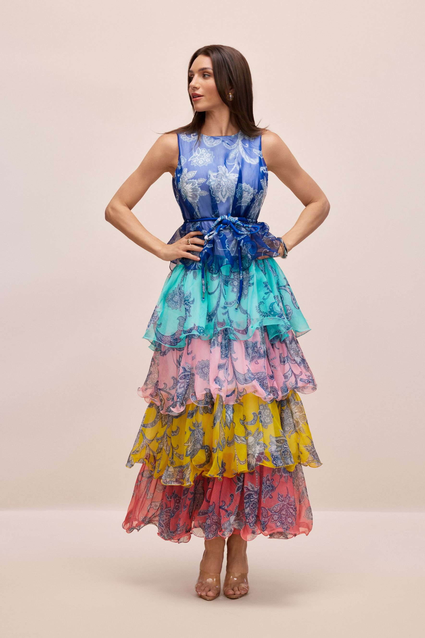
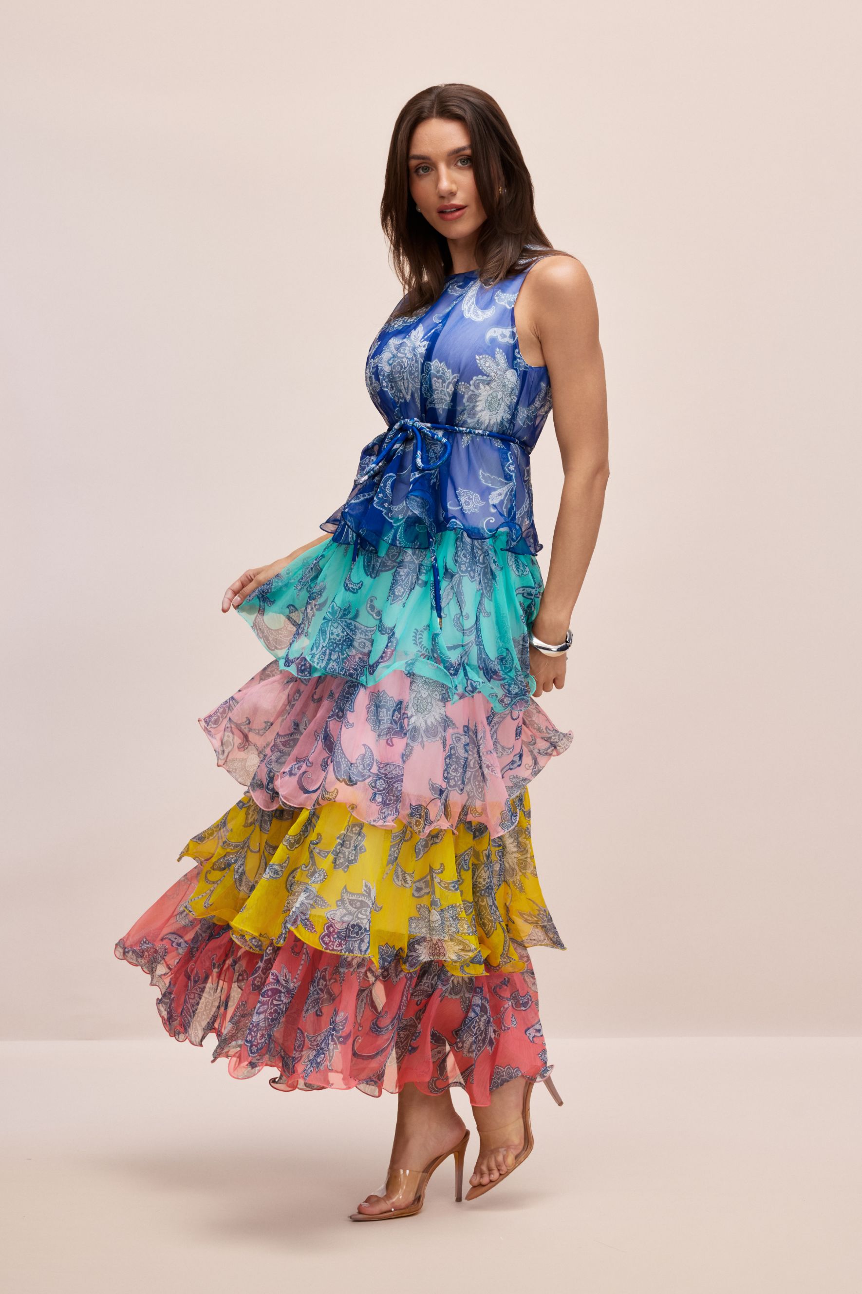
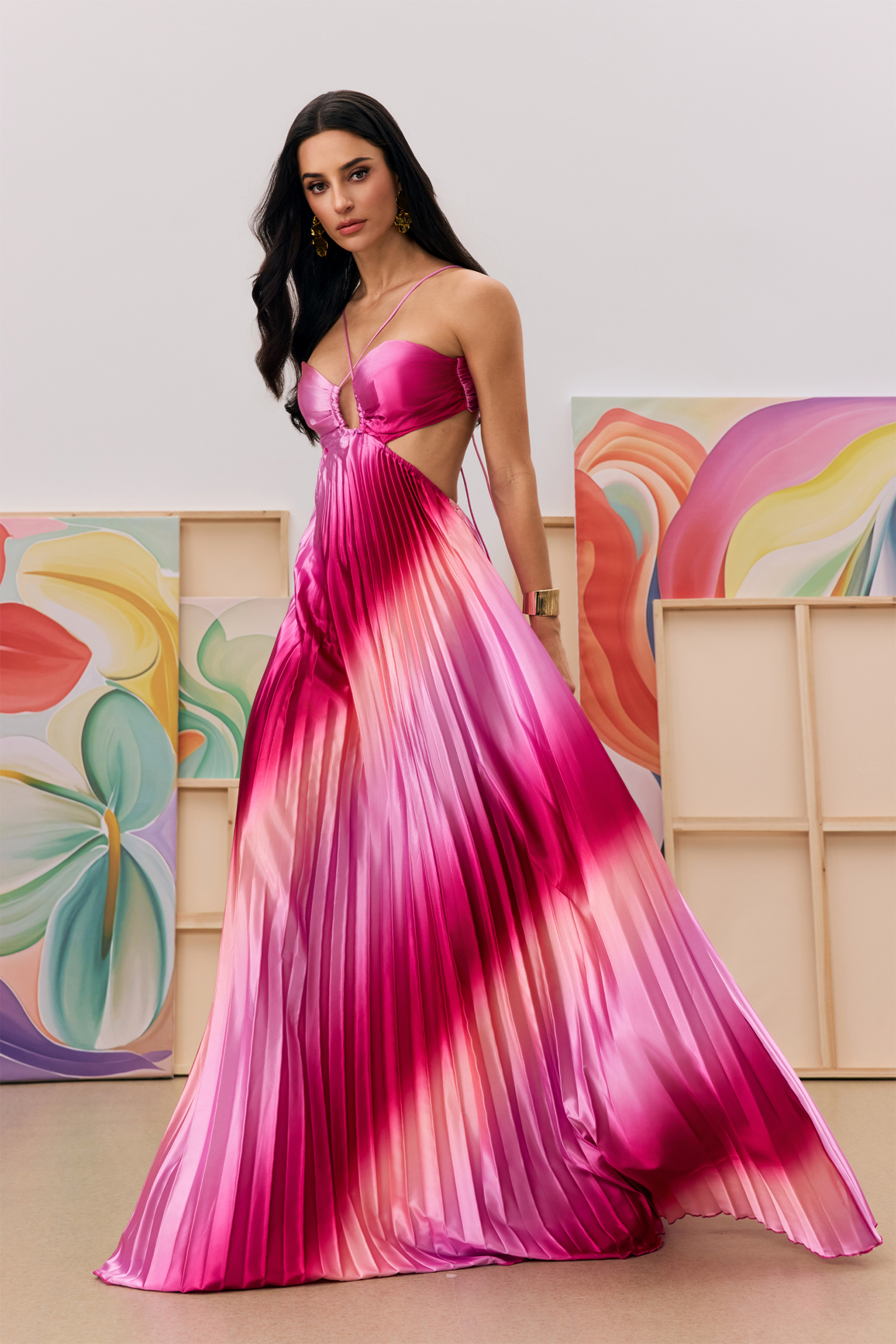
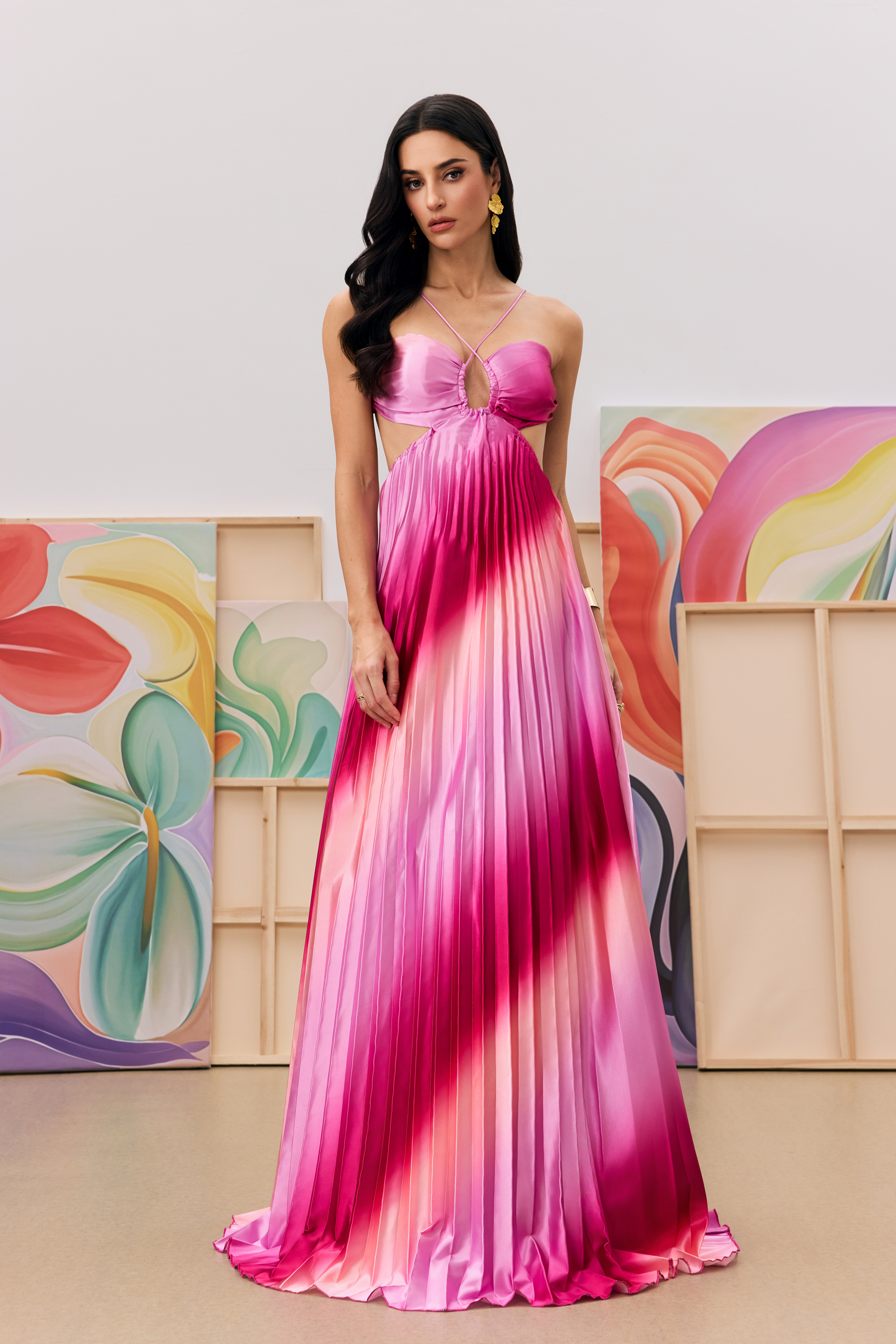
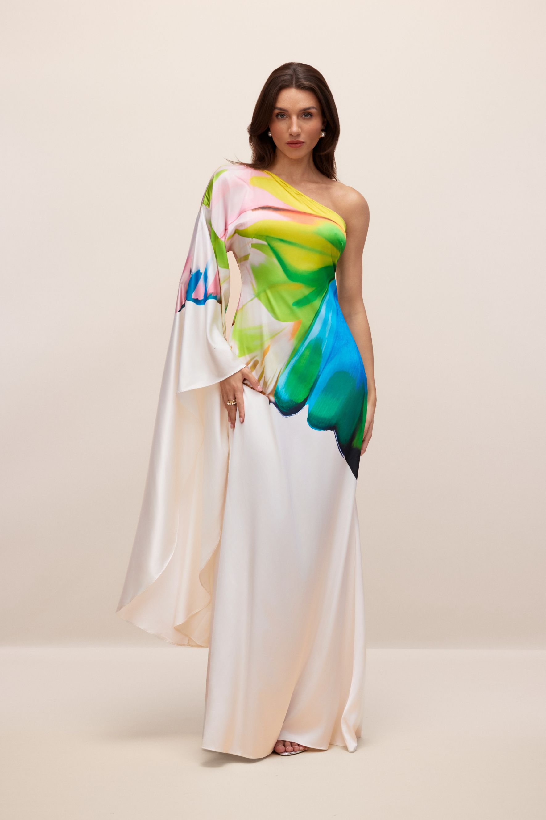
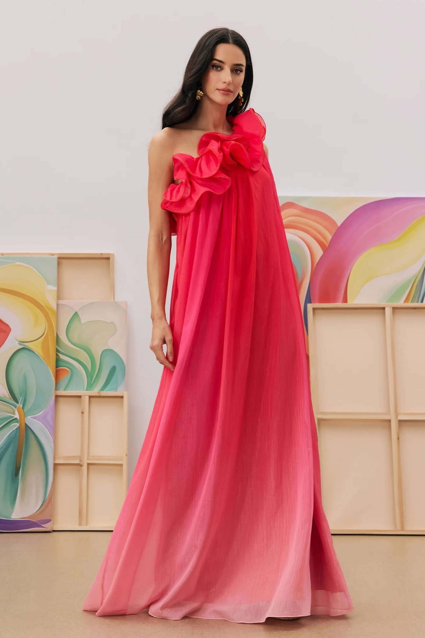
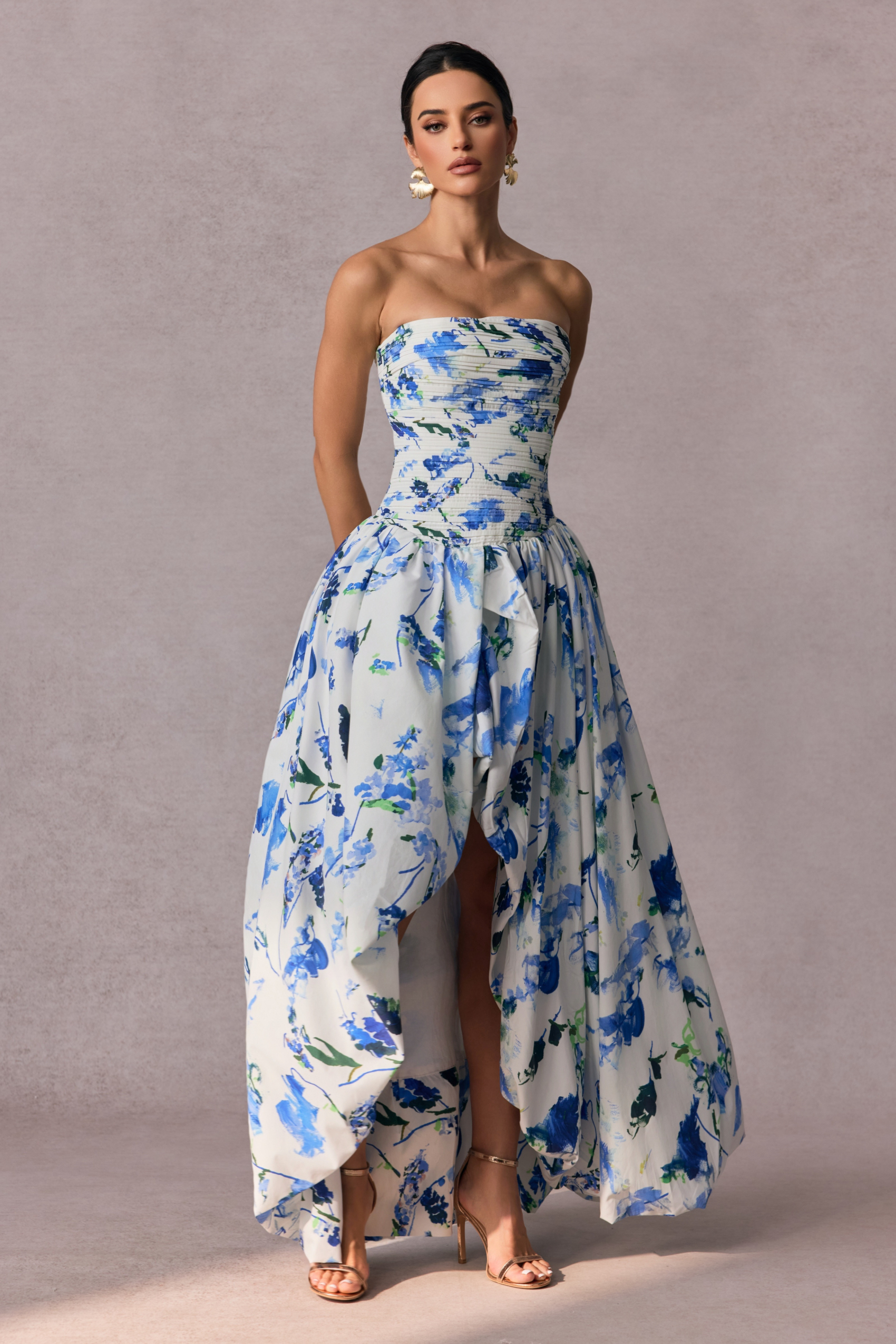
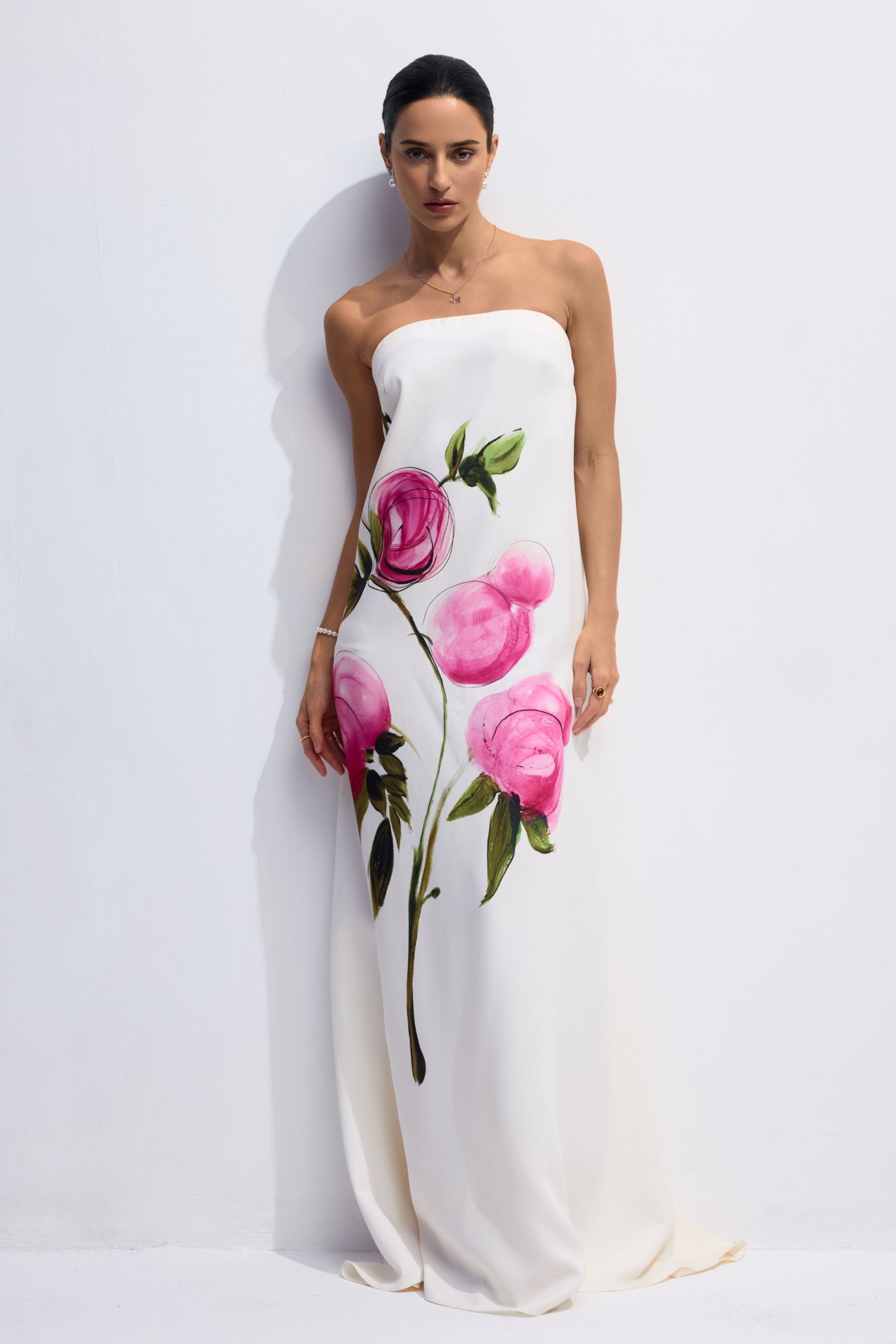
Abstract print dresses use shapes, lines, and color relationships to create an artful visual composition. Their character comes from how these elements interact: curved forms can suggest movement, while unexpected contrasts give the pattern a distinct focal point. The print itself becomes the defining feature, bringing visual interest through its arrangement and rhythm.
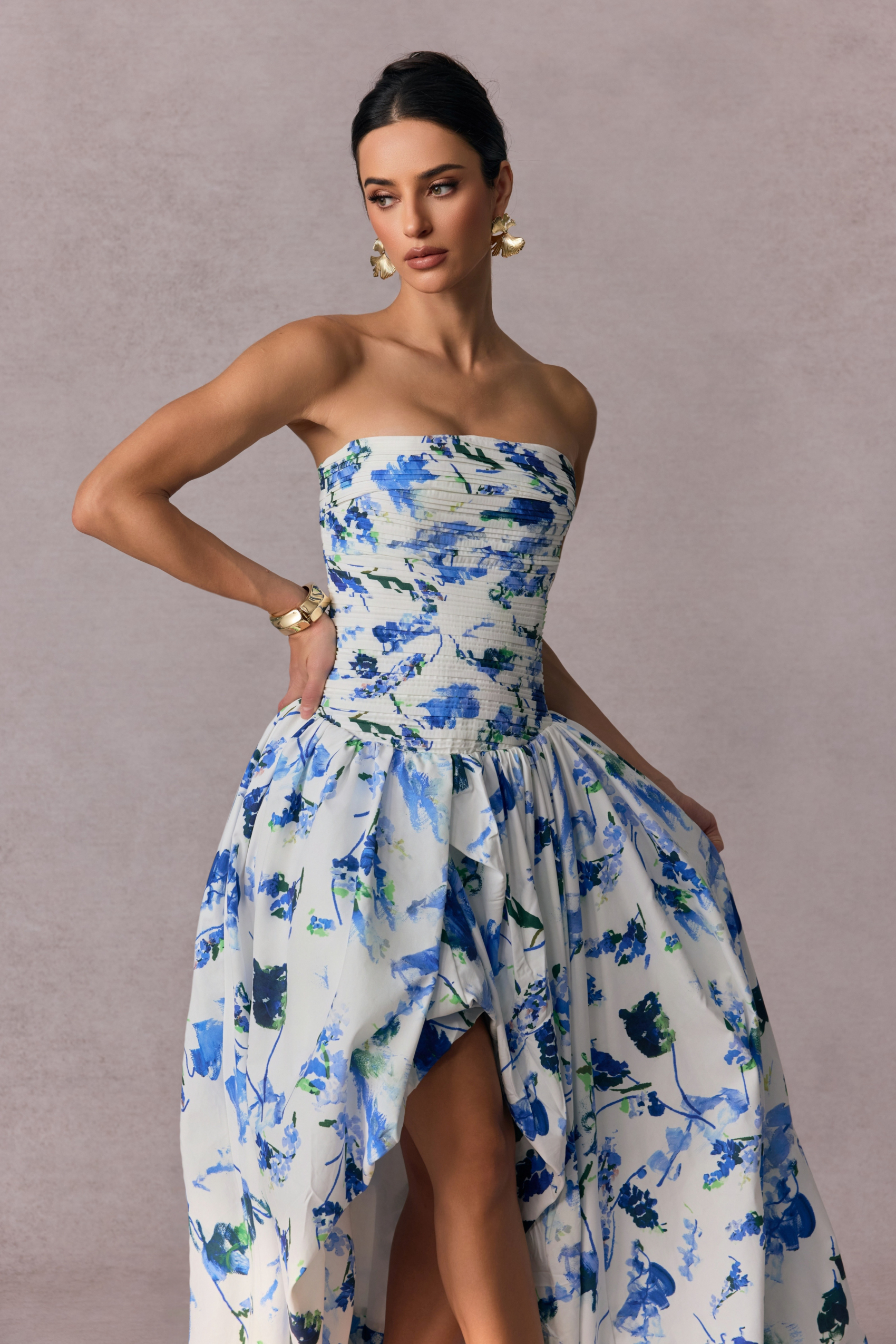
The scale of an abstract pattern influences how it reads. Larger forms make individual shapes more noticeable, while smaller marks create a denser, more intricate surface. Space between elements matters, too: an open arrangement allows each shape to stand out, whereas closely layered forms create a more continuous composition.
When browsing abstract print dresses, consider whether you prefer clearly separated shapes or a pattern that blends together at a distance.
Color contrast can change the impression of an abstract print as much as the shapes themselves. Closely related tones create softer transitions, while stronger differences between light and dark make the composition more defined. A concentrated accent color can draw attention to one area, while colors distributed throughout the print encourage the eye to move across it.
Look at the overall palette alongside the individual colors to understand what gives each design its character.
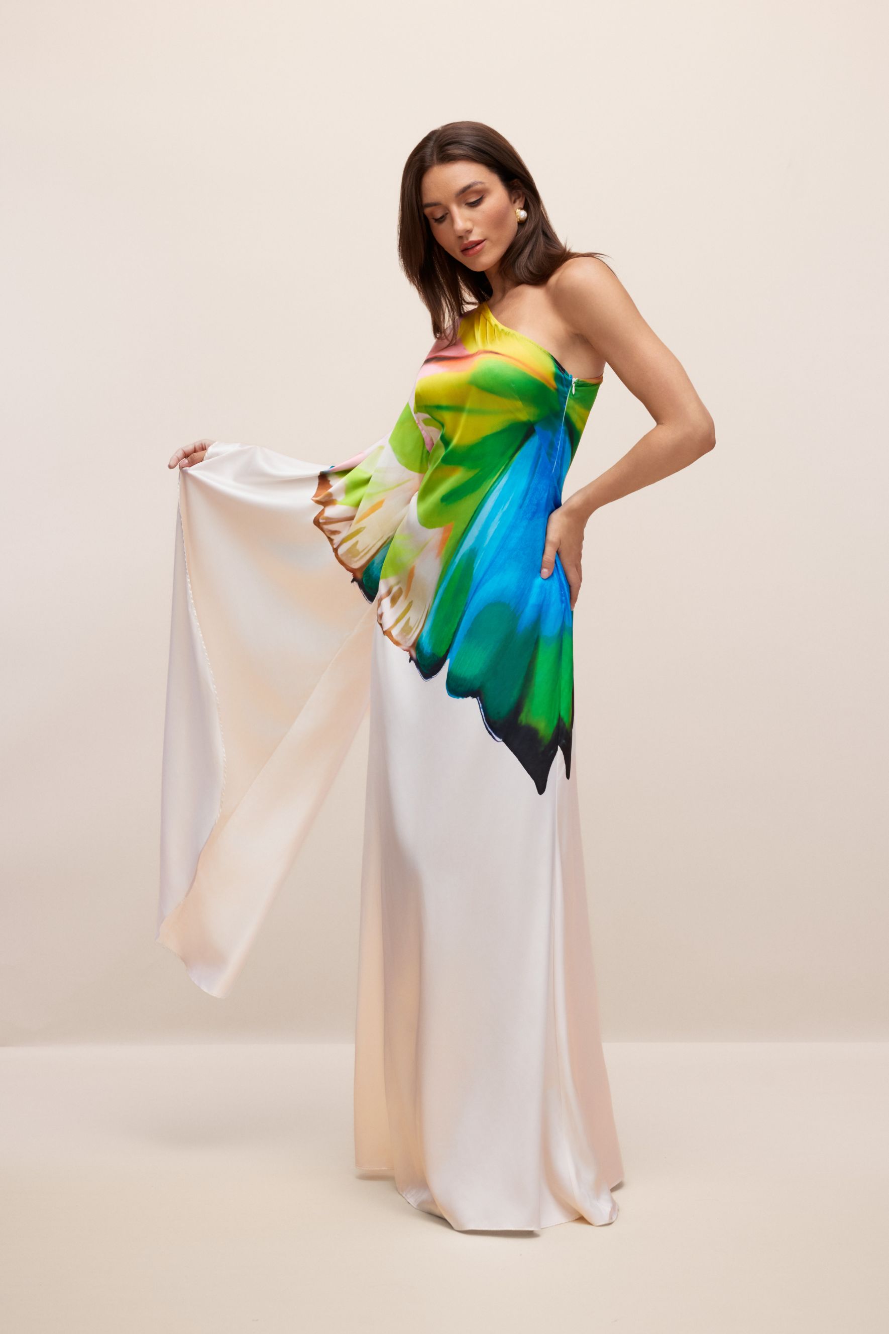
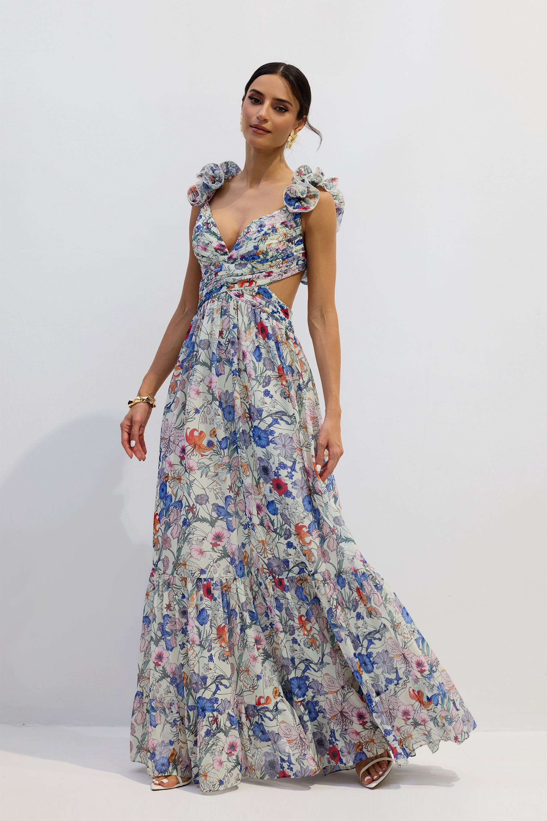
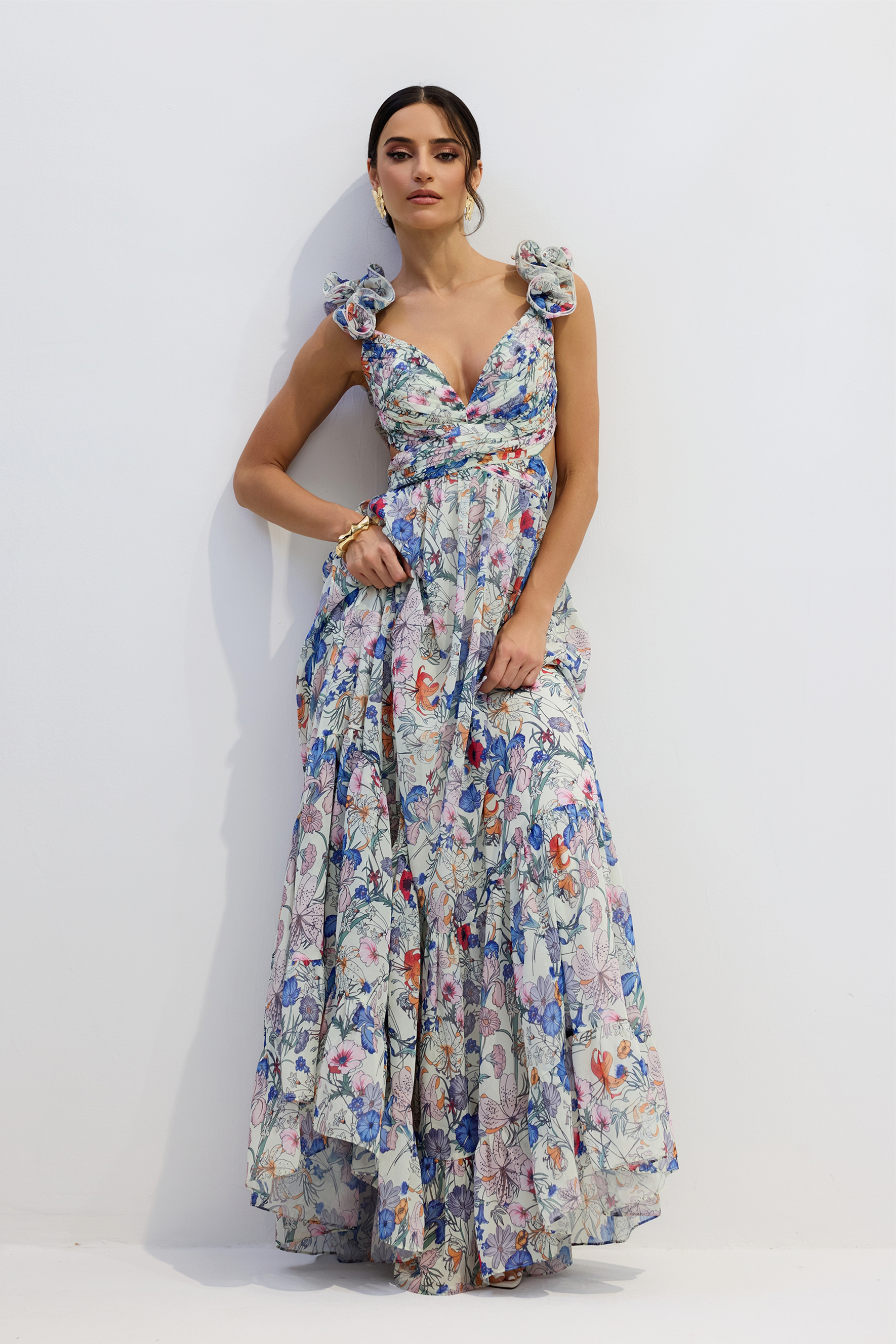
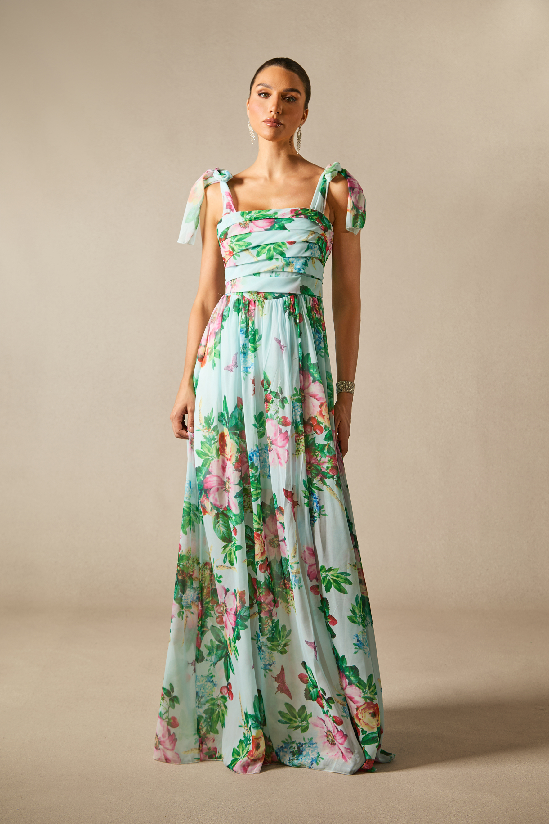
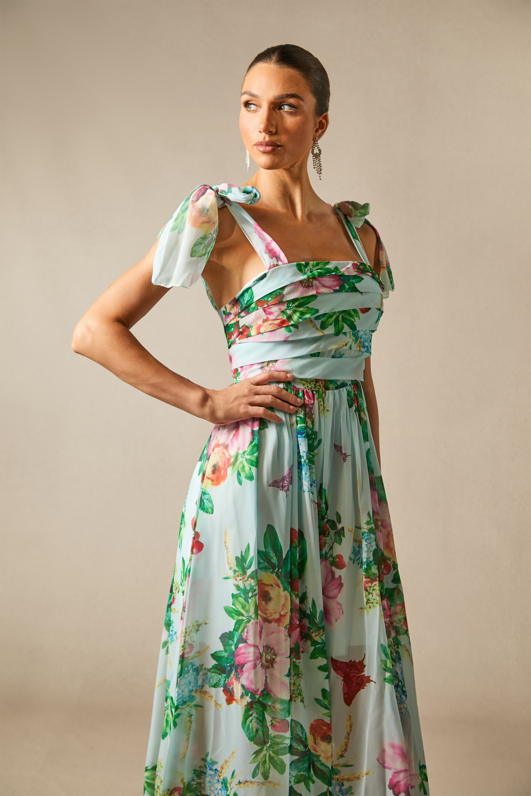
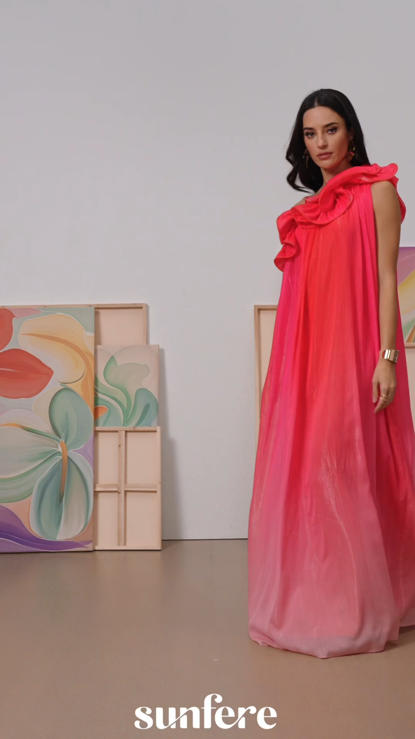
Start with the full view to see the overall composition, then examine close-ups for pattern detail. Front and back images can help you assess how the design continues around the dress and where its most prominent elements appear.
Print placement may vary between garments, so check any product-specific notes if the position of a particular motif is important to your choice.
Abstract print dresses use shapes, lines, and color relationships to create an artful visual composition. Their character comes from how these elements interact: curved forms can suggest movement, while unexpected contrasts give the pattern a distinct focal point. The print itself becomes the defining feature, bringing visual interest through its arrangement and rhythm.
The scale of an abstract pattern influences how it reads. Larger forms make individual shapes more noticeable, while smaller marks create a denser, more intricate surface. Space between elements matters, too: an open arrangement allows each shape to stand out, whereas closely layered forms create a more continuous composition.
When browsing abstract print dresses, consider whether you prefer clearly separated shapes or a pattern that blends together at a distance.
Color contrast can change the impression of an abstract print as much as the shapes themselves. Closely related tones create softer transitions, while stronger differences between light and dark make the composition more defined. A concentrated accent color can draw attention to one area, while colors distributed throughout the print encourage the eye to move across it.
Look at the overall palette alongside the individual colors to understand what gives each design its character.
Start with the full view to see the overall composition, then examine close-ups for pattern detail. Front and back images can help you assess how the design continues around the dress and where its most prominent elements appear.
Print placement may vary between garments, so check any product-specific notes if the position of a particular motif is important to your choice.
Cargando
.png?w=3633&h=3634)
.png?w=3623&h=3623)
.png?w=3623&h=3623)
.png?w=3633&h=3634)
.png?w=3531&h=3531)
.png?w=3633&h=3633)
.png?w=3633&h=3634)
.jpeg?w=1440&h=2160)
.jpeg?w=1440&h=2160)
.jpeg?w=1700&h=2550)